greenBV4
Bench
- Messages
- 2,508
doesn't need the lighter red stripes, if they are going to do it should of just done all red
doesn't need the lighter red stripes, if they are going to do it should of just done all red
Was the last red jumper an inverse of the blue one with the weird teeth-line thingies? Coal & Allied era?I this its really well done (We havent done a mostly red jumper since 2007 i think.)
It is obviously which team it is and you can clearly see their core brand in their, yet its different enough make the statement.
And the MHF and Beanie logos are done well too; clearly visible from up close, but wont be from far way when they are on the field.
It’s a nice jersey but I wish nib did away with the sponsorship for this jersey
I really hope this isn’t going to be the full England kit for the NZ test.
http://www.rugby-league.com/article/52466/report--england-universities---new-zealand-students
England university’s were wearing the same as the full team last year.
The design is clean enough (for an England shirt anyway). But England should be in predominantly white.You've said you hope it's not going to be, but why?
Looks simple enough to me?
You've said you hope it's not going to be, but why?
Looks simple enough to me?
Looks predominantly white to me?The design is clean enough (for an England shirt anyway). But England should be in predominantly white.

It’s awful. The BLK version wasn’t great but this design looks cheap and naff in my opinion.
I don’t mind the St. George’s Cross being used now and again to change things up but i don’t think it should become a permanent feature.
I know that the thread is titled "Jerseys/Logos/..." but if you take the whole uniform into consideration, there's a lot more red in the design than usual. I wouldn't be against having the shorts and socks as an alt but international teams don't have the amount of variation that NRL/ESL teams do.Looks predominantly white to me?
Looks like it's here to stay, having been on the shirt several years now and part of both of the last two logos.
And y'know, being on the flag n all too
Looks predominantly white to me?
Looks like it's here to stay, having been on the shirt several years now and part of both of the last two logos.
And y'know, being on the flag n all too
My best guess is that the Uni team might be wearing red shorts but I imagine the senior side would want to maintain the white shorts as usual.I know that the thread is titled "Jerseys/Logos/..." but if you take the whole uniform into consideration, there's a lot more red in the design than usual. I wouldn't be against having the shorts and socks as an alt but international teams don't have the amount of variation that NRL/ESL teams do.
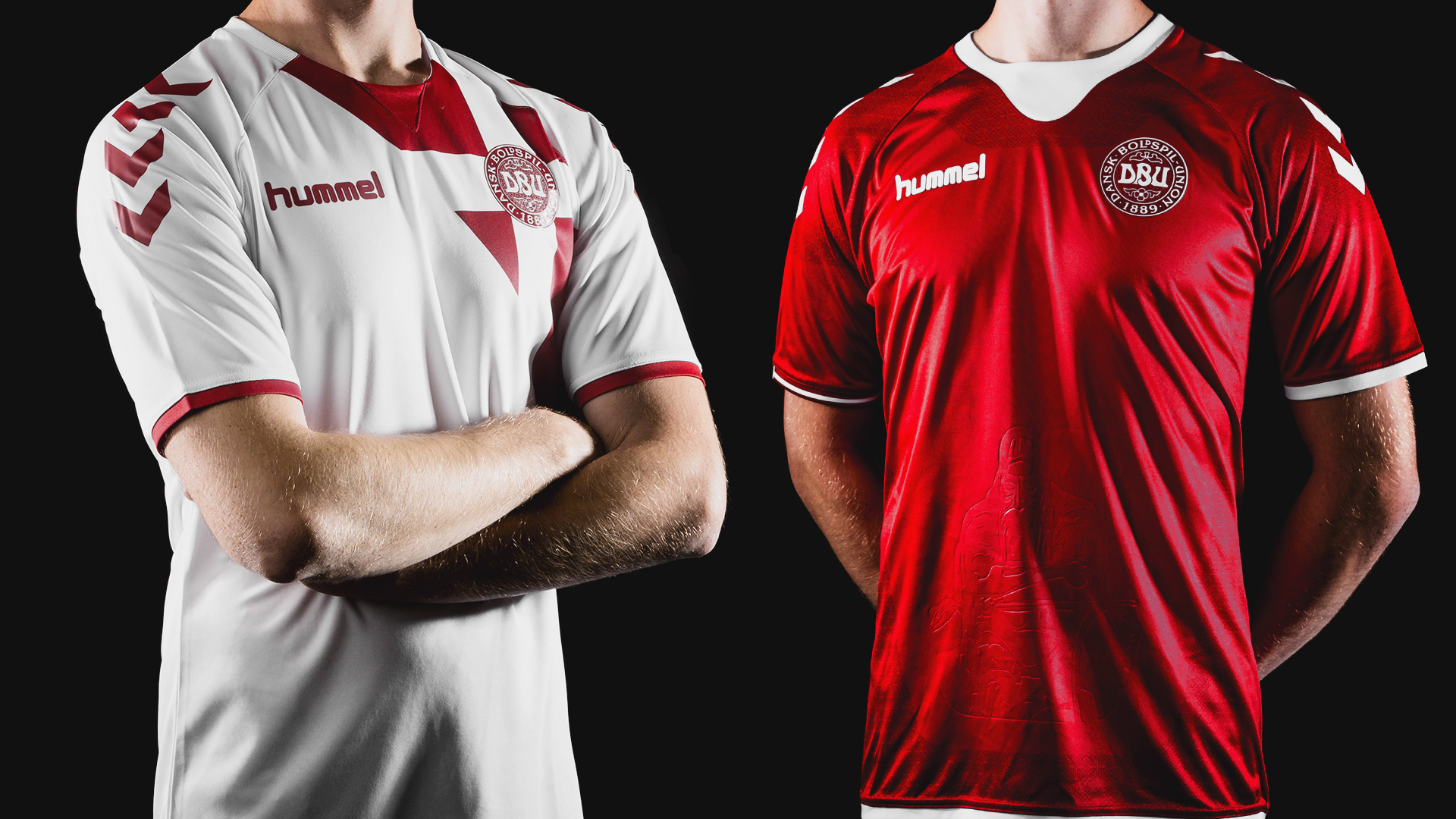
The bold red cross motif looks weird with a sponsor cutting it off, you have four "arms" on the cross with three different lengths. And most were up in arms about over use of the chévrôn on the Australian uniform a couple of years back. Excessive use of the St. George's cross (its not quite as bad from this limited view) is the same shit in different colours.
The chevrons on the shoulders are a Hummel brand mark which appears on almost every uniform they produceSome definite Denmark soccer vibes in that jersey......


