What's new
The Front Row Forums

Register a free account today to become a member of the world's largest Rugby League discussion forum! Once signed in, you'll be able to participate on this site by adding your own topics and posts, as well as connect with other members through your own private inbox!

2014 Jerseys, Logos & Sponsorship Thread

Status
Not open for further replies.

Nuke

Moderator
Staff member
Messages
5,015
Why is the Eastern Suburbs rooster always facing west ?
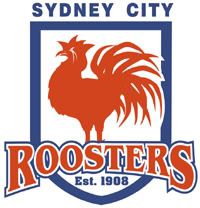
The rooster is facing west probably because the it's coming from the east.

In regards to the Roosters logo, I did this several years ago. Kind of amalgamating the current logo with the famous Easts logo of up until the mid-90's.
SydCityRoosters.jpg

Okay, this is off topic to some degree, but I've always thought the rooster silhouette idea is something they should return to.
 

GAZF

First Grade
Messages
8,740
Interesting......

Maybe its a subtle clue to let people gradually get used to the idea of the Roosters from the west.

Has a nice ring to it, doesnt it. West Coast Roosters ......... You heard it here first!!!!!!

Makes no sense, the focus on the West Coast clashes with the idea of the sun rising in the east.

The rooster is facing west probably because the it's coming from the east.

In regards to the Roosters logo, I did this several years ago. Kind of amalgamating the current logo with the famous Easts logo of up until the mid-90's.
SydCityRoosters.jpg

Okay, this is off topic to some degree, but I've always thought the rooster silhouette idea is something they should return to.

The next logo should be based on the logo this is based on. I don't think they need the Roosters wordmark, and no "Sydney City".
 

Von

Juniors
Messages
1,054
http://membership.roosters.com.au/

Check out this membership logo the roosters have come up with.

Its f**king awesome!!!! Id be thrilled if they used something like that as their club logo.

Im not a fan of their current logo, but i am sure they would come up with something brilliant if they did change.

Agree, it is very good....honour the history of the club.
Canterbury have done a similar thing on their logo with "CB 1935"


Why is the Eastern Suburbs rooster always facing west ?
I know what you mean, but strangely it also depends on which way you look at it or direction you stand.
 

Von

Juniors
Messages
1,054
Guys please vote for jersey number 9 on the broncos homepage poll (www.broncos.com.au).

My 3 designs are the only ones that incorporate the main sponsor (instead of a black sticker).

I want to win this so instead of separating the votes I will be getting everyone to vote for 9 as it is the design that everyone seems to be loving, :)

Thanks

Just cast my vote for you apple.

I do like the neck...very original, and appropriate for the Broncos.
 

Saint Doc

Coach
Messages
11,061
Regarding the membership logo... I don't know. It just doesn't feel right. I can't pin point what I don't like about it. The cursive font looks wrong, it seems crowded. The stylised shield...the doubled coloured border. It's like it's trying really hard to be great ...but just isn't.

e7f60ca38d013644b0c2c713f593d9d9.jpg
 

Hello, I'm The Doctor

First Grade
Messages
9,124
Regarding the membership logo... I don't know. It just doesn't feel right. I can't pin point what I don't like about it. The cursive font looks wrong, it seems crowded. The stylised shield...the doubled coloured border. It's like it's trying really hard to be great ...but just isn't.

e7f60ca38d013644b0c2c713f593d9d9.jpg


I think they're going for a NY Yankees look, kind of a classic thing.

I quite like the outline colours, they compliment each other. The shield shape is wrong thouhg.

I quite like the font, but it is obviously going for a retro look (i can see why people would think its cheesy). But id lower it to the bottom of the shield, it shouldnt clash with the rooster like it does.

Edit: If the League can ever move away from jersey sponsers, on some jerseys id like to see them replace the righting with the team nameon the chest (like what Cronulla had this year).

Picture that roosters font in place of the Steggles logo.
 
Last edited:

LJC

Juniors
Messages
584
The rooster is facing west probably because the it's coming from the east.

In regards to the Roosters logo, I did this several years ago. Kind of amalgamating the current logo with the famous Easts logo of up until the mid-90's.
SydCityRoosters.jpg

Okay, this is off topic to some degree, but I've always thought the rooster silhouette idea is something they should return to.


Good logo but the name should be:

East Sydney Roosters
 
Messages
11,402
they have right idea, but i think the membership logo has to much going on. The shield is the wrong shape and the 'Sydney roosters' writing in the middle is to distractive...
 

Von

Juniors
Messages
1,054
So sick of the walking billboard jerseys today.

1 or 2 sponsors is cool, but when we have front, back top, back bottom, sleeve, collar, mini chest, shorts, socks, it is getting a joke...ljust like F1.
 

Lambretta

First Grade
Messages
8,679
So sick of the walking billboard jerseys today.

1 or 2 sponsors is cool, but when we have front, back top, back bottom, sleeve, collar, mini chest, shorts, socks, it is getting a joke...ljust like F1.

Same - that's why the Roosters home jersey at the end of last season - start of this was sooooo good.

Steggles on the front - nothing on the sleeve and EASTS (Leagues Club - admittedly) on the back. It looked for all the World like a single sponsor. Then Isuzu trucks and Opel got added. At least their logos are just white writing, unlike the awful OO sleeve sponsor from 2010/11. Green and orange f**king circles. Horrid.
 
Status
Not open for further replies.

Latest posts

Top