Henson Park Hornets
Juniors
- Messages
- 1,973
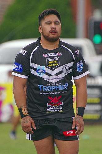
Wentworthville Sydney Shield side also have a few sponsors on their jersey..... FIVE on the front alone!
**Edit - that's from 2015 but it's the same for this year, just can't find a pic online.
I've had to do jobs where you need to cram that many sponsors onto a design, makes you die a little on the inside.Wentworthville Sydney Shield side also have a few sponsors on their jersey..... FIVE on the front alone!
**Edit - that's from 2015 but it's the same for this year, just can't find a pic online.

They actually did this to the VB sponsorship on the grass last wednesday..shame they cant do it to the jerseyI know it would never happen but here is a quick fix to the NSW Origin jersey. The white under the arms and chest is changed to blue. VB brought out Blue commemorative NSW Origin cans last year so its not that far fetched for them to change their colours for the jersey.


Ok, i think ive figured out how to fix the Titans branding (for anyone who remembers my anthology of suggestions, i promise this is my most conservative/least crazy one yet)...
Go back to the original Blue-Gold shades of '07 (they were actually distinct and original and their brand has been down hill since they ditched that)
Incorporate Logan into the clubs name (similar to the old Gold Coast-Tweed branding). Gold Coast-Logan Titans would give the club claim to an extra half a million potential fans and i think the association gives the club a more grounded, working class feel. Plus, its a first step into surplanting the Broncos as THE team for rural South Queensland.
Finally, go back to the old Giants logo. "Titans" is an equally applicable name and it gets us away from the dumb Greek-Mytholoy angle. Plus, it give them a retro 80s look (a call back to the RL glory days) AND representing themselves as a continuation of the '88 side gives them more to work with in terms of stiring up rivalries; "SuperLeague Broncos killed us off, Storm stole all our players, etc".
Anyway, this is my Clipart attempt at a logo (obviously more colour is needed). What do you all think?
Nice... love the jerseyOk, i think ive figured out how to fix the Titans branding (for anyone who remembers my anthology of suggestions, i promise this is my most conservative/least crazy one yet)...
Go back to the original Blue-Gold shades of '07 (they were actually distinct and original and their brand has been down hill since they ditched that)
Incorporate Logan into the clubs name (similar to the old Gold Coast-Tweed branding). Gold Coast-Logan Titans would give the club claim to an extra half a million potential fans and i think the association gives the club a more grounded, working class feel. Plus, its a first step into surplanting the Broncos as THE team for rural South Queensland.
Finally, go back to the old Giants logo. "Titans" is an equally applicable name and it gets us away from the dumb Greek-Mytholoy angle. Plus, it give them a retro 80s look (a call back to the RL glory days) AND representing themselves as a continuation of the '88 side gives them more to work with in terms of stiring up rivalries; "SuperLeague Broncos killed us off, Storm stole all our players, etc".
Anyway, this is my Clipart attempt at a logo (obviously more colour is needed). What do you all think?
Least crazy but still on a different wavelength. BUT...that is an awesome jersey design in the logo. I could definitely get behind that!!
One on the right is a classic... wish they kept with the Tomahawks name
stomache...

It's a better icon than the RLIF one but it doesn't exactly scream "rugby league".Im watching replays of some of the WC games, and it jumped out at me how striking the logo is. Its a great and very memorable logo and im just thinking that it is a shame that it wont be used again after the competition.
At the same time, it seems like the RLIF need a more memorable brand than their current piece of crap. They should have a logo the can throw on everything (in the same way the ARLC is putting NRL everywhere they can). RL doesnt have any kind of common, world-wide image. Something like this could be the beginning of that.
Anyway, i think with a few tweaks the WC logo could be used as the permanent RLIF badge to great effect.
It's a better icon than the RLIF one but it doesn't exactly scream "rugby league".
Im watching replays of some of the WC games, and it jumped out at me how striking the logo is. Its a great and very memorable logo and im just thinking that it is a shame that it wont be used again after the competition.
At the same time, it seems like the RLIF need a more memorable brand than their current piece of crap. They should have a logo the can throw on everything (in the same way the ARLC is putting NRL everywhere they can). RL doesnt have any kind of common, world-wide image. Something like this could be the beginning of that.
Anyway, i think with a few tweaks the WC logo could be used as the permanent RLIF badge to great effect.

Anyway, i think with a few tweaks the WC logo could be used as the permanent RLIF badge to great effect.
I think it needs an "XIII" in it somehow, possibly as the laces on a football?