greenBV4
Bench
- Messages
- 2,510
nice touch, and very victorian
(the pattern down the bottom is the geometric pattern of AAMI park for anyone who didnt notice)
nice touch, and very victorian
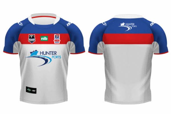
Not sure why they couldn't have used the 9s jersey as a template to make the away jersey, that really looks great, with the blue on top and red beneathThe Knights away jersey is probably the worst of all the home and away jerseys this year.
It’s trash. They obviously just took the home jersey and changed the colour of some of the panels. There’s no way they’d design it from scratch to look like that. Terribly lazy
Would have been a slight improvement, but the points where the panels connect are weird and don’t suit being the place where the colours change, if that makes sense?Not sure why they couldn't have used the 9s jersey as a template to make the away jersey, that really looks great, with the blue on top and red beneath
Well i just mean it would be a reversal on the home jerseyWould have been a slight improvement, but the points where the panels connect are weird and don’t suit being the place where the colours change, if that makes sense?

The Knights away jersey is probably the worst of all the home and away jerseys this year.
It’s trash. They obviously just took the home jersey and changed the colour of some of the panels. There’s no way they’d design it from scratch to look like that. Terribly lazy

They forgot the red collar and sleeve, and MOST IMPORTANTLY The NIB on the sleeve, that is the best thing they couldve done overall, i like the 2003 7s jersey there i wonder if the back is the same as the front tho, also the whole kit looks great on robbie o davis, due to the socks and shorts being the same as the home, this might have saved the current design from being total garbage this year
I'm sure NIB would've been stoked to reduce their sponsorship to less exposure just to keep a faithful reproduction of an old jersey...They forgot the red collar and sleeve, and MOST IMPORTANTLY The NIB on the sleeve, that is the best thing they couldve done overall
It does look better on the sleeves thoughI'm sure NIB would've been stoked to reduce their sponsorship to less exposure just to keep a faithful reproduction of an old jersey...
red and blue shouldnt be hard to make a decent home and away set out ofIs it their colours?
Have the Knights ever had a good away jersey? Serious question. I’m looking through Google images and there’s maybe one or two decent ones but I’m not really seeing one definitively good away jersey. Is it their colours?
I think it is their colours; even their better designs (97 and 01 styled) look like those huge bags you buy at The Reject Shop. I reckon they're a good candidate to use silver, just so their colours don't look so stark.Have the Knights ever had a good away jersey? Serious question. I’m looking through Google images and there’s maybe one or two decent ones but I’m not really seeing one definitively good away jersey. Is it their colours?
I think it is their colours; even their better designs (97 and 01 styled) look like those huge bags you buy at The Reject Shop. I reckon they're a good candidate to use silver, just so their colours don't look so stark.
Have the Knights ever had a good away jersey? Serious question. I’m looking through Google images and there’s maybe one or two decent ones but I’m not really seeing one definitively good away jersey. Is it their colours?
Strong disagree - easily mistaken for the Bulldogs home jersey on long shots.Roosters seem to be able to produce decent away jerseys consistently despite having very similar colours, so I don't feel like that's it.
Arguably the club has had some average home jerseys as well in the 2000s which didn't help, but to me, it's feels like they don't make any effort to adjust the design to work with the cut of the jersey or the placement of nib.
If I was to pick a good Knights away, I'd possibly pick 2012. Whilst it is a bit boring, it's at least clean and would look ok even with O'Neill's cut and nib as a sponsor (you would arguably be able to get nib to put their alternate logo on this design)