flippikat
Bench
- Messages
- 4,440
15 of the home jerseys for 2021 - and the Raiders heritage.

That's a LOT of black & blue.
15 of the home jerseys for 2021 - and the Raiders heritage.
15 of the home jerseys for 2021 - and the Raiders heritage.
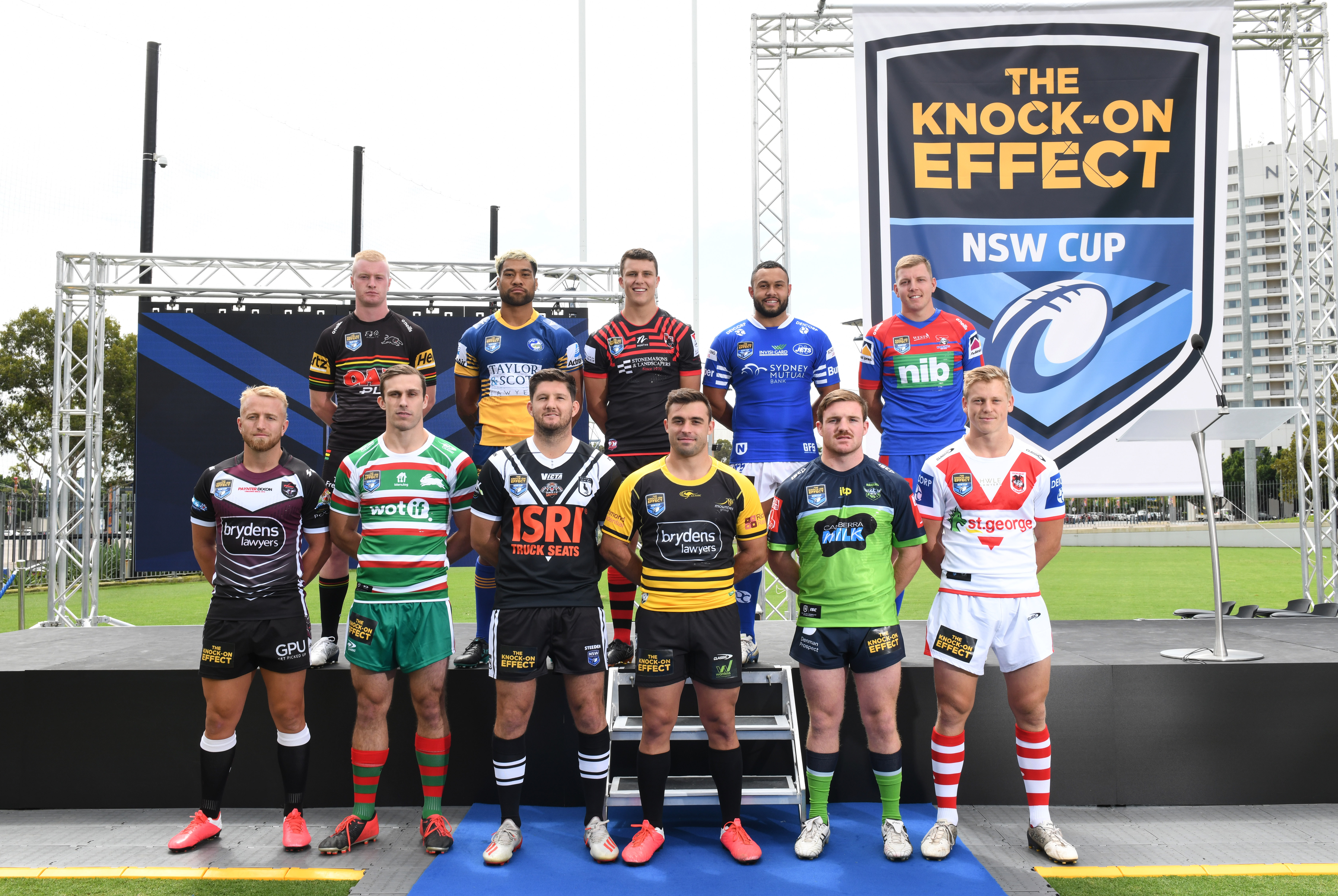
2021 NSW Cup Kits:
Have raiders ditched the home jersey already.??15 of the home jerseys for 2021 - and the Raiders heritage.
Smile!!!!15 of the home jerseys for 2021 - and the Raiders heritage.
But that Warriors jersey... I’m half-tempted to buy one n add to my classic collection...
I reckon that’ll be a future classic. Haven’t been able to say that about many (possibly any??) jerseys over the last decade or so..

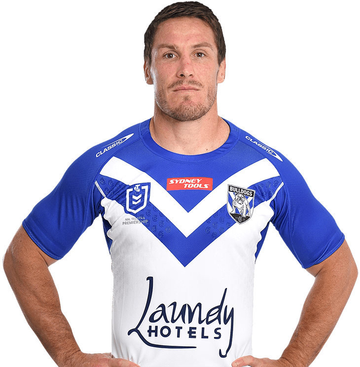
Why can’t Classic properly justify names on a jersey?Dogs members jersey View attachment 46334
Dogs members jersey View attachment 46334
Have raiders ditched the home jersey already.??
The club has said from the start that the "heritage jersey" would feature prominently in the season, i.e. it'd effectively be our main jersey. I think it's all part of the slow build that the club has been using to introduce navy, and to a lesser extent silver/grey, to the colour scheme.It feels like that.
- Nine Promos - Done in Heritage kit
- Fox Promos - Done in Heritage kit
- NRL Season Launch - Done in Heritage kit
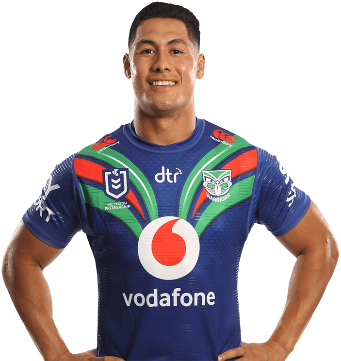
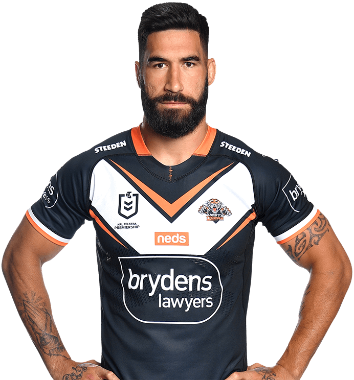
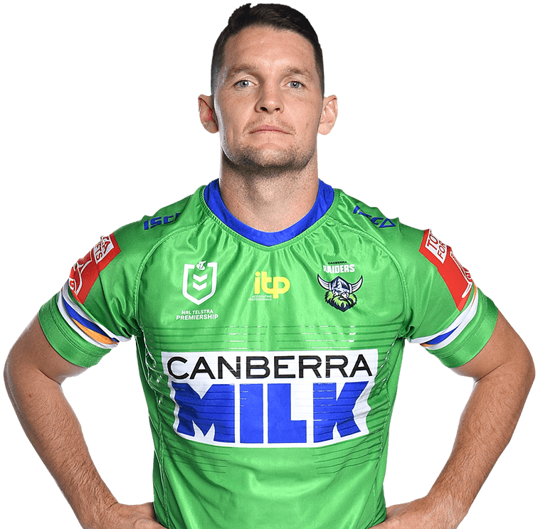
- Player Profile Headshots - Done in Heritage kit (https://www.nrl.com/players/?team=500013)
- Team Photo - Done in Heritage kit
I just can't keep this one short...The club has said from the start that the "heritage jersey" would feature prominently in the season, i.e. it'd effectively be our main jersey. I think it's all part of the slow build that the club has been using to introduce navy, and to a lesser extent silver/grey, to the colour scheme.
Somebody somewhere has convinced them that if they modernise by basically copying the Seattle Seahawks colour scheme that their brand will appeal to a broader audience, and I don't necessarily have a problem with that (though I feel I could make a strong argument against that logic).
However I just wish that somebody that is a fan of the club and has a better understanding of it's history was the person designing the jerseys, because I feel they would have done a much better job of transitioning to the new colour scheme without impacting on the clubs identity as much and pissing off a significant portion of the fans base in the process.
If for example @GAZF and a team of like minded people were tasked with making the transition I feel it would have gone much more smoothly.

I pretty much agree with you on everything.I just can't keep this one short...
I really don't mind the new design at all, and am of the opinion that a shift in this direction will appeal to a wider market. As cherised as the classic design is, a new fan is less likely to buy a plain jersey (solely consisting of bright colours) to wear casually. The new design at the very least is inoffensive visually and a solid base than can be re-designed iteratively to keep the identity fresh.
Due to the club having had a "jobs for the boys" mentality for decades, all of our success happening in a narrow timeframe, and two ill-advised departures in the late 90's-early 00's, the classic design has never really evolved outside of the changing of the direction of the stripes in 2003-05. The (generally) most rusted-on of fans exist in the age range of 35-60, who have great memories of the green machine era in this design and aren't young enough to be as open to change. Changing the visual direction of the club is certainly easier than telling the Dragons to get rid of the red V, but there is still a huge amount of equity in the look, that fans of other clubs (in this age range) even have a reverence for. But these fans aren't the target audience the club is out to capture, and solely catering to a demographic that is ageing (and will eventually die out) at the expense of the growing newer demographics is bad business for a club that was established in the age of expansion.
Yes, the transition could have been a bit smoother by gradually introducing navy. With the shorts included, the look is very navy-dominant from front-on while the balance looking from the back is about right. A thick green stripe on the shorts would have balanced the colours out a bit better. Navy is absolutely everywhere in the league, and adopting a more desaturated and slightly lighter colour (more slate-ish) would have provided a better differentiator. The contrast between the green and silver is pretty weak, but since it's tied to the new logo they are unlikely to change them; in this case, a thin navy keyline where the two colours meet may have worked. The away design is way too light on green, and perhaps the navy/green could have been swapped while keeping silver as the base.
I would like to think that some of my badgering to the club over the years has influenced this new direction a bit. There are some noticable similarities with a rebrand submitted to the club in 2013/14, right down to the colours and logo font, along with the jersey design submitted for the contest in 2016. This is also just as likely to be parallel thinking, and me being a pompous fool.
I hope the club sticks with their guns on this shift, and doesn't give in to the most vocal fan faction as RL generally does. As much as I love the classic design, it has stronger appeal to the already converted than it does to a new generation of fans. The last thing you can accuse the club of in the last 15-20 years is forcing change for change's sake in this department. Popularity comes in waves for small market teams like the Raiders, and the club should be capitalising on it's current resurgence to maximise the generation of new fans to supplement the one that waned in the late 90's. Just as importantly, the club needs to maintain a balance with the exisiting older generation of fans, like me and most others here. Using the heritage design a lot in the coming years and keeping the traditional blue/gold stripes will also help a new design like this gain acceptance.