tumbidragon
First Grade
- Messages
- 6,771
And what happens if cowboys play penrith
Cowboys will smoke them.
And what happens if cowboys play penrith
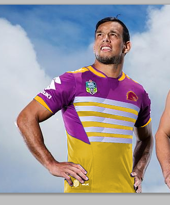
Those singlet's look even worse on.
Cowboys will smoke them.
That would be perfect for their alternate imo
The front of the Panthers shirt should have more gold, like the back. The back looks quite dark.
On the gold, it may have just been the shade or how it was captured, but I see it more as a light shade of brown... if that's the case, perhaps it's a nod back to 1967-1990 and this may be the wave of the future. Who knows.
Bronze?^^ Actually, ignore that assertion. It definitely is gold. But personally I would like it have a bit more of a brown tinge, if there is such a thing.