This must have been done by Dean Ritchie, in what world is the Titans logo the best in the competition?
Seriously?
It’s the worst in the comp!
By far!
Easily!
They should do a silver jersey - silver with purple and gold accents. Perfect opportunity to use their full colour set without there being too many colours on any given jersey.Actually they could do a 'silver' jersey
That list is beyond ridiculousThis must have been done by Dean Ritchie, in what world is the Titans logo the best in the competition?
Seriously?
It’s the worst in the comp!
By far!
Easily!
Needs an extra finger on the fist grasping the lightning bolt. Otherwise that’s a pretty good attempt at fixing it.View attachment 24224
IMO this fixes the new storm logo
removed the jarring triangle bit from the vee and added in a left hand
Did my comment upset you?Blahhh
Hahaha the person who wrote this sounds like that one person we all know who goes for the scariest sounding teams, since you know, the tigers will beat the Rabbitohs cause tigers eat rabbits! I should 100% rather logos stay traditional and within their heritage just like the recently new Bulldogs, Rabbitohs and Eels, compared to their cartoonish predecessors. In no way should a logo change to "make it more fiercer", unless of course it's Manly.This must have been done by Dean Ritchie, in what world is the Titans logo the best in the competition?
Seriously?
It’s the worst in the comp!
By far!
Easily!
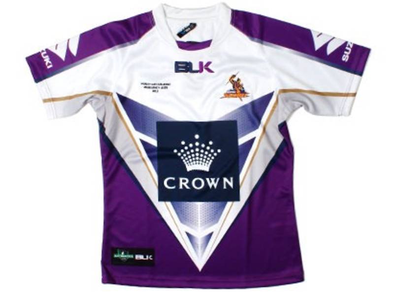
You'd think after this years GF that a Storm would have kept yellow in their back pocket just so they're not caught out with their white jersey again.
The colour scheme of navy/purple/black doesn't leave many options apart from white to use in a clash.
I would have given Stormy McStorm a yellow bolt.
*edit*
Actually they could do a 'silver' jersey
They should do a silver jersey - silver with purple and gold accents. Perfect opportunity to use their full colour set without there being too many colours on any given jersey.
That's all of their colours in one. There's way too much going on.They had a crack at silver and gold for the WCC a few years back
The Storm digital team seem to be patting themselves on the back.Hope Storm didnt actually pay anyone for this new fresh look logo lol. Storm fans are not happy with yet more messing about of the club brand and especially the loss of the yellow in the logo.
Brand agency named Wite Kite. They're based in Neatral Bay and have done some massive jobs both here an overseas. Same company that did the outgoing NRL and Cricket logos. Don't know if they were involved in designing the incoming NRL logo but they have done some good stuff in the past.Hope Storm didnt actually pay anyone for this new fresh look logo lol. Storm fans are not happy with yet more messing about of the club brand and especially the loss of the yellow in the logo.
You can tell it was written by NEWS Ltd when they rank that shitty horse head in the top 5 or soThis must have been done by Dean Ritchie, in what world is the Titans logo the best in the competition?
Seriously?
It’s the worst in the comp!
By far!
Easily!
Would like to see a AFL one, 18 teams fighting it out for the shittiest logoThis must have been done by Dean Ritchie, in what world is the Titans logo the best in the competition?
Seriously?
It’s the worst in the comp!
By far!
Easily!
Incoming NRL logos were done in-house by the NRL's graphic design team. At least in part.Brand agency named Wite Kite. They're based in Neatral Bay and have done some massive jobs both here an overseas. Same company that did the outgoing NRL and Cricket logos. Don't know if they were involved in designing the incoming NRL logo but they have done some good stuff in the past.

