What's new
The Front Row Forums

Register a free account today to become a member of the world's largest Rugby League discussion forum! Once signed in, you'll be able to participate on this site by adding your own topics and posts, as well as connect with other members through your own private inbox!

The Game 2020 Jerseys/Logos/Sponsorships

chiefy1

Juniors
Messages
2,480
Somebody PLEASE explain how you can go from this to this and still keep your job??
View attachment 34176

If you guys knew anything about sporting designs, especially when its a gladiatorial sport, you would understand that the new eels jersey trumps the 86 design.

The white bar across the lower chest improves masculinity by lifting the blue section higher making the focal point the upper chest which is what we want.

The last thing you want is the stomach area being the focal point. The white improves the symmetry
 

MugaB

Coach
Messages
11,975
If you guys knew anything about sporting designs, especially when its a gladiatorial sport, you would understand that the new eels jersey trumps the 86 design.

The white bar across the lower chest improves masculinity by lifting the blue section higher making the focal point the upper chest which is what we want.

The last thing you want is the stomach area being the focal point. The white improves the symmetry
Of course
 

gzerounian

Juniors
Messages
1,090
If you guys knew anything about sporting designs, especially when its a gladiatorial sport, you would understand that the new eels jersey trumps the 86 design.

The white bar across the lower chest improves masculinity by lifting the blue section higher making the focal point the upper chest which is what we want.

The last thing you want is the stomach area being the focal point. The white improves the symmetry
I may need on of these as I am really not sure how to take that.
Screenshot_20191119_135835.jpg
 

insert.pause

First Grade
Messages
6,446
The Blues jerseys are putrid.

The coloured in V is crap. It’s a worse version of last year’s jersey, which I also hated
The 5 million logos are a cluster F.
The 1997 jersey is somehow worse than the original, which is widely regarded as the worst jersey of all time.
The dilution of the State of Origin brand with these alternate jerseys is a travesty.

What a balls up.
What do you expect, the joint is run by amateurs.
 

insert.pause

First Grade
Messages
6,446
9ab1d334c46ac4c5def0b30af82918d1


Just because there weren't enough logos on the NSW Blues kit the NSWRL has decided that Tooheys New logo should appear just under the NSW Blues shield....
images
 

Reflector

Juniors
Messages
2,298
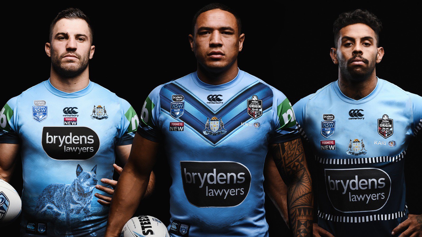
Mixed thoughts on those. I never care too much for the Captain's jersey, they're the kind of thing to flog off to collectors' although a NSW alternate to that one Qld had a few years back with all the pictures of iconic state attractions would be cool to see.

The 'smokey blue' adaption of the chevron jersey would look killer as a website background or an on-screen graphic during the telecast but I'll have to see the thing in the flesh and on TV before I make my mind up. The traditional NSWRL badge in the centre (on both) is overkill. Those jerseys would look notably less cluttered if it was absent and you only had the CCC logo in the middle.

Would LOVE to have seen this years' Perth navy blue alternate with that smokey blue chevron in the middle, could've even been tempted to buy if they'd executed it well. The Adelaide alternate must have been brought into concept by some hipster on the design team who looked back through NSW Origin jersey history and went "Hey, let's bring this one back ironically!"

If they were going to go retro, would've been cool to see either the early 80's striped sleeves one or the late 90's/ early 2000's one with the small white/ navy piping on the bottom of the sleeves. But if they wear that two-tone getup and run the steamroller through Qld again it might become an instant favourite...
 

Perth Red

Post Whore
Messages
65,790
8 badges/logos/sponsors on the front. We've finally become like Formula 1!

With tens of millions of $'s of revenue generated by SOO I struggle to see why we have to have any sponsors on these jerseys? Is it really not making enough money??
 

Rooster8

Juniors
Messages
432
Wow there’s even some intricate diamond pattern on the rest of the sky blue for the main jersey too....
Unless you're referring to the gel grip, that's the fabric? Canterbury uses a larger fabric for player jerseys, like X-Blades do. I think it gives their jersey strength, in comparison ISC uses a smaller fabric which gives it a shiney look, and allows a more lighter and tighter fit.
 

callmack1

Moderator
Staff member
Messages
11,691
Blues jerseys are shocking! Why change from the simple chevrons? I actually thought that looked pretty good and was a look they could go with for years. But no, they just have to change and make it look like shit.
 
Top