What's new
The Front Row Forums

Register a free account today to become a member of the world's largest Rugby League discussion forum! Once signed in, you'll be able to participate on this site by adding your own topics and posts, as well as connect with other members through your own private inbox!

The Game 2020 Jerseys/Logos/Sponsorships

MugaB

Coach
Messages
12,096
Haha f**k that big green box is stupid
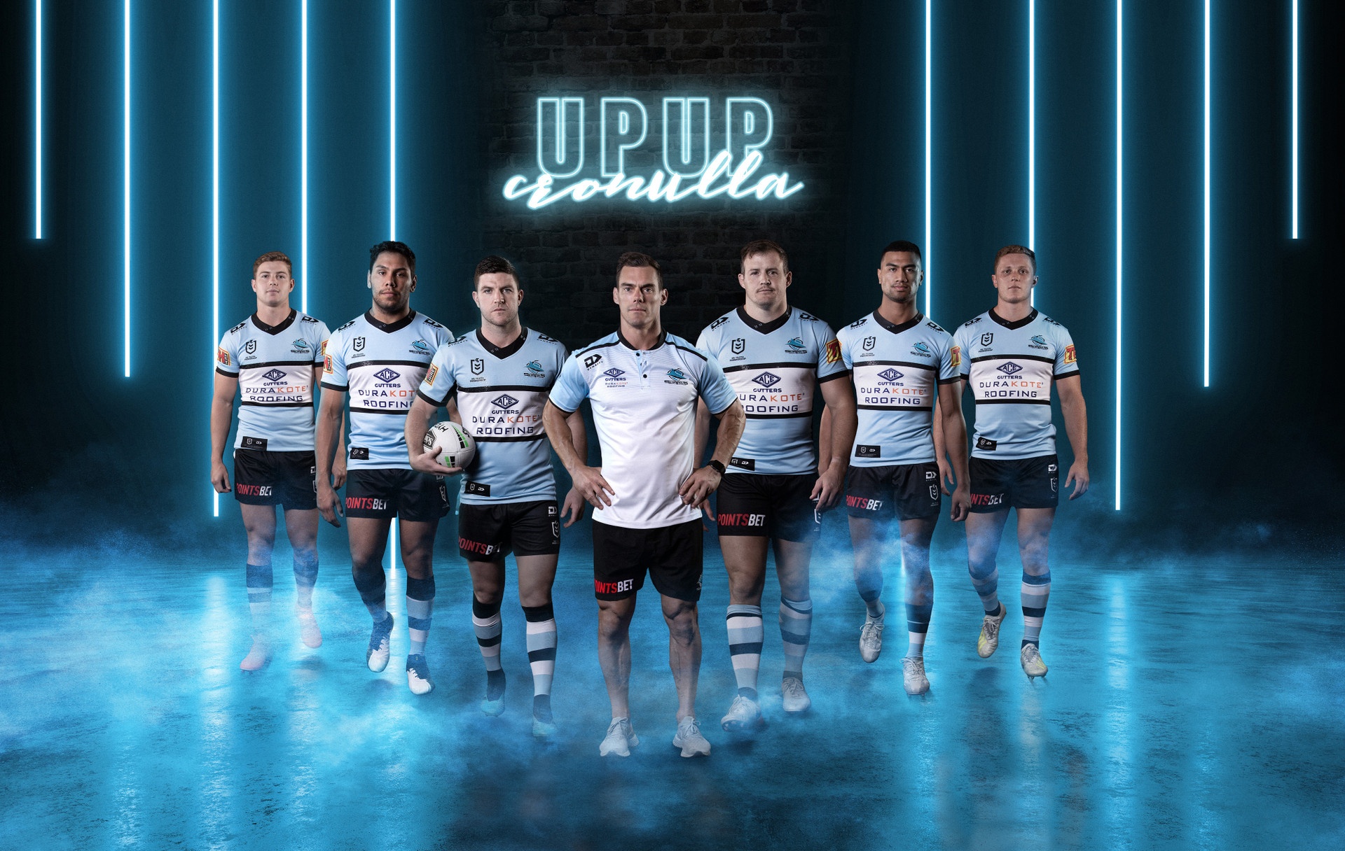
Agreed, why have such an ugly green box covering the design, fk they are stupid, I'd buy the home jersey if it wasn't for that ugly NIB logo, atleast they could have done was incorporate the colors to suit it
 

Reflector

Juniors
Messages
2,313
Knights home


I like those a lot better seeing them from these shots. The placement of the blue on the sleeves doesn't look too high, and the away has enough of an alternate look without it being passable for a Roosters jersey. If I'm picky, that Ladbrokes logo on the back could have been sublimated into plain white text on the home and red text on the away, but unfortunately its' seemingly a necessary evil these days. O'Neill's could hit a winner by supplying yellow numbers on those jerseys.
 

roofromoz

First Grade
Messages
7,580
Just having another look at the Panthers launch video with O'Neills - Keno is gone as front of shorts, Westfund stays as back of shorts.
 

Klim

Juniors
Messages
354
Sharks_Dynasty_Hero_2020_Home_Kit_005.jpg
 

toomuchsoup

Juniors
Messages
2,070
Also interesting to note, looks like no side panel on this version of the hoop jersey that has existed in recent versions.
Cronulla_Sharks_Mens_Replica_Home_Jersey_-_CSJRM501SKY_45RIGHT__92843.1575262306.png

Not the biggest fan of the playing shorts though:
Cronulla-Sharks-Home-Short_CSSHM001BLK_45Left__41077.1575256439.jpg
Cronulla-Sharks-Home-Short_CSSHM001BLK_Back__17333.1575256439.jpg
The jersey is nearly perfect. It’s got the same funky collar as Manly though. These jersey companies always want to put their own little ‘flavour’ on the designs.
The shorts aren’t bad
 
Messages
11,711
The jersey is nearly perfect. It’s got the same funky collar as Manly though. These jersey companies always want to put their own little ‘flavour’ on the designs.
The shorts aren’t bad


The black NRL logo belongs on that jersey, Wish the sleeve sponsor followed suit. Looks great, though. Their jersey from Steve Kneen/Paul Kahn era is one of the best ever. They’ve gone as close as you can get with these modern tops. All they need now is the black back panel with white numbers.
 

hellteam

First Grade
Messages
6,530
It's a good jersey but that sponsor logo looks like something you'd see on a local junior footy club.
Ruins it for me
 

Latest posts

Top