GAZF
First Grade
- Messages
- 8,740
nib thinks that making the middle stripe green looks so much better.This looks so much better....
View attachment 34436
nib thinks that making the middle stripe green looks so much better.This looks so much better....
View attachment 34436
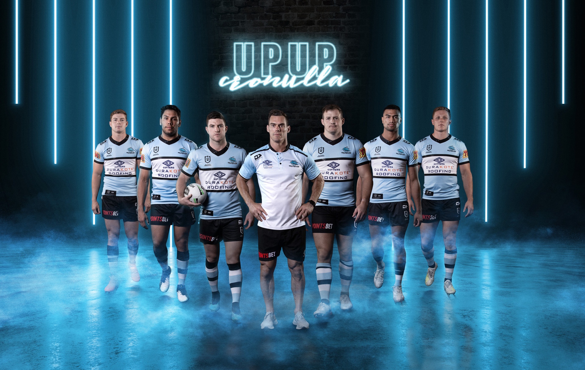
Also interesting to note, looks like no side panel on this version of the hoop jersey that has existed in recent versions.

Not the biggest fan of the playing shorts though:


It's the same template as the Titans shorts.That pattern on the shorts makes them look like boardies- intentional?
This looks so much better....
View attachment 34436
Had not really noticed before but Ronaldo must rival DCE for having the longest neck in the NRL
Had not really noticed before but Ronaldo must rival DCE for having the longest neck in the NRL
I pictured that jersey if it was from the 80's and imagined it'd have 'DURAKOTE' on the front in block letters and then 'ROOFING' on the back. Overall an improvement, they shouldn't have gone away from the classic design to start with. That pattern on the shorts makes them look like boardies- intentional?
And the Ace logo where the NRL logo is like they did before the NSWRL badges were on jerseysI pictured that jersey if it was from the 80's and imagined it'd have 'DURAKOTE' on the front in block letters and then 'ROOFING' on the back. Overall an improvement, they shouldn't have gone away from the classic design to start with. That pattern on the shorts makes them look like boardies- intentional?

I still see space for more logos. Come on, NSW - lift your game.A closer look at the supporter versions of the NSW jersey
View attachment 34490
A closer look at the supporter versions of the NSW jersey
View attachment 34490
The barcode jersey was not as bad 20 years ago... If they gave us something more like the below (please forgive the really really lazy photoshop), it would be so much more tolerable...
View attachment 34511 View attachment 34512
Should put the Star sponsorship on the bottom navy panel to declutter the top as the players name will also be there.
The middle navy panel should also be lifted higher (less light blue) so the jersey number fits in there.
No more green box for the unibet sponsor.
2019

2020


