The Mad Hatter
Coach
- Messages
- 14,506
Middle 4 LA Chargers 2020 combos a good start for GC.

Is it not the same colour combo they have had since day one? Just with more light blue than dark (as it should be)
I've always defended "2 blues and gold" as a colour combo for the GC, it suits it
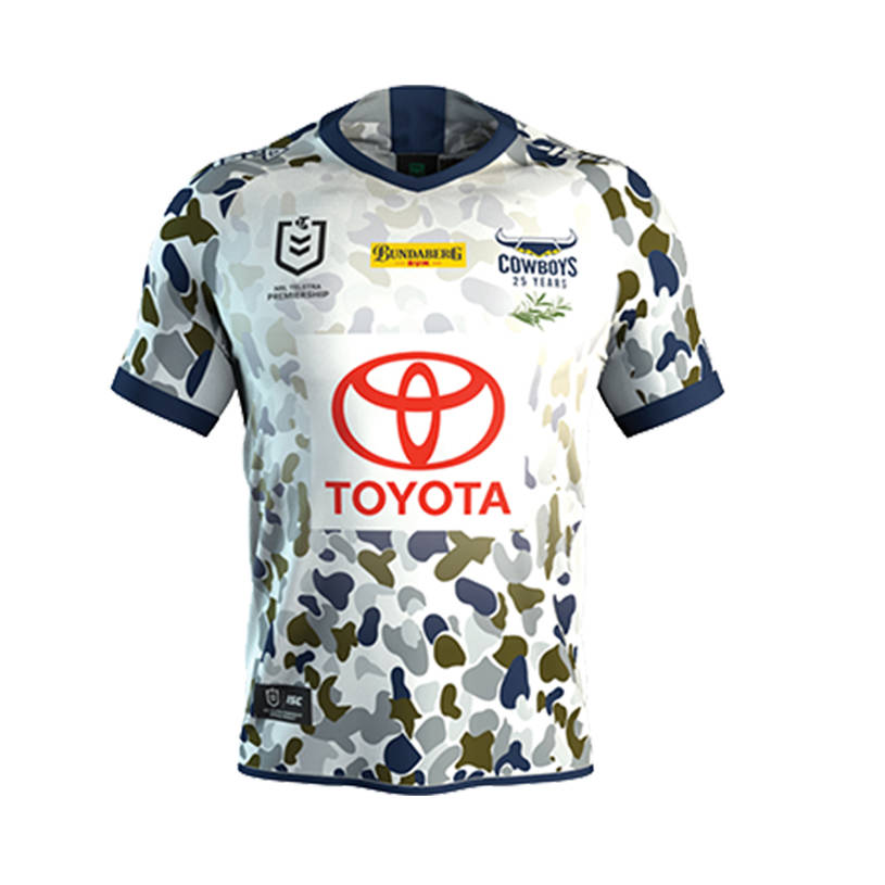
Cowboys have an ANZAC jersey this year???Their ANZAC jersey is similar, you can buy it in store but not online (well that was a few days ago that I last checked).
Not that I want to buy one. it’s pure ass this year
Would have been a good opportunity for them to wear sky blue shorts. I feel a few of the team colours were lost with white shorts this round.And another side this week is having a rare appearance in white shorts, this time Cronulla. Good to see as it makes them stand out against the Broncos a bit more
perfect, slight nudge to be a bit more unique and defined, but still true to the original coloursView attachment 40492The Titans could nudge towards bright turquoise without breaking too far from the blue of their first 12 seasons. Would work nicely with a sandier yellow and (sparingly used) navy.
They were pretty close to the mark with their brighter blue in 2018. The weird design at the time, and lack of gold let their look down though.perfect, slight nudge to be a bit more unique and defined, but still true to the original colours
Which jerseys clashed? Bear in mind shorts made it fairly easy to tell teams apart all weekend where both jerseys were similarly colouredWell all 16 clubs wore their Indigenous Jerseys this round, therefore showing that clubs care more about paying their respects to the Indigenous people than actually making it easier for the viewers to differentiate between the two teams playing.
I thought the knights and Storm jerseys might’ve clashed a bit but it wasn’t that bad in the match.Which jerseys clashed? Bear in mind shorts made it fairly easy to tell teams apart all weekend where both jerseys were similarly coloured
I feel like their 2014/15 kit was possibly closer to the proposed turquoise than 2018, all in all it is crazy how many variations of blue they have had over the years, even when you exclude the current jersey...
View attachment 40493
I know it's an anzac jersey, so i dont want to make fun about it.... but the design is......MOOOOOOOOO!!!!
I can’t think of a single incidence of faux camo looking good on a jersey. How do clubs get the indigenous designs so right and the ANZAC designs so terribly wrong?I know it's an anzac jersey, so i dont want to make fun about it.... but the design is......MOOOOOOOOO!!!!
Maybe they wanted to look like a cowI can’t think of a single incidence of faux camo looking good on a jersey. How do clubs get the indigenous designs so right and the ANZAC designs so terribly wrong?
Perhaps the noble cow will provide some inspiration this weekend, we can only hope.Maybe they wanted to look like a cow
Doesn't matter as long as they virtue signal as much as possible. Stay tuned for Covid -19 awareness round. Players and coaches can all wear face masks.Perhaps the noble cow will provide some inspiration this weekend, we can only hope.
On an unrelated point, the Women in League jerseys are also reliably terrible. Add a cliched splash of pink and we’re done. I wonder if anyone has ever actually bought one of these...
Doesn't matter as long as they virtue signal as much as possible. Stay tuned for Covid -19 awareness round. Players and coaches can all wear face masks.
.png")