What's new
The Front Row Forums

Register a free account today to become a member of the world's largest Rugby League discussion forum! Once signed in, you'll be able to participate on this site by adding your own topics and posts, as well as connect with other members through your own private inbox!

The Game 2021 Jerseys, Sponsorship, Logos etc

Nqcowboy

Juniors
Messages
157
images
that's why they got rid of this logo, the Harbour bridge told them to pay up or change.
According to this article it would suggest the harbour bridge is up for grabs, it would seem when they dropped the city part to just be the Sydney Roosters they went with a less cartoonish and more aggressive logo rather than it being a licensing issue
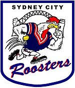
https://www.smh.com.au/sport/kings-...50-000-price-tag-on-logo-20200807-p55jqj.html
 

Timmah

LeagueUnlimited News Editor
Staff member
Messages
100,896
Surely they revert to the standing Rooster brand.
 

sempmrh

Juniors
Messages
1,197
I like the rooster head on the Roosters logo and that’s about it. That Roosters wordmark is a mess and the Sydney along the top is almost as bad.
 

It's Been Done

Juniors
Messages
631
XBlades should have either a new or revised template for the Dragons next year (for those new to or unfamiliar with jersey design, most manufactures change or revise their templates for their customers every 2-3 years)
 

Nqcowboy

Juniors
Messages
157
XBlades should have either a new or revised template for the Dragons next year (for those new to or unfamiliar with jersey design, most manufactures change or revise their templates for their customers every 2-3 years)
You guys have had the red v since inception
 

parrawentyfan

Juniors
Messages
731
This might sound stupid but if the Kings just remove the left hand streak the logo is basically the same.

They could just argue it is no longer the opera house just the streak from the bouncing ball. Extend the tall streak or add a new one with the same trajectory. kings~2.png
 
Messages
11,711
This might sound stupid but if the Kings just remove the left hand streak the logo is basically the same.

They could just argue it is no longer the opera house just the streak from the bouncing ball. Extend the tall streak or add a new one with the same trajectory. View attachment 40983


Looks like a couple of shark fins.
If they replace the crown with the basketball, you could tweak the sails and argue it’s a stylised crown with the ball looking like a jewel within it. Don’t know if it’ll get through cos it’s obviously inspired by the OH.
 

Nqcowboy

Juniors
Messages
157
Looks like a couple of shark fins.
If they replace the crown with the basketball, you could tweak the sails and argue it’s a stylised crown with the ball looking like a jewel within it. Don’t know if it’ll get through cos it’s obviously inspired by the OH.
And you know if they’re already being a stick in the mud they’ll get lawyers to try and tear that to shreds
 

wazdog

Juniors
Messages
377

yakstorm

First Grade
Messages
5,402
The Sydney Harbour Bridge is public license. Whether it was back in the mid-90's where the horrible 'Sydney City' logo existed, I'm not sure, but there is nothing preventing any of the sporting teams swapping out the Opera House for the Bridge, other than it may not work as well or look as good.

As others have mentioned, if the Roosters were forced to change, it would be a relatively easy move for the club. They have already been using the heritage silhouette more and more anyway, to the point it is already on the jersey anyway (on the back)
SR20JSY01L-D180-LS_80mm-Camera_a__06538.1575604801.jpg
 

It's Been Done

Juniors
Messages
631
You guys have had the red v since inception

We won't be abandoning the Red V, I'm talking about possible revisions to parts of the jersey like the collar and potentially things like the side panels, though it's more than likely XBlades if they do at least modify the template, they'll just change the look of the collar like ISC did every even year since 2012 except for this year. The one bit of the XBlades current template that annoys me is that the V does not extend onto the shoulders like it should
 

Latest posts

Top