MugaB
Coach
- Messages
- 12,102
In 2019 hoops home jersey?Eh? This was their design last year
And 2020 (this years) away pepsi style
In 2019 hoops home jersey?Eh? This was their design last year
Its actually only a training jerseyWhy wouldn't they extend the black strip so the club logo is entirely in the black section. Bizzare decision.
 Broncos Twitter have released a cool little video teasing the shift to asics. This has gotta be the lamest post I’ve made but the ‘mostly maroon’ rumor seems to be legit. Also the Kia logo is ‘transparent’ like last year, so no horrible box as feared.
Looks like they will be using the old KIA oval logo too, unfortunately.View attachment 44005 Broncos Twitter have realized a cool little video teasing the shift to asics. This has gotta be the lamest post I’ve made but the ‘mostly maroon’ rumor seems to be legit. Also the Kia logo is ‘transparent’ like last year, so no horribly box as feared.
in the video it looks like the player is wearing maroon socks, which is a shame because the women were wearing the good 90’s socks. View attachment 44005
I’m torn about it. Having the new fancy logo would be cool but I dunno how it would translate on a jersey without an ugly box.Looks like they will be using the old KIA oval logo too, unfortunately.
I think it would be striking enough to do without a box, we will find out in 2022 tho!I’m torn about it. Having the new fancy logo would be cool but I dunno how it would translate on a jersey without an ugly box.
Lapel jersey will be the 2021 jersey.I reckon this might be the broncos jersey next year. This is from a pin set on the broncos store. The first jersey is obviously a representation of the original. The second jersey I don’t remember the broncs doing. It looks like a maroon jersey with stripes in the lower half, the top and bottom stripes being white and the rest gold:
That away sounds like a crazy time and I love it.Lapel jersey will be the 2021 jersey.
Stripes are much thinner which are sort of the 2020 away jersey style and are low on the kit. Kia stays the same and is a bit bigger. White collar with maroon bib. Asics retain the sternum sponsor. Sleeve design retains the 2020 style with only one stripe instead of two. Sponsors remain the same.
Stripes also continue onto the shorts.
Away jersey is white with maroon stripes and a yellow block at the bottom. The maroon stripes are disfigured and make a sort of V shape like that rumored dragons kit. Maroon sidepanels and white collar with maroon bib. Yellow sleeves.
Not sure on the heritage side as I don't have any info on that.That away sounds like a crazy time and I love it.
Any word on heritage? Given their members gear and gold socks had that 90’s diamond vibe to it, people, like me, got excited.

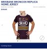
Better look.Broncos jersey is up on asics site. No away strip.
Interestingly they are wearing the gold 90’s socks but in the preview video the other day it shows maroon socks.
I like it. It’s different. The strips are an interesting take on an old broncos trope.
There’s something uninspiring about this jersey- I can’t put my finger on it, but I think the Broncos have had far better jerseys than this. I think it’s the overwhelming maroon and lack of gold that drops this design IMO.View attachment 44034
Better look.
Not only that, the largest block of gold has maroon lines all through it, giving it the illusion of shifting to a slightly greenish gold.There’s something uninspiring about this jersey- I can’t put my finger on it, but I think the Broncos have had far better jerseys than this. I think it’s the overwhelming maroon and lack of gold that drops this design IMO.