Saxon
Bench
- Messages
- 2,681
Here's the back - apparently no sponsors at all?

More sponsors to go on. No Suzuki yet among others.
Here's the back - apparently no sponsors at all?
Can we have this one? Please?It actually looks a lot better laid out flat than it does on (most jerseys are the opposite IMO).

Yeah especially being Melbourne based where pretty much all of the AFL guernseys have barely changed in decadesFor such a successful and powerful Australian sporting club, I'm not sure why the Storm have such a hard time creating a brand identity? I thought with the new logo change a few years back that it would be the start of a new identity embracing the 'V' shape they had with ISC for a few years. I can understand they want to break away from the ISC design, but surely they either could have done something more fit with their brand identify or even create a new one based on classic designs rather than going all out on something new for the 5th time in 10 years...
From an external perspective, I think this jersey has to be the Storm's design they build around. Not only is it similar in detail to all late 90's / early 2000's Storm jerseys, but also brings back memories of the times between 2006-2009 when the storm were unstoppable (I'm not a fan of the 2010-2012 Kooga jerseys). It would give the same vibes as the Chicago Bulls jerseys - whilst the Bulls aren't the successful club they once were, having a design that was similar or if not the same as the era that Michael Jordan was playing it helps cement and carry on that successful branding of the teamYeah especially being Melbourne based where pretty much all of the AFL guernseys have barely changed in decades
Personally I wish we just stuck with the 20 years jersey
The biggest issue with this one is it doesn't lend itself well to sponsors, no matter the logo a box or break in the design would be necessary (and i quite like our recent mostly monotone, no box sponsor integration), our current logo (as well as the new premiership logo and text) would also get lost in the boltsFrom an external perspective, I think this jersey has to be the Storm's design they build around. Not only is it similar in detail to all late 90's / early 2000's Storm jerseys, but also brings back memories of the times between 2006-2009 when the storm were unstoppable (I'm not a fan of the 2010-2012 Kooga jerseys). It would give the same vibes as the Chicago Bulls jerseys - whilst the Bulls aren't the successful club they once were, having a design that was similar or if not the same as the era that Michael Jordan was playing it helps cement and carry on that successful branding of the team
For the away / alternative, the club can go wild trying new designs or incorporating the gold colours they've been trying to for a while now
The biggest issue with this one is it doesn't lend itself well to sponsors, no matter the logo a box or break in the design would be necessary (and i quite like our recent mostly monotone, no box sponsor integration), our current logo (as well as the new premiership logo and text) would also get lost in the bolts

That jersey there is the winner. Keep that. Don't change it.The earlier ones had a shallower vee of lighting bolts which worked better with sponsor placing - not that I'm recommending the red background though.
The club has been pretty consistent with the lightning bolt they’ve been using since the new logo. I can’t see them using anything but that going forward. In saying that, they keep using it backwards which I don’t like.
Its not fair for me to say this as i have not felt or seen the jesey in real life but from the photos, I agree, it just doesn't look like it will hold up in a tackle without it ripping. It actually looks like a t shirt. Have Castor jerseys been used in rugby league anywhere around the world yet?A marked improvement.
I get the sense Castore might not be long for this world, at least in terms of the NRL. Not only are their designs woeful, but the quality of their on-field product seem poor, (material looks thin and cheap, pattern and cut seems outdated already) and their off-field gear has been nothing to write home about either when comparing to the Roosters’ and Storm’s previous ISC gear.
They must have given Uncle Nick and the people at the Storm deals they couldn’t refuse because for both clubs to sign up for 5 years is quite the commitment. I wouldn’t be surprised if both clubs end the deal early somewhere along the line (or Castore end up going the way of Kappa, Kooga, BLK, Star Athletic, and ISC).
Oh and their logo is also ugly as sin.
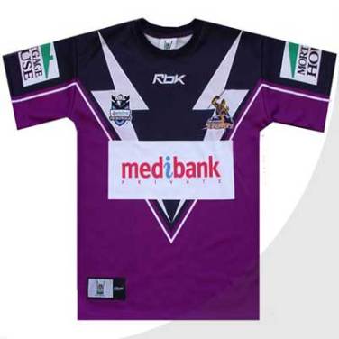
The one on the right has that classic Storm look.
I love the middle one, the more purple the better, the reverse of colors on the right should remain a heritage, and and away jersey could just be white/gold/ purple combo
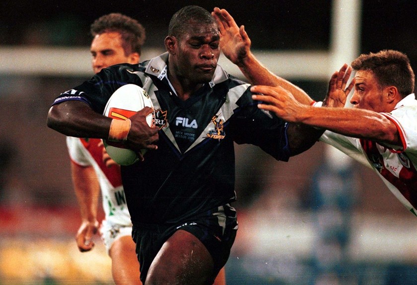
Also Suzuki on the sleeve has become so iconic that you almost want it to be there
All 5 of them?I'm genuinely afraid for Roosters fans when their jerseys are released after the effort Castore put into the Storm's home jersey in addition to what the Storm away jersey will look like