What's new
The Front Row Forums

Register a free account today to become a member of the world's largest Rugby League discussion forum! Once signed in, you'll be able to participate on this site by adding your own topics and posts, as well as connect with other members through your own private inbox!

The Game 2021 Jerseys, Sponsorship, Logos etc

Messages
8,480
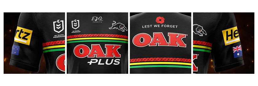
It’s personal of course but I just don’t like the panel. Too big for me. Surprisingly integrates well on the sleeve, however. Probably one of the better sleeve sponsors going around. Complementary colours help.

Agreed on the sleeve. Probably the best.

I hate the Blue Deicorp block on the Dragons sleeve. But the worst for mine would be McDonnell Jones for the Knights. I would have said Dare Iced Coffee for the Raiders but from what I can tell they've been punted - maybe coz Canberra Milk is back on the scene.
 
Messages
8,480
I have no problem with uniform, league wide numbers - but those numbers suck. Always have.

Agreed.

Do I remember right that a few seasons ago the Storm had White Numbering with Yellow "outline" on one of their kits (home or away)?

I can't find it online (only all yellow or all white).

If if wasn't the Storm, another team had alternate colours on the numbering that made the best fist of the crap design.
 

hellteam

First Grade
Messages
6,530
Agreed.

Do I remember right that a few seasons ago the Storm had White Numbering with Yellow "outline" on one of their kits (home or away)?

I can't find it online (only all yellow or all white).

If if wasn't the Storm, another team had alternate colours on the numbering that made the best fist of the crap design.

The current design allows for it, so many teams could use it but only Tigers do now, it's been frustrating me for years.

Storm had it around 2007ish, not with the new NRL template, was their own -


the-melbourne-storm-celebrate-after-winning-the-nrl-grand-final-match-picture-id77112830
 
Messages
8,480
The current design allows for it, so many teams could use it but only Tigers do now, it's been frustrating me for years.

Storm had it around 2007ish, not with the new NRL template, was their own -


the-melbourne-storm-celebrate-after-winning-the-nrl-grand-final-match-picture-id77112830

Ahh it’s the Tigers who do.... cheers mate yep I got mixed up with the Storm of that era above..
 

sempmrh

Juniors
Messages
1,197
Some teams do the numbers well. Souths have a fully solid number and it looks good but the Panthers have the number and the outline separate - you can see the stripes under the number. It looks unprofessional.
 

Timmah

LeagueUnlimited News Editor
Staff member
Messages
100,896
Thanks Timmah.

I wonder what their rationale behind this is. Personally I can't see what the benefit(s) might be.
It's standard practice in most major football codes/comps around the world. A-League and AFL in Australia have been doing it for decades too.
Agreed on the sleeve. Probably the best.

I hate the Blue Deicorp block on the Dragons sleeve. But the worst for mine would be McDonnell Jones for the Knights. I would have said Dare Iced Coffee for the Raiders but from what I can tell they've been punted - maybe coz Canberra Milk is back on the scene.
Sort of correct - Capitol Chilled Foods are the Raiders' sponsor and for the last 5-10 odd years they've had Dare as the product put forward as sponsorship, this year they switched it to Canberra Milk and moved to the front temporarily after Huawei walked away.

Similar story with Penrith - sponsor is actually Parmalat, and they used Oak, and now Oak Plus.
 
Messages
8,480
It's standard practice in most major football codes/comps around the world. A-League and AFL in Australia have been doing it for decades too.

Sort of correct - Capitol Chilled Foods are the Raiders' sponsor and for the last 5-10 odd years they've had Dare as the product put forward as sponsorship, this year they switched it to Canberra Milk and moved to the front temporarily after Huawei walked away.

Similar story with Penrith - sponsor is actually Parmalat, and they used Oak, and now Oak Plus.

Thanks again.

On numbering - While it might be practice in some codes ( NFL definitely don’t do this) I still don’t know the rationale... . If all the teams kit were made by the same manufacturer I could understand as it may save costs etc.

Cheers for the sponsorship info.
 

Hello, I'm The Doctor

First Grade
Messages
9,124
gct0657-2021-jersey-launch---web-header.jpg


This might be old, but its the first time im seeing it...

Titans have put out easily their best design ever (low bar, but anyway...)

The top-to-bottom fade from DarkBlue to LightBlue looks great (small callback to their foundation jumper). The solid DarkGold is what sets their colours apart so it is perfect as the jersey centrepiece.

Now the club just needs to keep this exact look permanently and to a series of weird one-off jumpers based on this core image

EDIT: actually the one change i would make is to separate the thin white line from the gold to make a butchers strip. Other than that, perfect!!
 

Saint Doc

Coach
Messages
11,061
gct0657-2021-jersey-launch---web-header.jpg


This might be old, but its the first time im seeing it...

Titans have put out easily their best design ever (low bar, but anyway...)

The top-to-bottom fade from DarkBlue to LightBlue looks great (small callback to their foundation jumper). The solid DarkGold is what sets their colours apart so it is perfect as the jersey centrepiece.

Now the club just needs to keep this exact look permanently and to a series of weird one-off jumpers based on this core image

EDIT: actually the one change i would make is to separate the thin white line from the gold to make a butchers strip. Other than that, perfect!!
Agreed, and the fact it is paired with white shorts is perfect too. I’m usually a fan of matching jersey + shorts (probably the only person who prefers Manly’s all maroon look) but for GC, the balance is much better with white shorts.

Disagree re: butchers stripe, the GC need a modern jersey, not a design relic from yesteryear.

I’d actually make the gold stripe slightly skinnier
 

Frailty

First Grade
Messages
9,331
Agreed on the sleeve. Probably the best.

I hate the Blue Deicorp block on the Dragons sleeve. But the worst for mine would be McDonnell Jones for the Knights. I would have said Dare Iced Coffee for the Raiders but from what I can tell they've been punted - maybe coz Canberra Milk is back on the scene.

Dare Iced Coffee is a product of Capitol Chilled Foods - who also have Canberra Milk under their banner. It's the same company, just advertising a different product.
 

sheepbender

Juniors
Messages
503
I dont understand how they expect to shift any of these if the design isn't significantly different from the Home jersey. And would be a one or the other situation, rather than buying both.
Whilst some Anzac jerseys have been pretty average, they still need to be unique to sell imo.
 

axl rose

Bench
Messages
4,940
Manly Captains Run Jersey.. (apols if posted previous).

Why oh why isn't this one of their home/away jerseys.

Absolutely mint IMO. Design & Sponsors all come together perfectly. How a jersey should be.

2021_MW_Sea_Eagles_Replica_Captains_Run_Jersey_Mens_SEJRM509CAP_Front_480x480.png
Ea61IPFVAAALhb4.jpg
Yes, would be a perfect away jersey. Manly should continue to put that glorious logo over all thier training gear like the Roosters do with thier retro. Or better yet go back to it permanently. Current logo is ok but sometimes they have to much detail and dont stand out on the jersey.
 

cooko

Juniors
Messages
494
Saw the Roosters and Storm gear in the flesh today. The jersey material is the same thickness as a training shirt so interesting to see how it handles games and more importantly how it sells.

$160 for a training shirt is a bit steep.
 

Hello, I'm The Doctor

First Grade
Messages
9,124
Disagree re: butchers stripe, the GC need a modern jersey, not a design relic from yesteryear.

Ehh, agree to disagree.

I think the Butcher Stripe is a classic look that is basically unused in the NRL (Tigers sort of use it, but thats it...)

I think it would a great base design that the jersey makers can play with for special event jumpers (like the Rabbit's Red-Green double stripe or the Panther's Green-Yellow-Red combo).

Screen Shot 2021-02-23 at 9.40.32 am.png


But, anyway, just nitpicking. The Titans are gonna look GREAT this year!!!


EDIT: Seriously, the whole Titan branding campaign is just so far beyond anything I have ever seen them put out before. It's great that they are going heavy on the gold!! That is what will make them stand out.

Screen Shot 2021-02-23 at 9.57.19 am.png
Screen Shot 2021-02-23 at 9.57.05 am.png

I REALLY hope they stick with this for a few years rather than changing AGAIN in 12 months...
 
Last edited:
Top