MoorookaSaint
Bench
- Messages
- 3,624
Orange with two thin black vee's was always your best looking jumper (60's-early 90's I'm guessing). It's got me buggered how many clubs overlook the fact fans like tradition.
Ughh
Can't we just go to a set of V jerseys without having to wear something a designer seemingly vomited after a hard night
I know people didn't like the current set (I did) but they were simple, and much better than anything worn post the original set. If we went back to the original 2000 jerseys (With the correct Balmain shade of gold), with a better designed V (Rather than a poor knock off Melbourne lightning strike V), surely people would love them?
Most clubs seem to be heading back towards traditional looking jerseys, yet we are seemingly going in the opposite direction?
You'll find the Balmain Ryde Eastwood colours are in the State Cup. The Wests Tigers colours are there for all to see, a couple of posts back.Exactly ! dont like the 2011 versions ,where are the tiger colours? slowly fading away ..... needs to be a stronger influence to much white not enough blck and gold
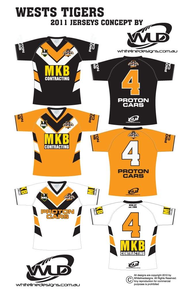
I actually like them. Traditional V with a modern twist. And a nice simple design. Seems pretty much what you guys were asking for at the top of the thread.
I actually like them. Traditional V with a modern twist. And a nice simple design. Seems pretty much what you guys were asking for at the top of the thread.
You'll find the Balmain Ryde Eastwood colours are in the State Cup. The Wests Tigers colours are there for all to see, a couple of posts back.
Maybe you're right, but its just not necessary IMO. Design should have one rule: keep it simple.
Honestly: a V design with gold, black and white should look f**king awesome. There is really no need to complicate things.
This one posted on the other forum looks brilliant, IMO. Clean, simple, effective:
