flippikat
First Grade
- Messages
- 5,244
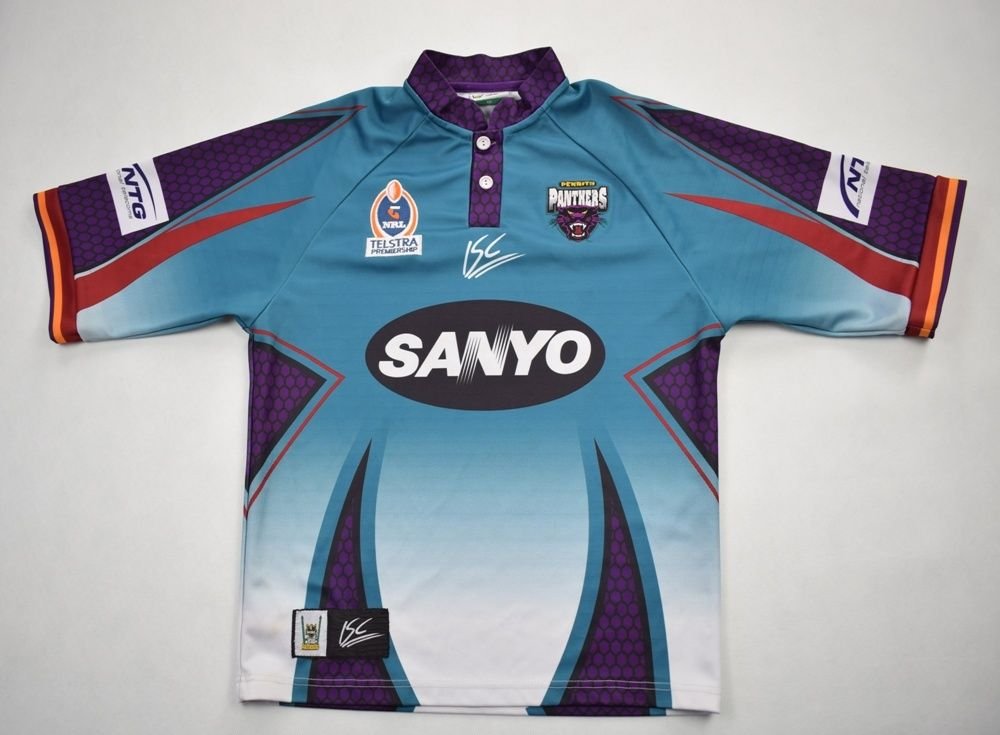
Early 2000s Penrith rang. They want their away jerseys back


 [URL='https://www.google.com/url?sa=i&url=http%3A%2F%2Fwww.oldrugbyshirts.com%2Fen%2Fteams%2Fp%2Fpenrith-panthers%2Fshirt-s2172.html&psig=AOvVaw1FvluiVhFNyS4yfGS8BPCK&ust=1584672177382000&source=images&cd=vfe&ved=0CAIQjRxqFwoTCKCViYvCpegCFQAAAAAdAAAAABAJ']

I doubt you'll even see that shark on the torso the Titans have their logo in the same position on their home jersey and you rarely notice it.I think that shark on the torso of the Cronulla is not just black, but made up of that silicon stuff too. The stuff that the Dynasty logo is made up of. Looks shiny to me.
The Cowboys Home & Away set look phenomenal!!
It really shows the importance of matching the shorts for the best possible onfield look
Similar to Dragons, they could end up using it for Nines next year if it's happeninThe interesting thing about the teal Storm captain’s run jersey is that it has full Telstra Premiership branding and sponsor logo placements. We haven’t had that for a captain’s run jersey before so theoretically it could be worn for a game - perhaps Women in League round. In the past we’ve worn the Ovarian Cancer Australia logo on our Women in League jerseys and their main colour is teal as opposed to pink.
Charlotte Hornets cap sales, last century.Wonder what the inspiration was?
Similar to Dragons, they could end up using it for Nines next year if it's happenin

not quite- as they would need the 9’s logo, not the Telstra Premiership logo.

Thanks scoop
Literally could not give a shitit’s ok to be wrong Tim tam.

And that team is not Canterbury
They wore the home shorts both weeks. Unsure if that's ya point?The Cowboys Home & Away set look phenomenal!!
It really shows the importance of matching the shorts for the best possible onfield look
Possible that they'd intended to wear their home jersey this week but under the circumstances ended up in the alternate again.Today’s warriors jersey is so meh. Grey never looks good as a prominent colour.
They wore the home shorts both weeks. Unsure if that's ya point?
