Babyface O'reilly
Coach
- Messages
- 11,711
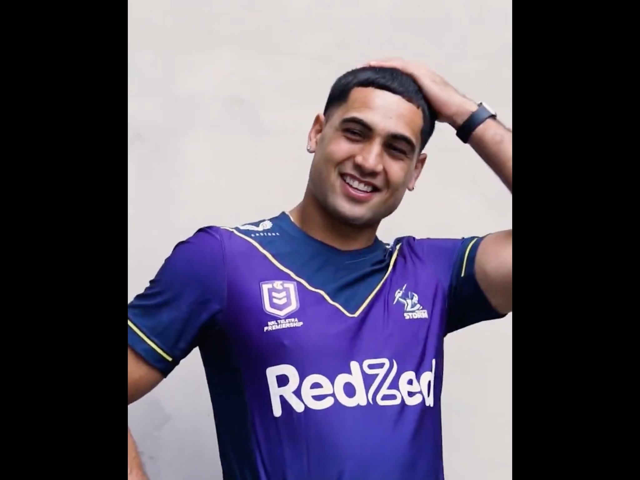
God damn I love these. If only we could go back to that retro logo, damn thats an awesome logo. That white jersey looks amazing also.
Don’t think we need the extra tricolour band at the very tip of the sleeve on the home jersey but would love to see the old logo back. Liking the hooped away kit too.