sempmrh
Juniors
- Messages
- 1,197
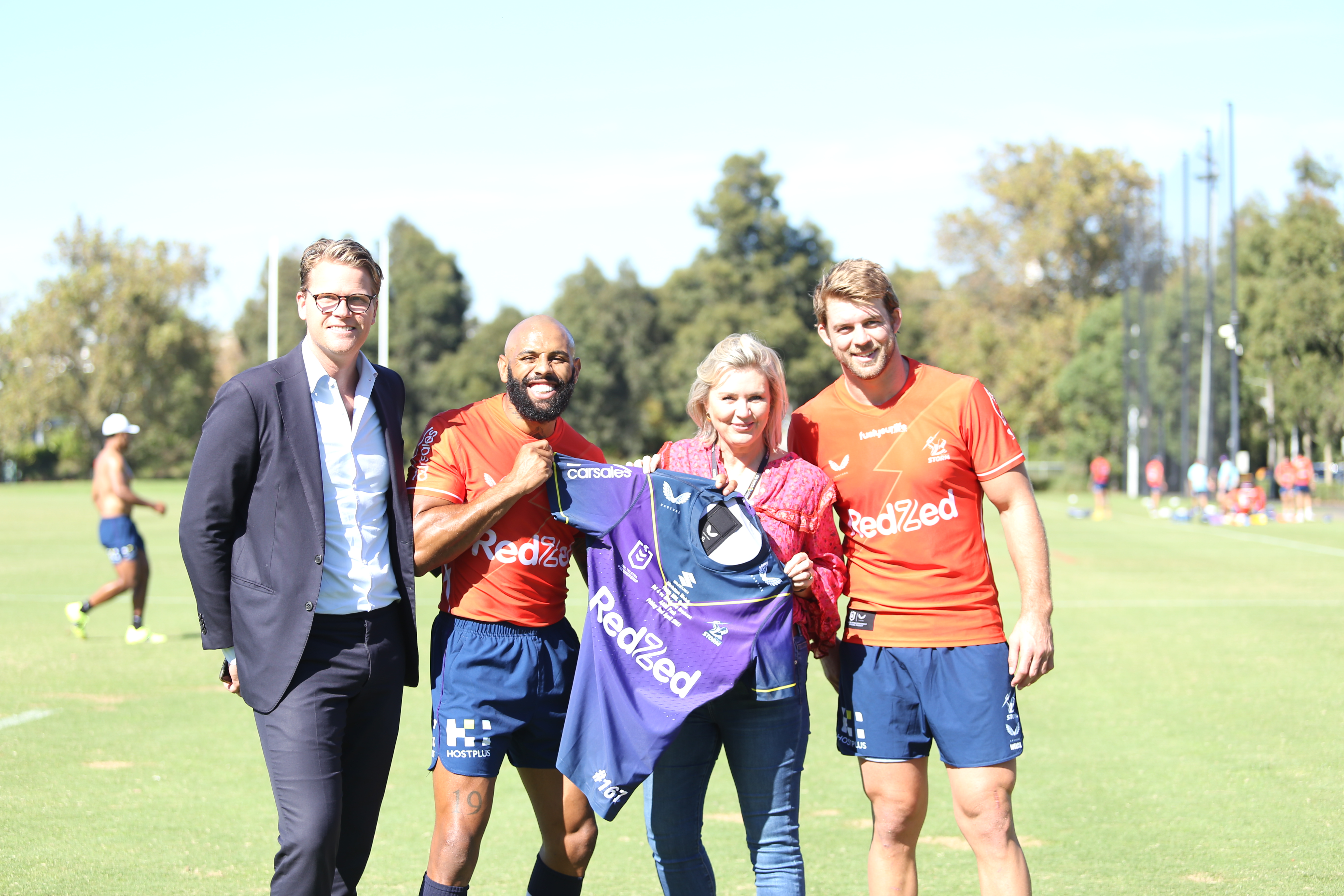
Carsales confirmed as Storm sleeve sponsor for at least the remainder of 2021.
https://www.melbournestorm.com.au/n...ly-partnership-for-storm-as-carsales-sign-on/
Their logo will be placed vertically on the sleeves which is unusual.
https://www.melbournestorm.com.au/n...ly-partnership-for-storm-as-carsales-sign-on/
Their logo will be placed vertically on the sleeves which is unusual.