- Messages
- 1,778
Hey Nuke (Adam is it?)
He wishes!!!
Hey Nuke (Adam is it?)
Close, it's Andrew, but no-one in footy circles calls me that..!Hey Nuke (Adam is it?), you're good at sigs, would you kindly make me a Titans one plz similar to your Joondalup one?
Cheers
Dream on, smart guy..!He wishes!!!

Hehe no worries fella, cheersClose, it's Andrew, but no-one in footy circles calls me that..!
Yeah mate, for sure. I can make up one of those in a pretty short space of time, so will do that for you soon.
How's something like this, GoldfieldsTitans?

I do indeed and never knew, cheers.Wide Latin
It's a pretty common font I think. You probably have it on your computer already.
I haven't as yet mate, no.Nuke any chance to look at our Red Army logo?
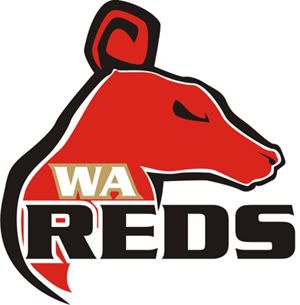
Here's one of the ideas I had on Friday.
I got the idea when I was looking for a photo certain breed of dog's head (it was for work) and came across a profile head pic.
Actually, now that I've done it and see it, it looks a bit too much like Brisbane's logo, so I don't think we should go this direction.