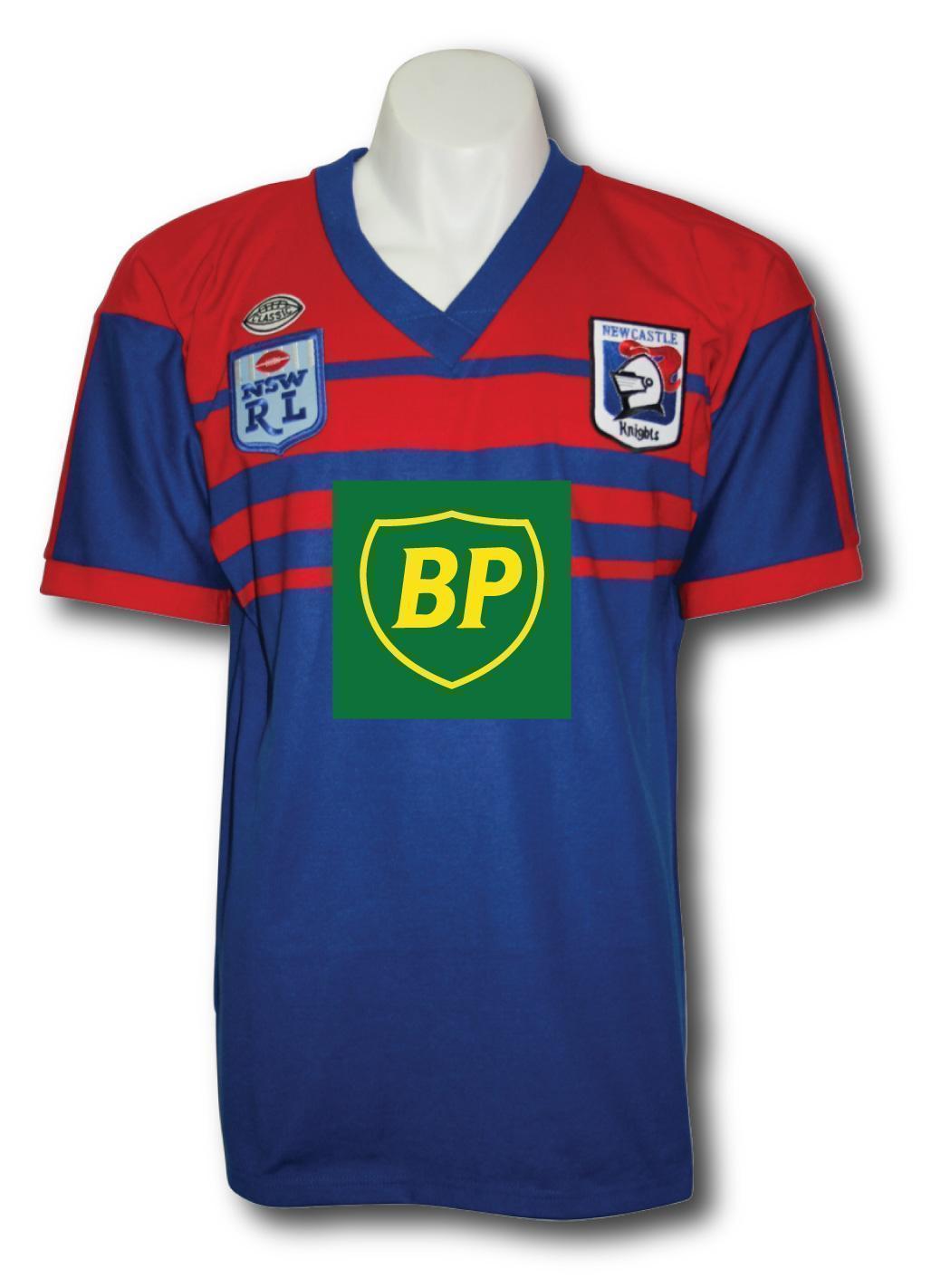
The Knights' most popular playing strip is and always has been the Henny-Penny/BP stripe with the inconsistent horizontal stripes between a blue and red panel
View attachment 16899
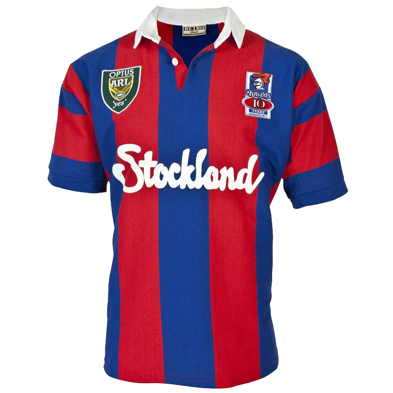
Beg to differ. I know the marketing people at the Knights shop and the most popular style jumper is the blue and red vertical stripe version by far! Its daylight second in that comparison. That 1997 strip is a special and historical jumper that should be used to galvanise current fans and attract new ones to the Knights fold. Looks like another marketing mistake is on its way!
The Knights and Panthers are similar in that regard.
A change of jersey coincided with their first premiership, and their respective fans hold that "first premiership" jersey as the iconic club shirt because of that.
Sure there's Penrith fans that like the 'Chocolate Soldiers' kits of old.. maybe because they represent the decades of hard graft building towards 1991 - but the overwhelming reaction to the allsorts jersey dwarfs that.


Dont think Penrith have ever nutted down a jumper that's really their's.
Haha and no sooner had I posted the above I thought hmm...wonder if @GAZF has any knights designs.
This is exactly what I was thinking...an iconic modernised jersey inspired by history but not bound to it. Shouldn’t have wasted my time with that post, should have just googled gazf from the start
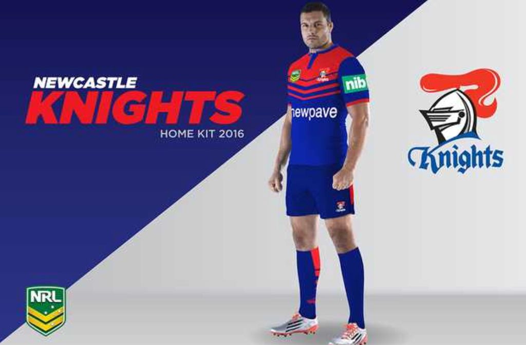
The red and white jersey the knights wore in 2008 for the centenary of league would look cool in red and blue and would in some ways represent their past going forwards.
? That's flawed logic. And in an earlier post you refer to the Knights 'ruining' the strip?
A loyal fan would follow the well known and familiar jumper through thick and thin. Don't think you get it champ.
That blue and red striped jumper is synonymous with the Knights first premiership win. You have not noted that the support for Knights waned with the change to the 'superleague style' jumper in 1999 or 2000?.
The Knights win a premiership in a year or two (2001) but were nowhere near as well supported.
An erosion of this clubs support coincided with the 'superleague ' jumper look despite being successful.
The jumper style had a fair bit to do with that drop in popularity.
Had the blue and red striped version been worn I believe alot more people would have warmed to the Knights 2nd premiership.The look of a playing strip maybe simplistic but is very real when galvanising loyal supporters and attracting new fans.
Wouldn't be surprised to see a move to vertical stripes.
Love Gazf's design though. Instant classic. Please send that to the club @GAZF
Haha and no sooner had I posted the above I thought hmm...wonder if @GAZF has any knights designs.
This is exactly what I was thinking...an iconic modernised jersey inspired by history but not bound to it. Shouldn’t have wasted my time with that post, should have just googled gazf from the start
I can't see the image but if its the one I'm thinking of (V style design on an actual player), its not mine.Wouldn't be surprised to see a move to vertical stripes.
Love Gazf's design though. Instant classic. Please send that to the club @GAZF
I can't see the image but if its the one I'm thinking of (V style design on an actual player), its not mine.
And vertical bars are the Knights best look imo, has a heraldic feel to them.

I have a completed Knights design thats midway between the current vertical stripes and the 2001 premiers design (vertical stripes with a taper). I just haven't had time to post anything of late though.Ahh right you are, sorry I google image searched your name and jersey designs, and a few of your designs came up, but didn’t notice the source website for the one I posted had changed. Your knights designs are excellent, but the ones I could see were fairly faithful replicas of the original Henny Penny strip or the vertical stripes. I do like that this one is a modern twist on a classic. Here is the source link so I can properly credit the designer
Gazf if the knights were to keep the vertical stripes, how do you think the design could be freshened for a couple of years. Would very skinny or very fat stripes work?
The other idea, whilst a “new design” for the knights, but I always thought their colours would suit a quartered design. Similar to this, but just red and blue
Lol. Champ! You dingbat! You havent had the decency to refer to your initial post ? Re: "ruined the 'Barca' strip"etc. Lol. On top of that my loyalty comment was a general comment . Not addressed to you. I don't know what you did! All I've noted is an insecere comment not consistent with your initial "ruined Barca strip" post! And that's a fact!
Are you aware of how many Novocastrians were lining the streets and at the Civic reception in 1997? Their was 100000 in Civic park for the Civic reception! You read what you will . My comments are purely based on the positive effects of a well established and popular jumper compared to the poor styles that have been used since the 1st premiership winning jumper. Thankfully that jumper is in vogue again. As quoted from Knightshop staff information.:"the marketing people had made a mistake going away from the 1997 jumper". Not my words their words. It reflected in the reduced popularity and loyalty toward the club over those years.
I have a completed Knights design thats midway between the current vertical stripes and the 2001 premiers design (vertical stripes with a taper). I just haven't had time to post anything of late though.
