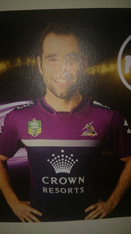
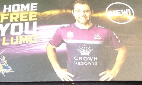
What's new
The Front Row Forums

Register a free account today to become a member of the world's largest Rugby League discussion forum! Once signed in, you'll be able to participate on this site by adding your own topics and posts, as well as connect with other members through your own private inbox!

2015 NRL Jersey & Sponsorship Discussion

some11

Referee
Messages
23,746
Just get it over with and make the entire jersey navy with crown covering the whole thing.
 

LineBall

Juniors
Messages
1,719
From the pic, I like the new storm jersey. Simple and clean. The socks and shorts could make or break it.
 

mt.wellington

Juniors
Messages
109
Warriors Zion Training jersey...

2015Training_zpsd41744a5.jpg


10153070_511314605637982_786711717441876457_n_zps892ff98e.jpg


10371472_511314642304645_447410100980978061_n_zpsd6dc3994.jpg
 
Messages
508
The Eels jerseys remain almost unchanged from 2014. Same design and sponsors except Shine Lawyers box on the bottom back changes from orange to black.
 

gzerounian

Juniors
Messages
1,094
That Storm jersey reminds me of an old Socceroos kit from a few World Cups ago.

Totally agree!

28a42mw.jpg


First of all I absolutely LOVE the jersey as it is. It is just a shame that over time the yellow has slowly vanished from the jersey. Yellow/Purple/Navy work so well together and the combination is synonymous with the Melbourne Storm.

Here a 2 tweaks.

21jykhg.jpg


Also it looks like there are subtle lightning bolts on the side panels...nice touch
 
Messages
22,179
i wish they still had yellow somewhere as well.

Purple and yellow are known sporting colours anyway. Vikings, Lakers etc


but its a quality strip none the less.
 

GAZF

First Grade
Messages
8,769
The Storm jersey, while nice, is a bit of a let down. Good to see restraint but they've simplified it to the point that it has nothing in common with past designs.

On the plus side, a template like that would better suit the V design of the Gold Coast. Lets hope they follow suit.
 

LineBall

Juniors
Messages
1,719
The Storm jersey, while nice, is a bit of a let down. Good to see restraint but they've simplified it to the point that it has nothing in common with past designs.

On the plus side, a template like that would better suit the V design of the Gold Coast. Lets hope they follow suit.

Yeah, the gold coast jersey currently is horrible. Gazf, do you think they would be better off having the sand/yellow colour as main colour on their jersey? A lot of teams have dark blue, or dark colours in their colour scheme.
 

RoosTah

Juniors
Messages
2,257
Gotta say, the change in the Kangaroos logo to this generic NRL logo carbon copy has annoyed me since day one. The logo they'd been using just before that was actually very well designed and I thought it had a really nice symmetry to it. This thing just looks like something BHP would have designed.
 

Canard

Immortal
Messages
36,921
Australia are wearing the maroon/blue Kangaroos jersey in Melbourne

For real?

That seems an odd choice? Im all for tradition and would think the wearing of this in Sydney or Brisbane is a good idea, but to wear the colours of NSW and QLD whilst playing in Melbourne is a MASSIVE marketing and identity fail for me.
 

RoosTah

Juniors
Messages
2,257
For real?

That seems an odd choice? Im all for tradition and would think the wearing of this in Sydney or Brisbane is a good idea, but to wear the colours of NSW and QLD whilst playing in Melbourne is a MASSIVE marketing and identity fail for me.

Yeah, just poor planning. This game should have been last week if that's what they were going to do.
 
Top