What's new
The Front Row Forums

Register a free account today to become a member of the world's largest Rugby League discussion forum! Once signed in, you'll be able to participate on this site by adding your own topics and posts, as well as connect with other members through your own private inbox!

2015 NRL Jersey & Sponsorship Discussion

Canard

Immortal
Messages
36,924
Not a big fan of those Warriors jersey's the chest area looks weird and the ferns at that size, position and scale look somewhat effeminate.

It makes the players look like they have man boobs.
 

Prometheus

Juniors
Messages
1,103
I like those two Warriors jerseys.

I wonder when they'll release the twenty other Warriors jersey designs for next year.
 
Messages
4,604
B0qoT0oIEAEAi1-_zps9ead86f1.jpg

Vodafone logo needs to be bigger.
 

AlwaysGreen

Post Whore
Messages
51,805
Fine jersey warriors. It's impossible to please everyone, but apart from the ferns being on at the wrong angle by 0.00002 mm :roll: I like them.
 

some11

Referee
Messages
23,746
People complaining it looks like a bra, there's no way it bares more resemblance than the 11-12 Knights jerseys.
 

kdalymc

Bench
Messages
4,384
This is the angle they should be on... Warriors had one of the only almost perfect kits last year


Gave it ago cos I'm a f**ken wizard with ms paint
 
Last edited:

CC_Roosters

First Grade
Messages
5,221
The skycity jersey the warriors wore for a few matches is my alltime favourite of any of their jerseys, would kill to get one if anyone knows a good online or sydney shop that might have it?

Will reserve judgement on the new warriors jersey until i see it on the field

btw how good is during internationals seeing a different variety of jerseys than normally on our screens in winter. The white of england is a great contrast to the rest and the kangaroos jumper is just iconic. I hope england keep the current design for years to come.
 

Diesel

Referee
Messages
26,106
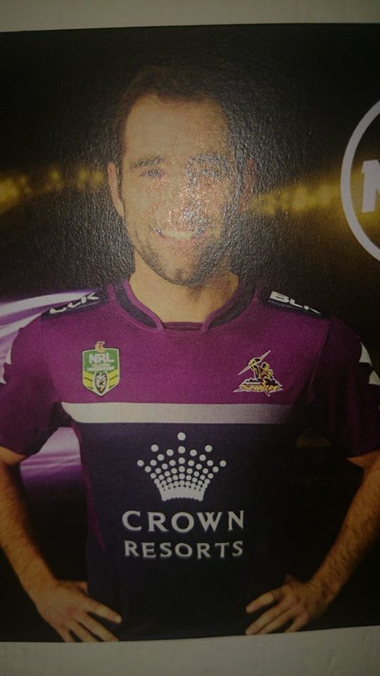
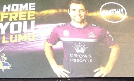
At least the Crown sponsorship blends in for once.

Reminds me a little of the Manly Pepsi jerseys of the 90's
 

Saint Doc

Coach
Messages
11,103
The Storm jerseys are a little plain BUT I think will look fantastic on the field.

For years we've been saying (for storm)
- no tacky lightning bolts: tick
- more navy: tick
- no sponsor boxes: tick
- good sponsor integration: tick
- simple design: tick

I'm in favour
 

thorson1987

Coach
Messages
16,907
The skycity jersey the warriors wore for a few matches is my alltime favourite of any of their jerseys, would kill to get one if anyone knows a good online or sydney shop that might have it?

Will reserve judgement on the new warriors jersey until i see it on the field

btw how good is during internationals seeing a different variety of jerseys than normally on our screens in winter. The white of england is a great contrast to the rest and the kangaroos jumper is just iconic. I hope england keep the current design for years to come.

England are wearing the red and white hoops this week apparently.
 

rabbitohs95

Bench
Messages
4,711
Really enjoyed the storm jersey from 2007-2009 where i believe there was dark black on the shoulders, silver lightning bolts on the front and dark purple around the bottom, something along those lines.

Ironically it's from the period where they cheated but i thought it was a dominant design (with dominant colours) that worked really well. Should go back to that or something similar.
 
Top