What's new
The Front Row Forums

Register a free account today to become a member of the world's largest Rugby League discussion forum! Once signed in, you'll be able to participate on this site by adding your own topics and posts, as well as connect with other members through your own private inbox!

2015 NRL Jersey & Sponsorship Discussion

Timmah

LeagueUnlimited News Editor
Staff member
Messages
101,142
Plus the Kiwi special jersey v Samoa:

64344_10152327260106881_8757385759510951438_n.jpg
 

Mr. Snrub

Juniors
Messages
973
Raiders Away jersey. I quite like it. I never really liked the white away jersey.
 

Attachments

  • Raiders Away.jpg
    Raiders Away.jpg
    67.5 KB · Views: 20

AlwaysGreen

Post Whore
Messages
51,805
Yeah, sort of like it.
Better than the white I suppose.

Hopefully it's not an away jersey but only an alternate.
 

Saint Doc

Coach
Messages
11,103
Kangaroos is just plain crazy. Words can't describe what a bad decision that is.

England looks great.

Raiders: i don't know. Looks gross but I don't know what else they can really do. White is boring. Blue is too common.
 

Saint Doc

Coach
Messages
11,103
Can one of you with photoshop skills mock up the centenary jersey green replacing blue and gold replacing maroon. Would look amazing IMO and been a nice compromise rather than promoting the "NSW/QLD" sport in Melbourne
 

GAZF

First Grade
Messages
8,769
Raiders Away jersey. I quite like it. I never really liked the white away jersey.

Yuck. Of all of our colours, yellow should have the least prominence. Doesn't contrast with the lime green of the home so why have it? Is it meant to be an extension of the CBR brand?

It's also a shoehorning of the Manly away style which is just lazy. I'm just glad the main design is very good and hope to see very little of this one.
 

GAZF

First Grade
Messages
8,769
Yeah, the gold coast jersey currently is horrible. Gazf, do you think they would be better off having the sand/yellow colour as main colour on their jersey? A lot of teams have dark blue, or dark colours in their colour scheme.

I don't think so. The Titans should focus on the blue they currently have which is a unique shade. I don't mind the current jersey except all the unnecessary piping and the god awful navy blob on the upper back. They could probably afford to darken up the yellow a bit, they need to switch the shorts and sock colours around (white shorts, blue socks). Also piss off the dumb sock garter look - vertical stripes/piping/blobs look stupid on socks.
 

flippikat

First Grade
Messages
5,673
I like the Raiders away jersey. It sticks to their colours, with an emphasis on the two lightest colours - yellow and white.

Sure, it loses points by using the same template as Manly's away jersey for 2015 (no two teams should use the same design), but I think the design works for the Raiders far better than Manly. Now would have been a good time for Manly to use good old double-stripes for their away.
 

Diesel

Referee
Messages
26,106
A few teams seem to be moving away from the genetic white jersey which is good IMO however I don't think we need away jerseys, just clash jerseys
 

flippikat

First Grade
Messages
5,673
A few teams seem to be moving away from the genetic white jersey which is good IMO however I don't think we need away jerseys, just clash jerseys

Precisely. For clubs with more than two team colours there is plenty of scope to come up with a more distinctive away jersey than the usual white jersey.

I've also been impressed by the clean simpler designs we're seeing now (eg the Manly home jersey, Storm home jersey, Parra's revival of an old favourite, and the Bulldogs getting the right V back) - especially the home Tigers jersey now they finally ditched that rubbish on the sides. It's a far cry from how bad jerseys were about 10 years ago.

Sure there are some clubs that are still trying to be too fancy with their home jersey (*cough*Warriors*cough*) and cannot settle on their colours - but I think we're heading on the right track
 
Last edited:

mt.wellington

Juniors
Messages
109
Sure there are some clubs that are still trying to be too fancy with their home jersey (*cough*Warriors*cough*) and cannot settle on their colours - but I think we're heading on the right track

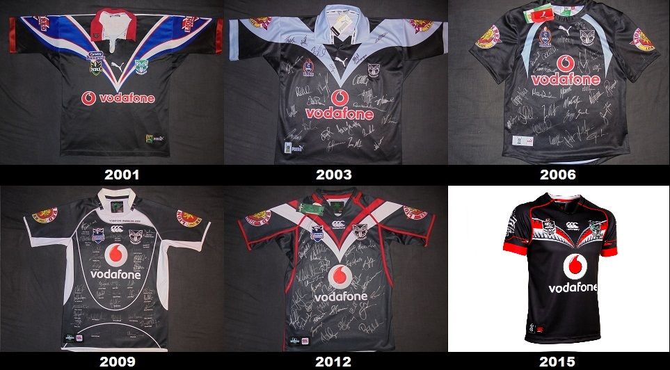
We had the exact same colours since 2012 and red has been a feature since 2001. The jersey has evolved.

What really kills the Warriors is those training jerseys they release and the out there Women in League ones.

Where most clubs turn their main colour pink or swap out red for pink we see fit to introduce a completely new design that has nothing whatsoever to do with the club bar the Warriors logo. This year it was the smoky women, last year was the hibicus flower and leafy frond and the year before that it was the pink paintball jersey.

And what about the training jersey! The flame Inferno or iced up Subzero or the green paintball, Green High Voltage that looked like we were sponsored by Xbox.

Then theres the one off Wellington jersey, Eden Park jersey, Black Fern jersey, etc.

You also have the U20 team that except for this year didnt even look like they were part of the club.

FML...

2001-2015home_zpsffd263df.jpg
 

Latest posts

Top