yakstorm
First Grade
- Messages
- 5,411
Do the Titans actually train?
You live and you learn
New coach, must be trying something new to see if it helps.
Do the Titans actually train?
You live and you learn


Always been since around 2017 I believe. Not sure if it has to do with NRL licensing issues or other factors, but every year one of the main comments is to change the current logo back to the old ESRLFC logo. What I would give to have a logo that looks like this roosters logo (I think this was one done by GAZF a while back) with a modern twist like the spurs logo, only with our font style and location.Has that rooster always been on training jerseys or have they updated an old logo?


Gone?
Not sure the 2020 one was ever there?
they've sent out emails like the Instagram ads you click on the link and no away jersey. However the away jersey looks better than it did on insta View attachment 34010
Fair enough. However, in my personal opinion, I would much prefer all jerseys for teams still be the correct colours.I guess I’m in the minority here but I kinda wish more teams had their away strips similar to the EPL with their 2nd or 3rd kits. I really dug when the broncos had blue and white. It was truly an alternative.
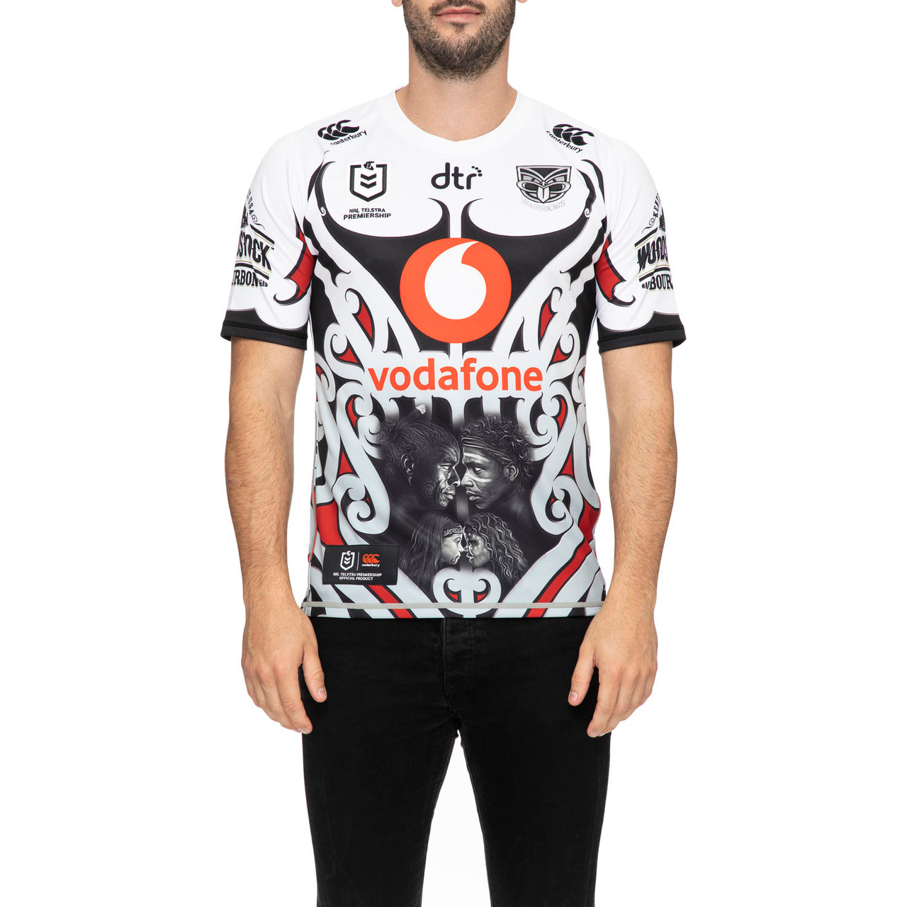
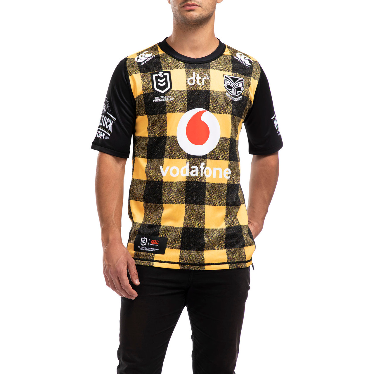
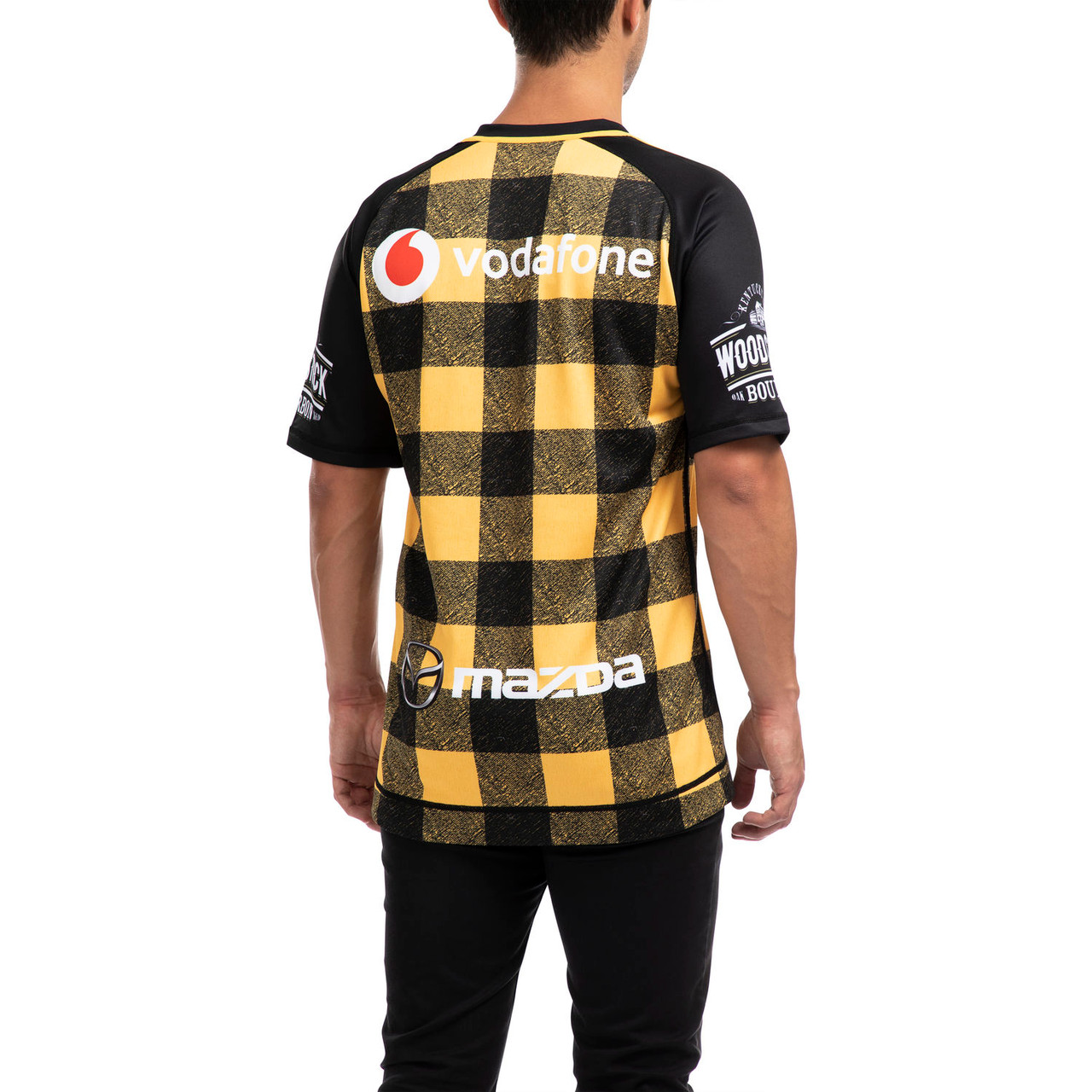
I like how it looks like the warriors are going with two totally different color schemes for home and away. That’s cool.
Roosters 2020 training shirts as per the Legends and League website: https://leagueandlegends.com.au/nrl-teams/nrl-telstra-premiership/sydney-roosters.html
Would be a good french jersey tooI would be happy if they were our actual jerseys
While I wouldn’t want completely different colours (I’d be fine with the Warriors in black as an exception), I prefer alternate or away jerseys that compliment the home jersey instead of just being a white version or inverted colours. For some teams inverted colours work because there’s historical precedent (Manly or the Eels for example). But if clubs are interested in selling jerseys (an understatement, I know), I feel like two different designs is better as opposed to a home jersey and a ‘lesser’ version.I guess I’m in the minority here but I kinda wish more teams had their away strips similar to the EPL with their 2nd or 3rd kits. I really dug when the broncos had blue and white. It was truly an alternative.
I like how it looks like the warriors are going with two totally different color schemes for home and away. That’s cool.
its a flanny! for bush round. derrrrrrBush shirt WTF?