What's new
The Front Row Forums

Register a free account today to become a member of the world's largest Rugby League discussion forum! Once signed in, you'll be able to participate on this site by adding your own topics and posts, as well as connect with other members through your own private inbox!

2015 NRL Jersey & Sponsorship Discussion

Messages
14
Wow some teams have 6 different jersey's for the year. Surely we can go for more, like the commemorative jersey to commemorate the original commemorative jersey.
 

insert.pause

First Grade
Messages
6,446
image.jpg


I think the stripes could finally be coming back, maybe something similar to the nines jersey but maroon with yellow strips.
 

ShaneO85

Juniors
Messages
513
Here it is. I gave it a quick shot.

ra2k5d.jpg

I think i just jizzed a little.

If the new Donkey's Jersey can be somewhere around the storm home or broncos 2014 u20s jersey that would be awesome.

I think i read in that article about Canberra's Jerseys that the Home and Away now only have to last for 2 years? Also, 6 Jerseys would seem a bit much.

How would they break that down. nines (9s jersey), 13 Home matches (home x 10 + Camo x 1 + Heritage x1 + ?Movie? x1), 13 away matches (away/alternate x 10 + home x 3)? I guess it isn't too bad a mix so long as they use their home/main jersey for some road trips.

Also, I am pretty sure i read on something from the Bronco's that both the Home and Away were being replaced this year. Which would mean dispensation to get rid of the blend jersey early. I am in the vast minority in not hating the 2014 Brisbane jerseys. If only they had've had better integration of the sponsor instead of the big, unnecessary, white box on the away it would have looked so much better.
 

hellteam

First Grade
Messages
6,532
Here it is. I gave it a quick shot.

ra2k5d.jpg

This is excellent, well done. If the maroon could extend to under the sponsor with the white strip and gold below it would be perfect IMO. No doubt we will end up with some weird mishmash of stripes and misplaced panels
 

GAZF

First Grade
Messages
8,744
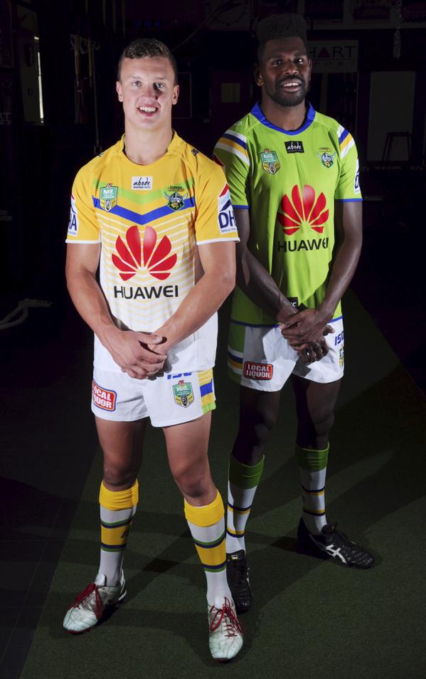
New Raiders jerseys in the flesh.

B1KmNR_CYAEmx4B.jpg

After seeing them in the flesh, the yellow is not quite as bad as I thought but it just isn't the Raiders. I like the style of V on the away but nothing else works with it. There's even less green on that uniform than the current design. We now have two light jerseys (see how the lime green V blends in with the gold background?) with white shorts and socks, it doesn't make sense.

The whole club identity is fairly disjointed, right down to the training gear. The club marketing/media material had been pushing lime and blue and I had hoped that they'd continue to push that. But now the club has kind of backflipped and changed the jersey to a lighter green while changing everything else to a darker green. The striping was intended to represent the ACT and now oddly includes green and is inconsistent between applications.

Don't have a problem with the 9's design as its perfect for the application but the heritage just looks odd. I'll get the new home jersey because its pretty good but I wouldn't waste money on the rest.
 

rabbitohs

Juniors
Messages
457
Australia are wearing the maroon/blue Kangaroos jersey in Melbourne

So for one of the few games in Victoria they decide to wear the jumper that has the state colours of NSW an QLD and is not representative of the whole country.

Great idea...:(
 

Timmah

LeagueUnlimited News Editor
Staff member
Messages
100,958
Interesting. The storm have '#purplepride' and the raiders 'thegreenmachine' in their inside collars. Any other jerseys got this type of thing?

Bulldogs have had "TOGETHER. FOREVER." on the inside of the collar for a couple of seasons I believe.
 

100%green

Juniors
Messages
514
The whole club identity is fairly disjointed, right down to the training gear. The club marketing/media material had been pushing lime and blue and I had hoped that they'd continue to push that. But now the club has kind of backflipped and changed the jersey to a lighter green while changing everything else to a darker green. The striping was intended to represent the ACT and now oddly includes green and is inconsistent between applications.

Agree with you totally on this. Though i'd prefer the darker green (Emerald I think its called). But yes, they have no idea how to a range as a whole.
 

Craegus

Juniors
Messages
101
Interesting. The storm have '#purplepride' and the raiders 'thegreenmachine' in their inside collars. Any other jerseys got this type of thing?

From the previews the Tigers will have 16 YEARS PROUD.

It is called a "hanger effect' (text or design that features on the inside of the collar) and was introduced in the NHL a couple of years ago. Now it seems that ISC has taken up the mantle here (BLK's is a variation on it).
 
Top