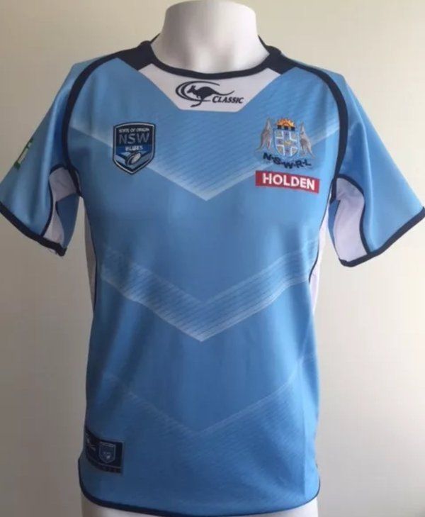
Once again Classic have stolen a design concept from either Canterbury or ISC and found a way to ruin it.
The subtle V design on the Queensland jersey worked. It very nicely introduced a V into an Origin jersey but kept that look one associates with a Queensland design.
That NSW design just looks cheap and nasty. I'm not sure what I hate more, the crappy V effect, the ugly collar and classic brand integration, the white side panels or just the fact everything bad is highlighted by a dark blue outline.


