I posted this in the Jubilee Ave discussion on our ANZAC jersey but thought I'd post it here too FWIW
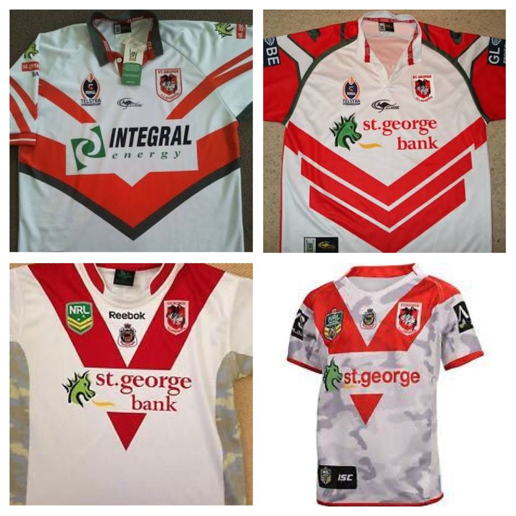
Top left: the original. To be fair this was our first ever subliminated new design jersey. We still had cotton home jerseys and polyester blood+bandages away. So I can somewhat understand the appeal of trying something different. It's terrible but I have a soft spot for it.
Top right: the next jersey. Terrible. The only thing that saves it is the Mat Head heroics on the day
Bottom left: the camo side panels. The Roosters had been doing camo jerseys for awhile. Until this we had at least stayed away it. At least we didn't go full camo.
Bottom right: We went full camo.
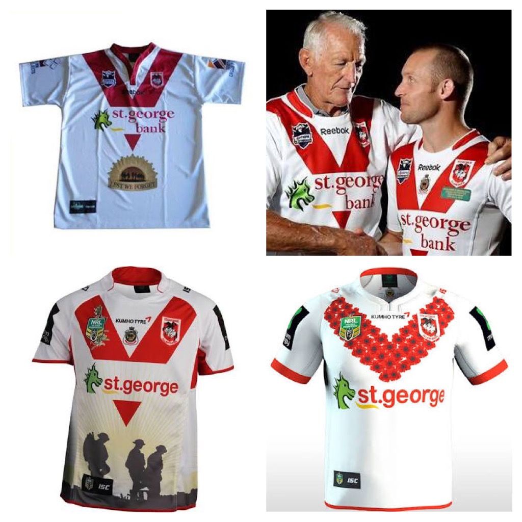
Top left: the infamous golden pubes!
Top right: Perfection. Home jersey with RSL badge and commemorative text under the logo. Nailed it
Bottom left. Oh boy. Nothing says respect like silhouettes of soldiers on your abdomen. Who thinks of this?
Bottom right: fantastic. Subtle, iconic. No need to change. (Spoiler alert. We bedazzled this design to pimp our profits / show respect)


