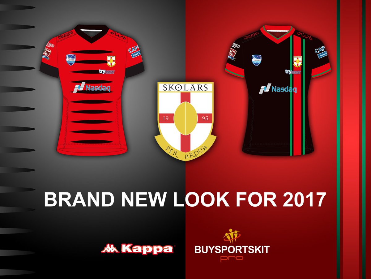
The problem isn't necessarily their design, its the make and fit. They can be as good a design as you'll get and they're unbuyable if they're poorly fitted.Rubbish. Kappa have come out with some outstanding kits this year.
Keighley

Skolars

Workington. Home (blue) is snazzy
![workington-town-adult-home-replica-jersey-2017-111260-p[ekm]300x376[ekm].jpg](http://www.buysportskit.com/ekmps/shops/buysportskit/images/workington-town-adult-home-replica-jersey-2017-111260-p[ekm]300x376[ekm].jpg)
![workington-town-adult-away-replica-jersey-2017-pre-order--111281-p[ekm]300x376[ekm].jpg](http://www.buysportskit.com/ekmps/shops/buysportskit/images/workington-town-adult-away-replica-jersey-2017-pre-order--111281-p[ekm]300x376[ekm].jpg)
EhClassic Sportswear's Titans 9's
View attachment 11124

At least these are similar to the original Fulham RLFC designs.Grey... another colour for london

The Broncos are trying to pimp our culture to sell a few extra jerseys at the ground.
Hey! Who needs facts? This is the Broncos Fault Forum after all.Ah, yes. Cultural appropriation. Everybody's favorite gripe.
I don't recall any indigenous Australians complaining about the indigenous art being used on Close The Gap jerseys worn by white fellas.
Broncos have a pretty heavy Kiwi contingent as well don't they?
Grow up.


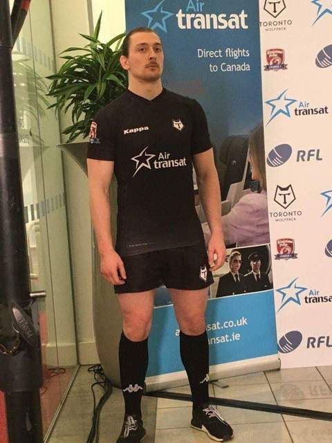
Looks nice enough All Blacks look.... but maybe a gold V or some whitr armband stripes... it needs something..And finally, the Toronto Wolfpack

Not so much a design as the lack of one really.
Supposedly a very significant sponsorship deal. Pays for all flights for all teams so would be worth a lot, but in kind.
And finally, the Toronto Wolfpack

Not so much a design as the lack of one really.
Supposedly a very significant sponsorship deal. Pays for all flights for all teams so would be worth a lot, but in kind.
Small bits of red trim would have been good. The design isn't ugly but its not really much of a design either, viewing it from far away anyway.I think there's a bit of a conscious effort not to mention "rugby league" in a dominant way, so Canadians with a vague awareness of union aren't necessarily scared off to start with. Yes it could have done with a dash of white and even red but it's a start.
