parrawentyfan
Juniors
- Messages
- 774
VB is gone, no replacement yet from memory.
Yay. Haven't bought a NSW jersey since VB has been on there. The green is horrid plus hate the idea of a huge logo from another state on our jersey.
VB is gone, no replacement yet from memory.
I think it's tooheys?VB is gone, no replacement yet from memory.
I actually like... looks goodView attachment 16519
Salford's Steeden Jersey isn't too bad...
Nope, front of jersey yet to be announced. Tooheys are a minor sponsor (shorts I think)
Wigan away jerseys outdo themselves in horridness every year.


Yep, thats a butcher stripe.It’s a massive improvement from the centurion armor, gradient red or the checkerd shirt.
Still, looks too plain to me. The aditional stripe does wonders IMO:

I believe I’ve read here that it’s called “butcher’s stripes”?
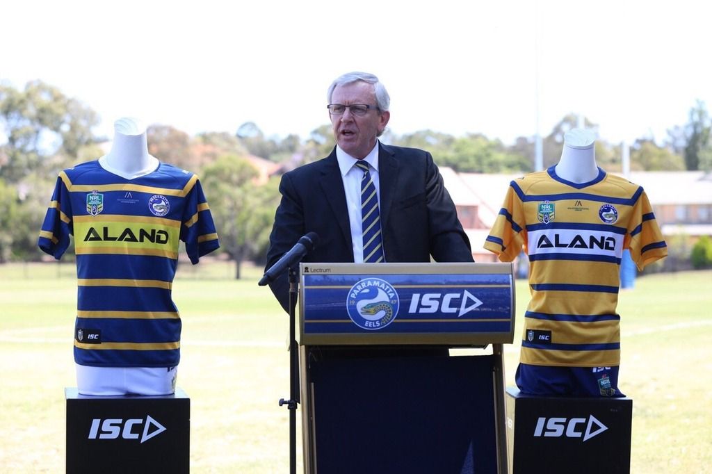
"We understand how important the playing jersey is. The visual reputation of our club."
"And that's why we didn't even match up the yellow on the home jersey. Well that and the fact that people would have no possible idea who ALAND was without their specific shade of yellow being used, or their official shade of white on the away jersey."
White logo on blue and black logo on gold gives decent contrast without detracting too much from the club colours. The away kind of looks like that yellow Sharks jersey from a few years back.Yellow letters on the Blue Jersey and vice versa for the yellow jersey would look so much better than what they've produced. It reeks of laziness and looks unprofessional.
Edit: Just realised the hoops are interrupted by the side panels. Amateur hour.
Every single year there is a serious lack of common sense. This would have been perfect.
View attachment 16526

