SLRBRONCOS
Referee
- Messages
- 26,327
I wonder when / if that will become the main logo across websites / jerseys etcDragons already use a simplified logo, the dragon itself without the St George crest.
I wonder when / if that will become the main logo across websites / jerseys etcDragons already use a simplified logo, the dragon itself without the St George crest.
Depends what you're chasing in that regard.I wonder when / if that will become the main logo across websites / jerseys etc
If the club logo is changed, hopefully they keep the shield logo on the jerseys at very least for heritage reasons. Speaking of, with the Manly heritage, I miss the days when the appropriate period logo was on the heritage jerseys of the 2000s, even Manly did it with the Maroon with a White Vee in 2008Depends what you're chasing in that regard.
On the website, the main logo is used in the top-left corner, however the simplified logo is used on the draw, ticketing, backgrounds, etc.
For on-field jerseys, again it's the main logo. But the rest of the players attire (excluding polos) is the simplified logo - warm up gear, training, hats, etc. Fan merchandise seems split almost 50/50 between both logos, though on balance tends to lean more towards the main logo.
So there is a move towards the simplified logo marketing wise, but for on-field I don't see that happening.

99.9% sure this is from a pisstake account, if you read the authors comments from that post.
Looks exactly like the broncos
It’s not bad though

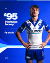
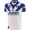


Looks cheap & atrociousCanterbury Heritage Jersey

Bulldogs Unveil Iconic 1995 Heritage Jersey for 30-Year Anniversary Celebration
Members can now purchase their 1995 Heritage Jersey!www.bulldogs.com.au
View attachment 103155
View attachment 103151
View attachment 103152
View attachment 103153
View attachment 103154
It's the white V, it was a lot narrower on the original kit (especially when you compare the original with the player shot) and thats what stands out the most.The V doesn’t look quite right but the Hyundai-style Laundy logo looks great.
Having the anniversary logo which is pretty close to the 1995 logo also is greatThe V doesn’t look quite right but the Hyundai-style Laundy logo looks great.
I've been checking out possible website addresses.. perthbears.com.au doesn't connect to anything but nrlbears.com has a mysterious coming soon screen.
I’d say that it. WESTERN AUSTRALIAN SPORTS CENTRE TRUST is listed as the ownerI've been checking out possible website addresses.. perthbears.com.au doesn't connect to anything but nrlbears.com has a mysterious coming soon screen.
