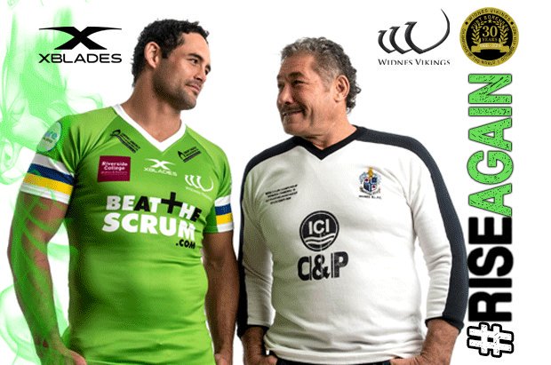
There isn't exactly a great deal they can do about the sponsors covering part of the bands is there... And besides that even in the 90s many of the jerseys had the bands partially obstructed by sponsors logos on the sleeves, you of all people should know that sometimes it's just par for the course unfortunately.
In my book (and frankly any reasonable persons book) even with the bands partially covered they "are at least as good", for one thing they don't look like Nascar shirts with a ton of logos covering the front of the jersey, which is something that you lot would normally whinge about...
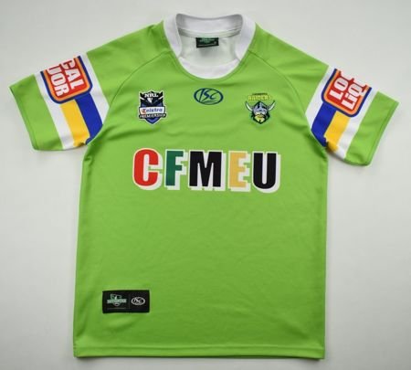
My guess is that Gzerounian was confusing a bunch of Raiders jerseys from recent times as being a "remake of their 80's/90's jersey" when they weren't actually meant to be remakes of the old jerseys and more modern interpretations of the old design (with the exception of next years jersey which is supposedly an imitation of the 89 jersey, but is a pretty poor one), and that he (like many others including plenty of Raiders fans) seems to have forgotten that the shade of green was constantly changing even in the Raiders earliest days and has latched onto a particular shade of green as 'the Raiders shade of green' when frankly any number of the shades of green has just as much of a claim to that as any other. The shade of green changing was normally because each manufacturers "lime green" colour was a different shade or because the green faded which was a problem early on (though nobody was really concerned about it at the time), we'd often start the season one shade of green and by the end of it be significantly lighter because of it.
This photo is a great visual representation of how much the green changed, even jerseys that are from the same year and as such are supposedly the same jersey and should have the same shade of green have significantly different shades of green.