Scott Gourley's Lovechild
Referee
- Messages
- 23,953
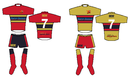
Those shorts are a good design, I would put some grey piping next to the current red piping (or between the red piping and black stripe), then the rest could be black.
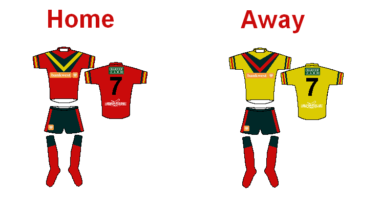
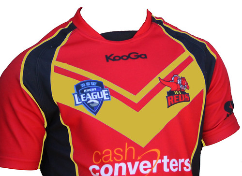
I agree, however it was too hard to use their logo in paint :sarcasm: so I used bankwest. The Indian Pacific logo didnt come out too well eitherI hope Cash Converters remain a sponsor for a long time to come. They've shown such amazing loyalty.
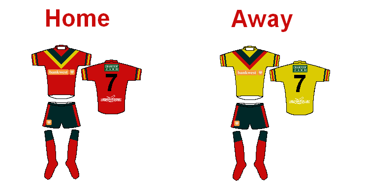
I have had a play around with jerseys in MSpaint. Let me know your thoughts & if someone has the skills to replicate these jerseys in Photoshop that would be great!
Example sponsors used:
Main (Front): Bankwest
Top back: Bartercard
Bottom back: Indian Pacific
Shorts: Bankwest
I will attempt later when I can access photoshop at work with the current sponsors and also try to re-work the jerseys.
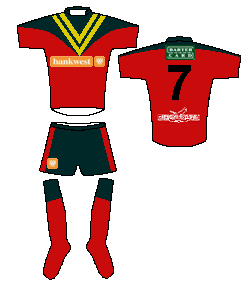
Another:
IMO the Reds should choose a traditional RL jersey design mainly for the fact Perth is a expansion city. I could not imagine Perth embracing something like the tigers jerseyI like this, alot! Have to say I prefer the tradiotional RL V in designs. With red, black and yellow/gold need to be mindful not to look too much like PNG!
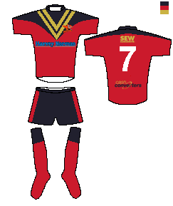
Keep them coming, I will collate and add to the survey resutls to present to the WA Reds/WARL
 . Vee's and/or stripes are the way to go!
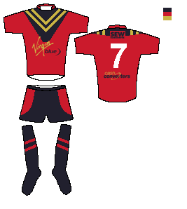
What's wrong with the 1995 design?
That was choice.
Can't they just modernise that a touch?
Yes, have to agree with you on this one as well.this is still by far the best Reds jersey mock up I have seen. IMO this needs to be the jersey chosen by the club. I emailed the reds this as well but I never got any reply, oh well.