- Messages
- 10,441
QLD Origin and All Stars jerseys
Last edited:
 www.nrl.com
Since I first saw the logo earlier this morning, I've been waiting for a certain somebody to complain about it - which I am sure they will...Logo looks mint. Youd have to be a prick to complain about it
theres a W and an A on the cheeks. apparently the W on left is the state outline slightly turned theres a video of it on insta.I like that it's more "traditional" than the modern logos, and still retains a fair bit of detail.
Recently clubs seem to be going really minimalist.
The only thing I would suggest in the future is some sort of nod to WA or Perth to be "hidden" in the logo, like the Thwannies do.

man @Red&BlackBear literally showed us on this forums this logo over a year ago. crazy he had it that long ago.Since I first saw the logo earlier this morning, I've been waiting for a certain somebody to complain about it - which I am sure they will...
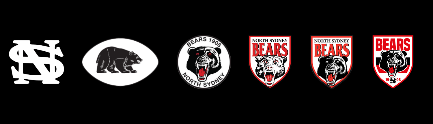
The designer has angled the top of the eyelids on a downward cant, giving the bear hunter eyes rather than stunned with a taser eyes. Smart move...I really like it. Bear looks aggressive as well, not shocked, like so many of the previous Bears logos.
Should’ve had a Black Swan dangling from its mouth.theres a W and an A on the cheeks. apparently the W on left is the state outline slightly turned theres a video of it on insta.
View attachment 108933
man @Red&BlackBear literally showed us on this forums this logo over a year ago. crazy he had it that long ago.