What's new
The Front Row Forums

Register a free account today to become a member of the world's largest Rugby League discussion forum! Once signed in, you'll be able to participate on this site by adding your own topics and posts, as well as connect with other members through your own private inbox!

2013 Jersey, Logo, Sponsorship Discussion

Status
Not open for further replies.

ShaneO85

Juniors
Messages
513
Do you think the airbrush effect that has become so prevalent once the old cotton jerseys died out has contributed to so many bad designs? A lot of designers aren't thinking 'graphically' like they once did?

a little too much freedom in design, i'd tend to think it has had some impact. things that may have previously been kept for screen printed supporters gear, etc have now been able to be implemented in on field gear. i can't recall and good designs that involved blending/airbrushing elements.
 

Saint Doc

Coach
Messages
11,100
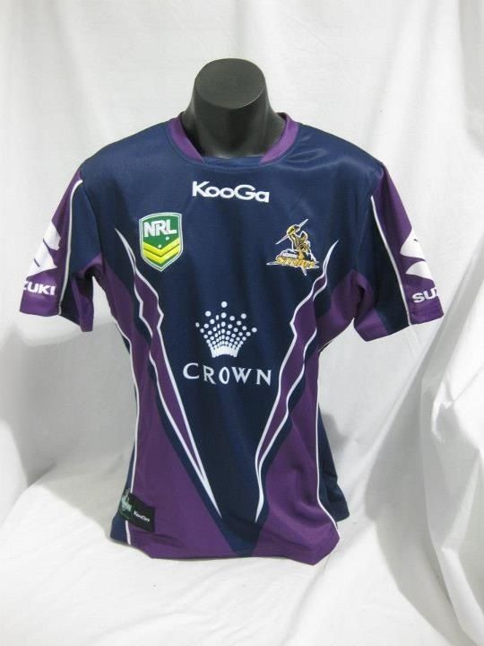
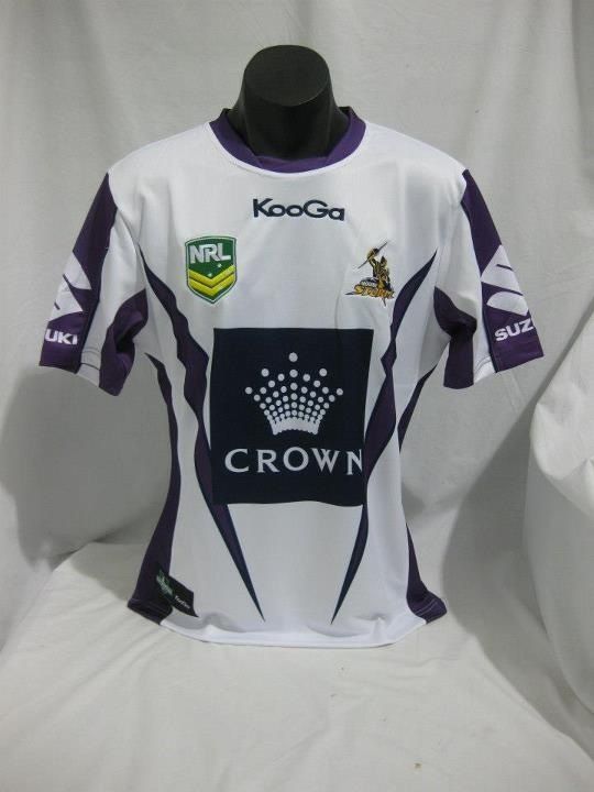
Storm jersey in the flesh from jerseys.com.au Facebook

216AA313-F8E7-45C8-9FF4-8E3E0AA64316-16113-000010DE96DC63B9.jpg
 

_Johnsy

Referee
Messages
28,426
That's a shocker, it makes the Broncos jersey look like a masterpiece

Exactly & that's saying something. Do these morons Nth of the Tweed have any idea of how to integrate tradition into their club jersey design. FMD amateur hour, you could serve anything uP to them & they'd lap it up, as shown by the ease of the acceptance by the broncs fans. Honestly their original strip is close totheir best, modify it slightly & bingo!!!! Or use Gazf's design.

The Gold Coast Bitans strip is beyond comprehension, who @ the club gave those designs the ok? Never go full genius, unfortunately this has become a habit for them.
 

Saint Doc

Coach
Messages
11,100
Why are people saying the "T" on the home jersey??? It's the helmet from the Titans logo

Because it looks like a T, and out of context does not remotely look like a helmet. It's different colours, wrong spot and oversized.

That's like saying the dragons alternate red jersey is actually just really zoomed in on the red writing, it's actually part if the letter "E"
 

GAZF

First Grade
Messages
8,759
Do you think the airbrush effect that has become so prevalent once the old cotton jerseys died out has contributed to so many bad designs? A lot of designers aren't thinking 'graphically' like they once did?

I think that the technology to achieve design has outpaced the abilities of many designers. Design in general was terrible in the 1990's/early 2000's as a result of the development, increased usability and accessibility of designs suites such as Adobe and Corel. In terms of jerseys, this meant that clubs would impose more "vision" on their designs, manufacturers would respond by creating more crap and therefore perpetuating the trend of shit that comes out year after year. Thats not to say that everything is bad but for the most part, clubs aren't constructing their identities with consistency of longevity in mind.

Additionally, I think marketing has further compromised the quality of designs. Yes, the role of a marketer is to sell the club but visual identities such as uniforms and logos, which will have historical context in the future, should best be left to those who have a better knowledge of what makes an identity work and what makes it memorable. And before the usual suspects come out and tell me I'm talking out of my arse, its the exact opposite attitude that leads to designs such as the Titans/Tigers/Knights/etc... which will be remembered for being terrible in compromise for money that has been long spent. I talk primarily from an aesthete point of view and cannot see myself and these other people ever fully agreeing with one another, so whats the point of arguing I guess.
 

axl rose

Bench
Messages
4,946
I think that the technology to achieve design has outpaced the abilities of many designers. Design in general was terrible in the 1990's/early 2000's

Early 90's were very good in regards to the NSWRL. Even Brisbane and Knights had established a good identify with their jerseys despite being new to the comp. Only one I could fault would be Manly or Norths with thier black jersey. Manlys change from their hoops to their Pepsi billboard was really a sign of worse things to come.
 
Last edited:

sheepbender

Juniors
Messages
518
Because it looks like a T, and out of context does not remotely look like a helmet. It's different colours, wrong spot and oversized.

That's like saying the dragons alternate red jersey is actually just really zoomed in on the red writing, it's actually part if the letter "E"

Sure it looks like a T, plenty of things look T's.. Doesn't mean you should refer to it as a T when clearly its the Titans helmet. Whether its out of context, a different colour, and your clutching at straws here, wrong spot & oversized??!! Is irrelevent, a casual non fan would see a T but with any sort of education & culture would also see the helmet...

And goin by your complete pie in the sky bulls&@t explanation of the Dragons alternate..Your just plain trippin son..
 

sheepbender

Juniors
Messages
518
:lol:

It's a fat squished T

I doubt "culture and education" will really make people see a helmet

Through education and culture one would read about & watch movies about Trojans & Greeks and would recognise the similarities in shape & design of the helmet.
 
Status
Not open for further replies.

Latest posts

Top