What's new
The Front Row Forums

Register a free account today to become a member of the world's largest Rugby League discussion forum! Once signed in, you'll be able to participate on this site by adding your own topics and posts, as well as connect with other members through your own private inbox!

2014 Jerseys, Logos & Sponsorship Thread

Status
Not open for further replies.

beave

Coach
Messages
15,680
THe sponsor style on the indigenous would have looked far better across all 4 of the designs
 
Last edited:

DeeJ

Bench
Messages
3,119
Indigenous design just looks like a slapped on afterthought.

I think the Toyota logo on the away jersey should be navy blue, but I guess they wanted red to make it stand out even more than the 1m square area it already takes up.
 
Messages
1,390
1378659_249250228555613_236752879_n.jpg


All four Cowboys jerseys.

I don't mind this as an update of the 1995-1996 look. However, it does suffer a bit from chevronitis when combined with the NRL logo, much like the Kangaroos.
 

LineBall

Juniors
Messages
1,719
It's horrid. The cowboys really struggle to have a distinctive design. I think a big part of the problem are their colours, particularly when blue dominates. Perhaps having the dominant colors as grey with some blue and yellow accents would be better.
 

PARRA_FAN

Coach
Messages
17,806
Those Cowboys jerseys would look better if the V's were a bit lower and the sponsor wasnt so big. Apart from that it looks good.
 

beave

Coach
Messages
15,680
Can someone with some art skills please get that jersey riethmuller is wearing and turn all the stripes grey and make the sponsor logo like ray thompsons indigenous one?

I think that will look much better tbh and should be the home version.
 

some11

Referee
Messages
23,694
These look like utter shit.

Major fail, will stick with my 2013 heritage one.

:thumn

Seriously, clubs should be forced to wear their heritage jersey that closest resembles their retro jersey.

Making different jerseys for the sake of different jerseys just ends up with rubbish like that.
 
Messages
4,002
Just about every club in the English super league as well as manly rabitohs and and a couple of French clubs has got or used that chevron style and it's a bit over done at the moment c'mon guys lets be original ffs!
 

Saint Doc

Coach
Messages
11,100
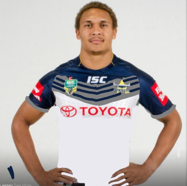
Can someone with some art skills please get that jersey riethmuller is wearing and turn all the stripes grey and make the sponsor logo like ray thompsons indigenous one?

I think that will look much better tbh and should be the home version.

Sorry you (a) asked for someone with skill, and (b) asked for something in particular.

Im neither skillful nor done what you asked, but the grey stripes interested me so i did a dodgy Paint fix up.

Like it. Looks tough. Maybe needs thin gold outline of the grey?

cbgrey.jpg
 

beave

Coach
Messages
15,680
Sorry you (a) asked for someone with skill, and (b) asked for something in particular.

Im neither skillful nor done what you asked, but the grey stripes interested me so i did a dodgy Paint fix up.

Like it. Looks tough. Maybe needs thin gold outline of the grey?

cbgrey.jpg

And (c) you put it on the wrong players jersey..........:p:p
 

BunniesMan

Immortal
Messages
33,738
Sponsorship aside (which always annoys me because all NRL jerseys have too much of it) I like the Cowboys jerseys. They're all a big improvement. Not a bland mess like the last one. Actually looks like a footy jersey now.
 

kdalymc

Bench
Messages
4,353
Design is ok. Shits all over last years efforts.
Sponsor. Ridiculous.

However the white bottom one should be the home jersey
 

beave

Coach
Messages
15,680
Please excuse my 5min ipad art skills.

This should be the home jersey design or something close to it. Maybe remove the yellow on the sleeves

c504f36642ec41344e5f168a09e00be9.jpg
 
Last edited:

steggz

Juniors
Messages
1,410
I like the yellow in the chevron. Don't know what you could do to make the crest stand out more but keep the yellow
 
Status
Not open for further replies.

Latest posts

Top