What's new
The Front Row Forums

Register a free account today to become a member of the world's largest Rugby League discussion forum! Once signed in, you'll be able to participate on this site by adding your own topics and posts, as well as connect with other members through your own private inbox!

2016 Jerseys, Sponsorship, Logos Discussion

beave

Coach
Messages
15,626
Yellow is light enough to use as an alternate primary colour. White was always a secondary colour in their set, it was but of a few horizontal lines and looked really good mixed in with the maroon and yellow in their original 8 or so years.

This just misses the mark for mine big time.
 

LESStar58

Referee
Messages
25,496
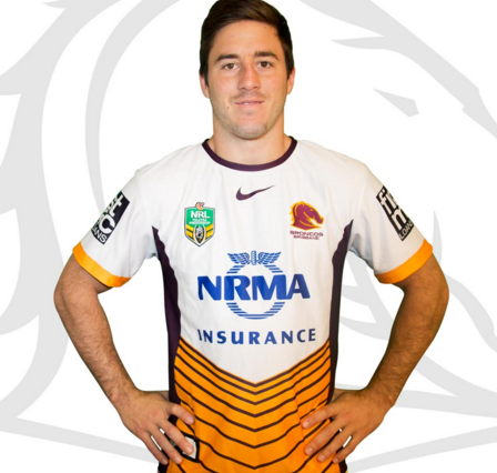
Broncos away:

CRzRloUUcAALe-A.png


New back of jersey (bottom) sponsor - National Storage: http://leagueunlimited.com/news/27071-broncos-partner-with-national-storage/

A nines jersey at best. Terrible.
 

SLRBRONCOS

Referee
Messages
24,007
Nah mate, I loved your heritage jersey this year. Jerseys, crowds and stadiums I will show no bias or hate because of said club on here at all, I call a spade a spade on those issues. Even against my own clowns.

Just teasing ;).

I despise too. Its the underbelly of a lobster.
 

some11

Referee
Messages
23,468
f**king hell, who approved that?

They really ought to have members vote to avoid these kind of garish designs.
 

JW

Coach
Messages
12,657
SMH, yet another gimmicky away strip.

Looks like a bloody training shirt.

The best jerseys we've done in recent times by far have been, surprise surprise, the heritage ones.
 
Messages
170
One of the key strengths in Brisbane's colour scheme was that by inverting the design to a predominantly gold with maroon trim for an away strip the jersey would still keep its distinctive 'brisbane' appearance. With the predominant white however it looks just like 90% of every other away strip in the competition. I was never fond of the white and navy away strips they used in the mid to late 2000s and this one looks even more tacky than those.
 

Saint Doc

Coach
Messages
11,065
Clearly Nike's thinking is that the alternate is a "twist" on the home.

When Brisbane had the diagonal design home, rather than just inverse the colours, they inverted and then did the weird gradient.

Here they've kept the same design as the home, but rather than keep the stripes horizontal, they've bent them into chevrons.

Not a fan but clearly that is their brief
 

kdalymc

Bench
Messages
4,322
Here they've kept the same design as the home, but rather than keep the stripes horizontal, they've bent them into chevrons.

Not a fan but clearly that is their brief

The 2014 nines jersey would have/would be perfect for an away jersey
 

Frailty

First Grade
Messages
9,392
Home one is ok... Not sure about the black on the shoulders. Fairly traditional design with slight changes.

The nines... Yeah not a fan. It looks like a blue iron man.
 

Ricey

Juniors
Messages
74
Home one is ok... Not sure about the black on the shoulders. Fairly traditional design with slight changes.

The nines... Yeah not a fan. It looks like a blue iron man.


The only thing that I'm not convinced on is the yellow bluestone sponsor. I don't know why they didn't have the same as on the training shirts.
E63FA7C1-D7FC-A04E-C146816EFFE730C5TrainingShirtSky2016.jpg
 

beave

Coach
Messages
15,626
Main looks really nice, good work sharkies.

Alternate looks to be a play on that old reebok/pre superleague era jersey which is no too bad.
 

Latest posts

Top