What's new
The Front Row Forums

Register a free account today to become a member of the world's largest Rugby League discussion forum! Once signed in, you'll be able to participate on this site by adding your own topics and posts, as well as connect with other members through your own private inbox!

2017 Jerseys, Logos, Sponsor Discussion

Status
Not open for further replies.

the beavers

Juniors
Messages
384
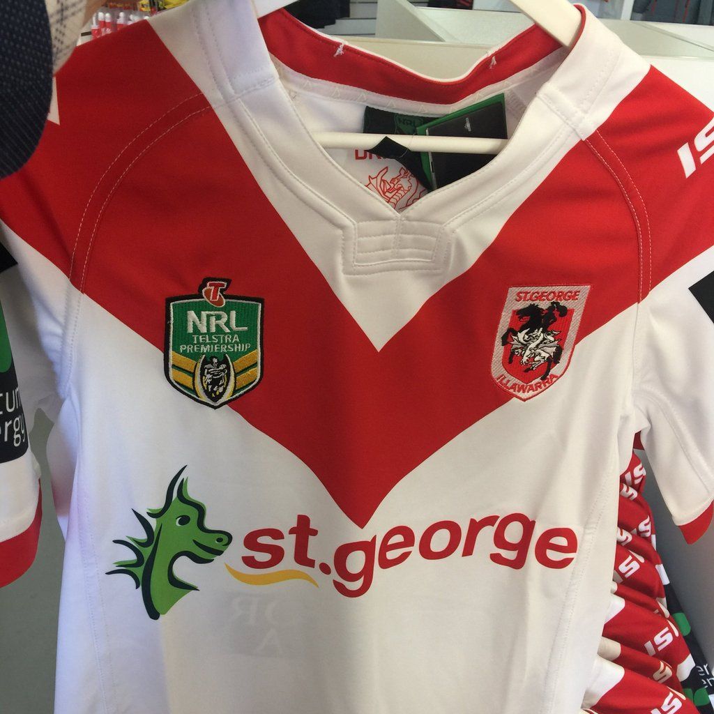
Noticed the isc jerseys have significantly longer sleeves this year...down to elbow..

The tigers Jersey in the flesh makes tedesco look like he doesn't have shoulders.....it's the funny angle of the orange segment on the sleeves.....
I think a tigers coloured version of the Catalans Jersey would be similar but look better...
 

GAZF

First Grade
Messages
8,760
113a1059_1.jpg


113a1209.jpg


113a1123_1.jpg
Meh.
 

rabbitohs95

Bench
Messages
4,711
I get the feeling roosters will use that logo like Souths do with the bunny silhouette. On all their gear but not the official logo
I think they do (or at least they've done so in the past at some capacity, I could be wrong)

How good would a traditional Rooster look? Hate the cartoony crap they've got, although the opera house inspired crest is a great design.

Similarly I think Penrith should just stick with a black (and maybe gold) design. I at least hope they keep this design, but honestly it doesn't do much for me. If anything it just reinforces the fact they are unsure of their identity.
 

kdalymc

Bench
Messages
4,354
The Panthers are delighted to reveal the 2017 Home and Away Jerseys - an iconic tribute to the club's proud history as we look ahead to an exciting future.

They are both in-stock and available for purchase at the Panther Shop and online here.

IN THE WORDS OF PHIL GOULD AM

"You know in 50 years here at Panthers we've had over 50 jerseys. Now wouldn't it be nice to have just one jersey for the next 50 years? I don’t know if that's possible but this is where we need to start.

"We asked you the question – what look best captures our identity? What design most embodies our Panther Pride? What are the colours that truly define us?

"Your response was undeniable. This is the jersey you wanted.

"We will respect our past as we set about creating our future – and this is the jersey that will carry us forward. This is the jersey we will aspire to. This is the jersey we will fight for.

"We are the Panthers. And these are our colours."

http://yi.nzc.am/bzyCSs
No, the jersey they wanted was the 91 one....

And, how long til this gets changed?
 

Lambretta

First Grade
Messages
8,689
Tigers home kit looks really good - the away is meh


I honestly thought the Panthers had nailed it with the black and gold
The Gold / Tan colour is a nod to their Brown whilst the Black is classic Panthers

I quite like the jersey for this year - an update on a classic, but I just thought the Black and Gold was classy and the Panthers had finally found a colour that really suited them
 

Knightmare

Coach
Messages
10,716
The Panthers are delighted to reveal the 2017 Home and Away Jerseys - an iconic tribute to the club's proud history as we look ahead to an exciting future.

They are both in-stock and available for purchase at the Panther Shop and online here.

IN THE WORDS OF PHIL GOULD AM

"You know in 50 years here at Panthers we've had over 50 jerseys. Now wouldn't it be nice to have just one jersey for the next 50 years? I don’t know if that's possible but this is where we need to start.

"We asked you the question – what look best captures our identity? What design most embodies our Panther Pride? What are the colours that truly define us?

"Your response was undeniable. This is the jersey you wanted.

"We will respect our past as we set about creating our future – and this is the jersey that will carry us forward. This is the jersey we will aspire to. This is the jersey we will fight for.

"We are the Panthers. And these are our colours."

http://yi.nzc.am/bzyCSs


Spot on. And this has been a big set-back to Panthers' branding for a long time now. For the first 23 years of their existence they had brown and white (drab as it comes and the application was rubbish), since then they've had any number of colour schemes. This is a problem that continues with Warriors branding to this day.

The "liquorice all sorts" look was always the best and (like the Raiders lime green or the Storm purple) stood out from the other teams. Glad they've settled on this, at last. The application of both home and away jerseys I like- not an exact replica, but they've taken what worked 25 years ago and adapted it tastefully. Hope the back of the jersey isn't a mess with pasted on Tony Ferguson/ Herbal World type sponsorship on it...
 

DiegoNT

First Grade
Messages
9,378
20161103_143153.png
Souths have had the Mintie Wrapper, now they introduce the Panadol Box

Thank god it's only a 9s jumper and the club jumper designers never have permission to change the real jumper
 

kdalymc

Bench
Messages
4,354
actually very simple. BUT they only thing on the jersey they cant stuff up- an equal width red v, was stuffed up
 

kdalymc

Bench
Messages
4,354
View attachment 10293
Souths have had the Mintie Wrapper, now they introduce the Panadol Box

Thank god it's only a 9s jumper and the club jumper designers never have permission to change the real jumper
its mad, but WHAT actually is it based on? surely someone adds them little lines at certain distances and the specific circles for A REASON?
 
Status
Not open for further replies.

Latest posts

Top