GAZF
First Grade
- Messages
- 8,760
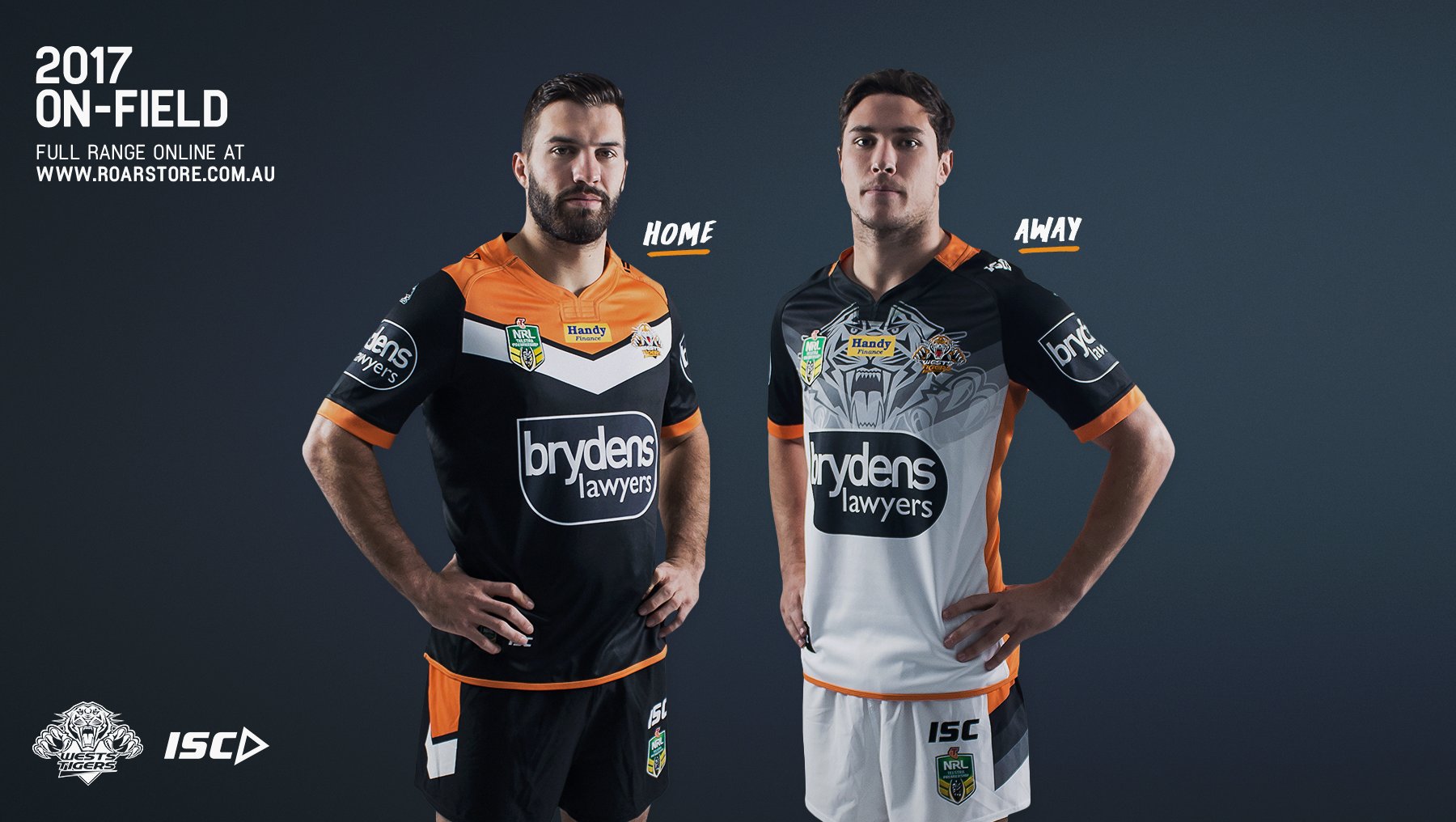
The current one is better. Felt like they should have kept it long term.But I digress, that Tigers home jersey is very nice. Supporters should be happy with that one.
The current one is better. Felt like they should have kept it long term.But I digress, that Tigers home jersey is very nice. Supporters should be happy with that one.
Does it really need a hashtag on the back of the collar? It looks rather tacky to me.Storm Home.


Perhaps your comprehension skills aren't great? "Dragons jersey is also the same" was a reference to the last line of the previous sentence.Wtf does the colour under the sponsor have to do with anything? Talk about going off on an unrelated and irrelevant tangent. Lol, you were trying to say the Dragons sponsor, like the Dogs, cuts through the design (which it doesn't). Remember how the original argument was about sponsor integration? When you failed in your original argument you pointed out the colour of the jersey (for some reason). Hey, did you know that lots of team have away jerseys with white space under the sponsor too!
But I digress, that Tigers home jersey is very nice. Supporters should be happy with that one.
then all white space below it.
Dragons jersey is also the same?
Just showing off the hard to get twitter handle that they have, It would look better in a different font or in purple as a tonal feature.Does it really need a hashtag on the back of the collar? It looks rather tacky to me.
Twitter handle?Does it really need a hashtag on the back of the collar? It looks rather tacky to me.
It's worth noting both Balmain & Western Suburbs club logos now appear at the back-top of the jumper - on all variants (home, away etc)I love the new Tigers Home jersey but upset with the home jersey. Not so much the design (although I dont like the design so much) but more the fact that the obvious alternate strip would be just the inverse of the Home, being predominantly Gold with black above the white chevron.
But since the Wests side of the Merger have dominated the Balmain side on the board, the orange has disappeared. To me everytime I see the white alternate, I just SMH at the pettiness.
The contrasting hem stripes bug me. Breaks up the transition from the jersey to the shorts.In-the-flesh versions revealed a moment ago
It's worth noting both Balmain & Western Suburbs club logos now appear at the back-top of the jumper - on all variants (home, away etc)
The contrasting hem stripes bug me. Breaks up the transition from the jersey to the shorts.
