that stuff is foul. i had it once, tried to drink it cos i paid for it but could only bring myself to drink a third before cutting my losses and chucking it outBarista Bros is where it's at
Barista Bros is where it's at
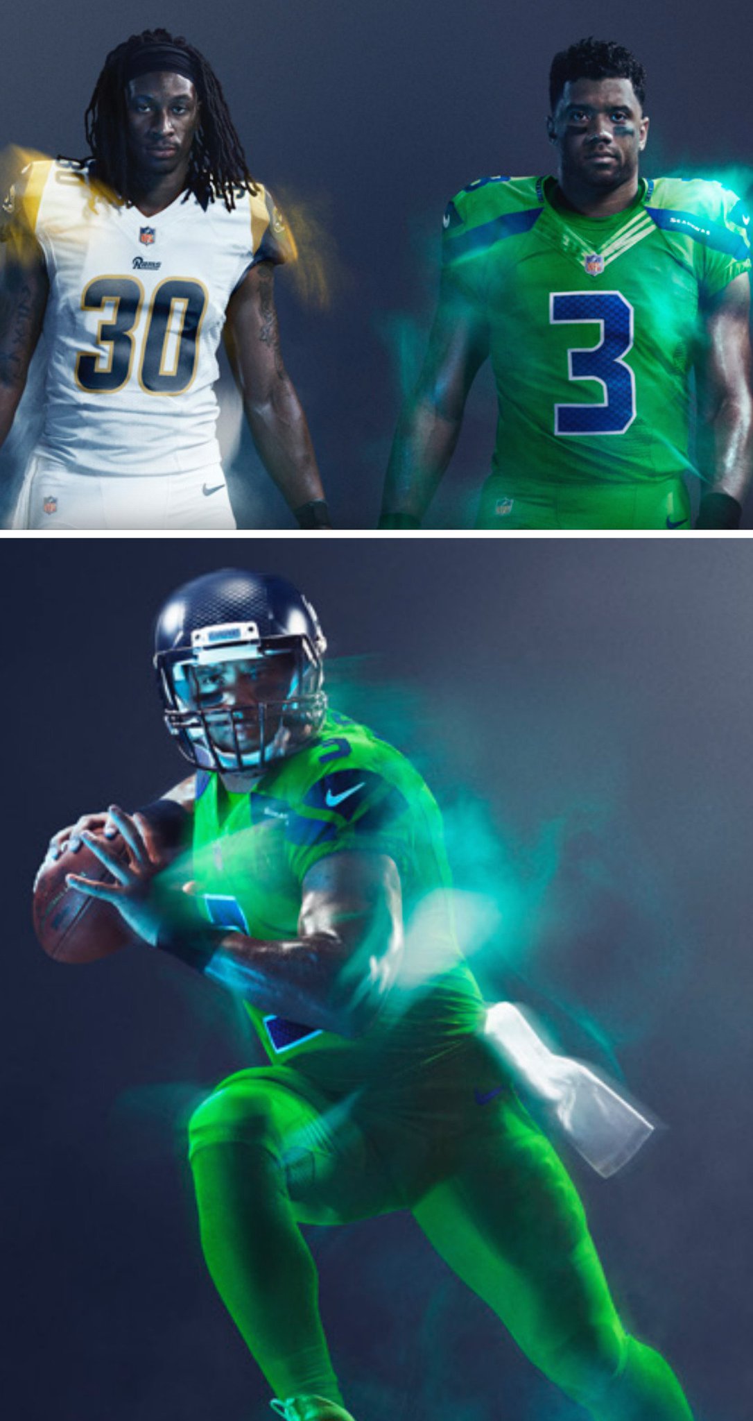
Not really sure about the blue strip down the sides of the jersey. What's wrong with keeping it green all over?
Huawei sell much more than just mobile phones
Just about every mobile data device sold by the carriers in Aust is made by Huawei. They also sell huge amounts of network switching gear, security and storage appliances along with IP telephony kit
They are in everything to do with comms technology
Funnily enough Huawei sounds a lot like "Who are we?"
If you pronounce it it phonetically then.Not if you pronounce it correctly. It is meant to sound like "Wah-way".
By the way, to all of the people arguing over which flavoured milk is best- you'd be amazed how few companies all of those brands belong to.
Pretty disappointing. Systematic design is fine but the base design needs to be worth keeping. Your one had a good amount of the original logo on it.Newcastle have unveiled their 2017 '30 Years' logo. Disappointingly, apart from the change of font for the number, the inclusion of two stars (presumably in honour of our two premierships), and the inclusion of '1988' and '2017' into the red oval, it is exactly the same as the Knights' 1997, 2002, 2007, and 2012 anniversary logos. Considering the knights head emblem has been modified slightly since 2008, and that this special logo has in essence been used for 20 years now, I really would have thought they would have ventured out and changed it. In 10mins several weeks ago, I came up with one based on the original 'shield' logo that I was hoping would be close to what they might have used for next year. Alas, no.
I should point out that I don't dislike the logo below, or the various versions of it in the previous 2 decades, but I was just hoping for something different this time. Oh well. Maybe in 2022!!View attachment 9493
I just like that they can achieve uniformity across the comp...
Just think how shit this would look if only half the teams participated and half of them decided they wanted to do it a week later instead.
The Lions are one of nine teams that won’t be wearing their Color Rush uniform in 2016. Some teams were not scheduled for Thursday Night Football and others are visiting teams playing in the game that will wear all white uniforms due to the color combination with the home team not being distinguishable for all viewers.
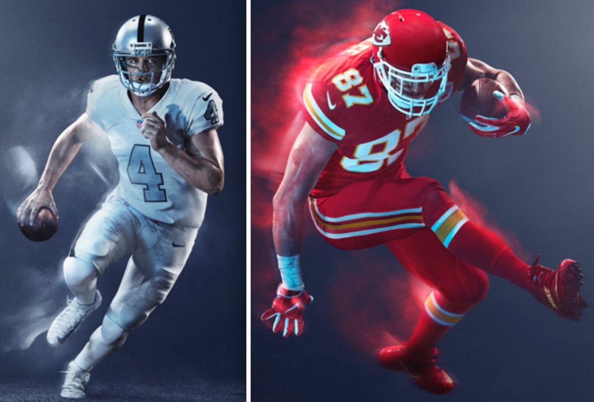
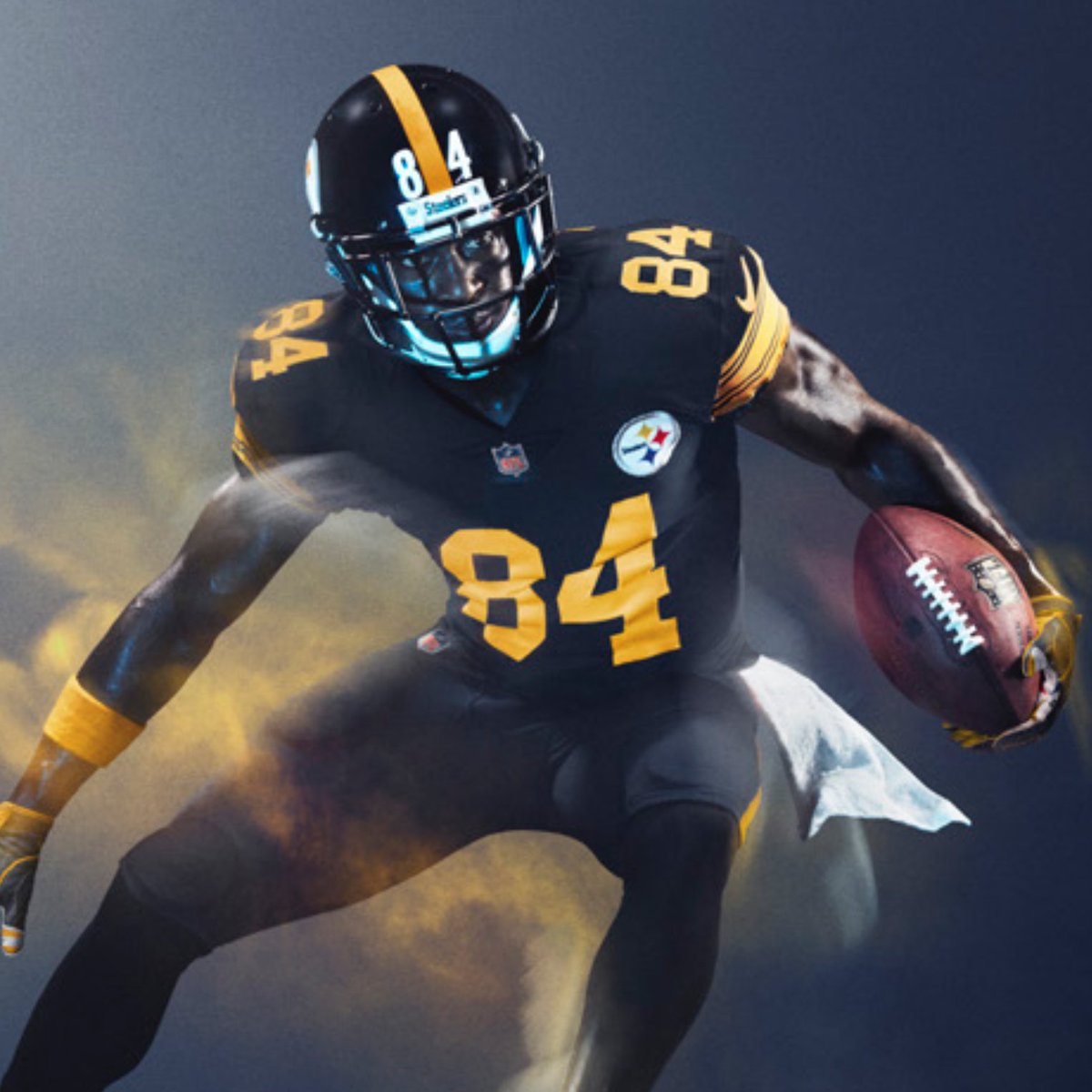
Colour rush is pretty yuck. Raiders and Chiefs look good though