What's new
The Front Row Forums

Register a free account today to become a member of the world's largest Rugby League discussion forum! Once signed in, you'll be able to participate on this site by adding your own topics and posts, as well as connect with other members through your own private inbox!

2018 Jerseys/Logos/Sponsorships

Status
Not open for further replies.

Zerô

Juniors
Messages
585
Both of your Storm logos are the previous version which they won't be reverting to next year. My understanding is the new logo will be adjusted without the 20 years and be similar again.

I really hope they don't.

While the logo is definitely a product of that era, it still looks like it could have been created yesterday.

And what NRL club can say they've had the same unchanged logo for 20 years, and it's still their inaugural logo
 

Timmah

LeagueUnlimited News Editor
Staff member
Messages
100,887
I really hope they don't.

While the logo is definitely a product of that era, it still looks like it could have been created yesterday.

And what NRL club can say they've had the same unchanged logo for 20 years, and it's still their inaugural logo
The Gold Coast in 8 years time lol
 

thorson1987

Coach
Messages
16,907
I really hope they don't.

While the logo is definitely a product of that era, it still looks like it could have been created yesterday.

And what NRL club can say they've had the same unchanged logo for 20 years, and it's still their inaugural logo

Can't see the Dragons changing theirs next year.
 

Hello, I'm The Doctor

First Grade
Messages
9,124
Both of your Storm logos are the previous version which they won't be reverting to next year. My understanding is the new logo will be adjusted without the 20 years and be similar again.

Good if true...

Just ad a bit of gold for colour and contrast and bring the guy down a bit.

IIRC someone here did a pretty nice mock-up of just that a while back
 

Hello, I'm The Doctor

First Grade
Messages
9,124
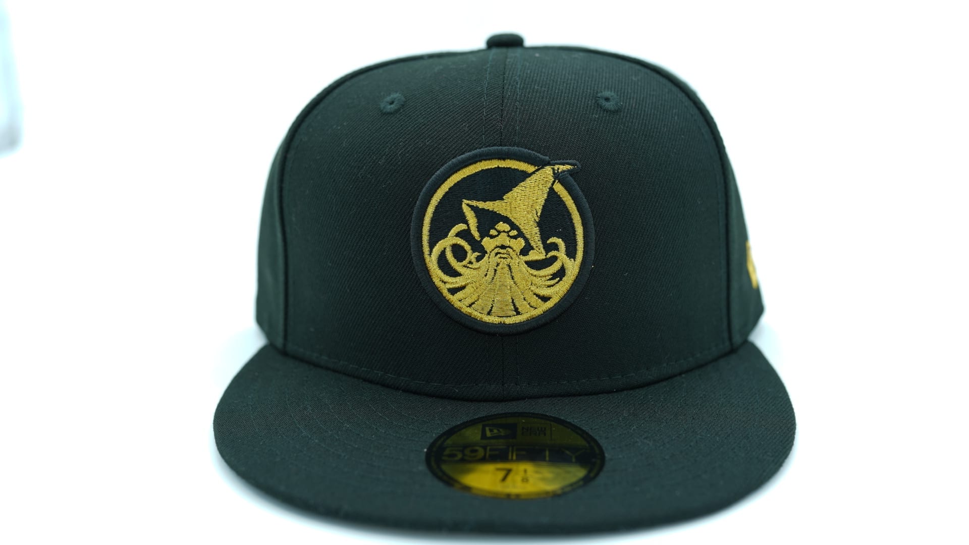
Either way, both would look good as secondary
latest

Or,

latest


melbourne-storm-59fifty-fitted-cap-nrl-new-era_4.jpg


I prefer it without that bottom bolt....
 

beave

Coach
Messages
15,557
If melbourne are gonna now use that 20 year one as their future logo, I reckon a splash of yellow in it wouldn’t go astray. Either the lightning bolt or storm mans head in yellow and it would top it off nicely. I love their current home jersey, they just need to stick to it or perhaps the white lightning bolts within the vee and they have an asbolute ball tearing jersey for the ages.

f**kers.
 

gzerounian

Juniors
Messages
1,090
Ok this is very freaky...the logo designs I did were created totally randomly. Then once they were all created they were again randomly dumped into another program and arranged. I just noticed...EVERY club has ended up being adjacent to their opponent for this week!

Screen Shot 2018-03-16 at 9.36.55 am.png
 

Knightmare

Coach
Messages
10,716
Ok this is very freaky...the logo designs I did were created totally randomly. Then once they were all created they were again randomly dumped into another program and arranged. I just noticed...EVERY club has ended up being adjacent to their opponent for this week!

View attachment 18350


Illuminati confirmed...

I'd change the background of the Titans one to the same yellow as the inner circle, and get rid of the grey in the Knights one and change it to the blue of the inner circle. If this means reversing the colour order of the inner/ outer circles, so be it. Otherwise, they're all fine.
 

hrundi99

First Grade
Messages
8,396
I did this for my local team which we've implemented. The main logo was too small to present properly on social media feeds, and we're shifting to a predominantly red jersey this year so it made sense to me.

BE_logo1.png
FB_logo2.png
 

Timmah

LeagueUnlimited News Editor
Staff member
Messages
100,887
WT ANZAC jersey now available for pre-order on their site. To be worn Round 8 v Parra at ANZ (Sunday arvo game)

upload_2018-3-16_13-25-27.png
 

gzerounian

Juniors
Messages
1,090
The minimalist approach of less detail on emblems not only looks better but it also makes it easier to reproduce on things such as social media feeds or embroidery on uniforms etc. Qantas has really cut back on the detail of their flying kangaroo in their most recent version. Most people wouldn't have even noticed this change. The wings, paws and ears now have all disappeared leaving a nice neat silhouette. I would like to see more emblems like that in the NRL.
Screen Shot 2018-03-16 at 2.48.10 pm.png
 
Status
Not open for further replies.
Top