What's new
The Front Row Forums

Register a free account today to become a member of the world's largest Rugby League discussion forum! Once signed in, you'll be able to participate on this site by adding your own topics and posts, as well as connect with other members through your own private inbox!

2018 Jerseys/Logos/Sponsorships

Status
Not open for further replies.

Zerô

Juniors
Messages
585
On the NRL Facebook page they had an option to select a team border for your profile pic.

On the team selection page it looks like they are starting to embrace the idea of secondary logos and the removal of team names/fonts
 

Attachments

  • IMG_20180312_223521.JPG
    IMG_20180312_223521.JPG
    175.5 KB · Views: 63
  • IMG_20180312_223619.JPG
    IMG_20180312_223619.JPG
    187.1 KB · Views: 60
Messages
12,007
20861.jpg
 

Hello, I'm The Doctor

First Grade
Messages
9,124

Warm up shirts. I may be in the minority but that would be a good jersey design.

Epic snail trail...

Maybe a good 9s jumper, but they shouldnt mess with their current main.

For me, the great thing is that they have finally found a great core brand to work outwrads from. Green-yellow-red stripe on black/white is a great base; we can then start looking at Vs or a Rabbitohs-style jumper with stipes all the way down.

If they ever change their colours again, Gus needs his head checked...
 

gzerounian

Juniors
Messages
1,094
there will be no point of difference in their jersey for them when (not if) a LGBTI round is eventually introduced. Melbourne already have the Cameron Smith testimonial jersey ready to go.
 
Last edited:

Prometheus

Juniors
Messages
1,102
there will be no point of difference in their jersey for them when (not if) a LGBTI round is eventually introduced. Melbourne already have the Cameron Smith testimonial jersey ready to go.

The NRL have definitely given that some thought. I filled out a survey emailed to me by the NRL last year and some of the questions were about themed rounds. One of them asked whether there should be an LGBTI round.
 

Hello, I'm The Doctor

First Grade
Messages
9,124
On the NRL Facebook page they had an option to select a team border for your profile pic.

On the team selection page it looks like they are starting to embrace the idea of secondary logos and the removal of team names/fonts

Nice (though they should isolate the Cowboy horns and the Tiger head)....

Given the chest badges are so small, writing becomes pointless. Pictures like these have a much better chance of being seen (and these can be bigger with the writing/frame all cut away).
 

Zerô

Juniors
Messages
585
Nice (though they should isolate the Cowboy horns and the Tiger head)....

Given the chest badges are so small, writing becomes pointless. Pictures like these have a much better chance of being seen (and these can be bigger with the writing/frame all cut away).

Yep, Cowboys just the horn.

Tigpies just the tigers head.

Dragons just the silhouettes of St George and the dragon.

Storm, logo minus the text OR the Storm font by itself could work.

The only head scratcher is Parra. Without the text the logo looks bare, but with just the eel head it looks stupid.
 

greenBV4

Bench
Messages
2,510
On the team selection page it looks like they are starting to embrace the idea of secondary logos and the removal of team names/fonts
Storm, logo minus the text OR the Storm font by itself could work.

Storm have been using just this part of the current logo for a lot of their communications (minus the shield), I think it works well for a small/secondary logo

MS18_FooterLogo_200x200.png
 

Shorty

Moderator
Staff member
Messages
15,555
Just because its not the worst, doesn't mean its good.
It's really not that bad, it's only being complained about on here by the die hards.
Nobody on the social media sites has anything bad to say about it (in the comments when it was released).

It comes down to a matter of opinion I think.
 

Hello, I'm The Doctor

First Grade
Messages
9,124
Storm have been using just this part of the current logo for a lot of their communications (minus the shield), I think it works well for a small/secondary logo

View attachment 18319
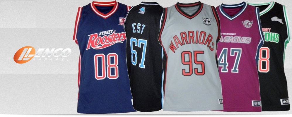
Fully remove the shield and you would have a great logo...

Id also love to see them put the wordmarks across the back/shoulders for a bit more of a branding push.

(I have said this one before, but i only just realized where i got the idea from. Those NRL basketball singlets had the wordmark across the chest. Just cut and paste that to the shoulders of the jersey and we are set.)

Lenco%20Courtside%20Banner.jpg
 
Status
Not open for further replies.
Top