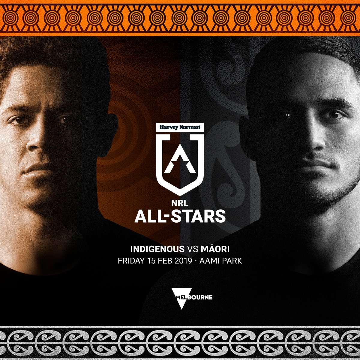
If the NRL rebranding is true, it may be a semi-kneejerk reaction to the branding approach of the AFLW and (to a lesser extent) the A-League. The UK Premier League has also gone with this approach as well.
Each of these leagues has gone with relatively flat aesthetics that are flexible with colour schemes, which allows for a wider range of applications and the added bonus of better legibility in small formats (i.e. mobile devices). Fox League has been doing something similar for a while now and their graphics package is better for it.
This approach also allows for easier extension of the brand, such as with the Women's and All-Stars logos, where green/gold may not be the best way of standing out from the primary product (NRL). Additional iconography like the All-Stars "star A" and the WNRL "W double V" allows for further distinction as well.
From an outsider's perspective it looks like the NRL wants to be the first major football code with a full brand of this nature by beating the AFL to the punch (sort of).
If this rebrand is to extend to all NRL logos, I'd prefer to see the NRL wordmark stay as-is (even though it could be better) and a downplay of certain elements like the southern cross and a restriction of the double V to the NRL comp, the state leagues, and the Kangaroos so that it isn't overly repetitive.


