What's new
The Front Row Forums

Register a free account today to become a member of the world's largest Rugby League discussion forum! Once signed in, you'll be able to participate on this site by adding your own topics and posts, as well as connect with other members through your own private inbox!

2018 Jerseys/Logos/Sponsorships

Status
Not open for further replies.

beave

Coach
Messages
15,677
Another thing i would like to see is compulsory shorts matching jerseys when away. I hate the mismatched look.

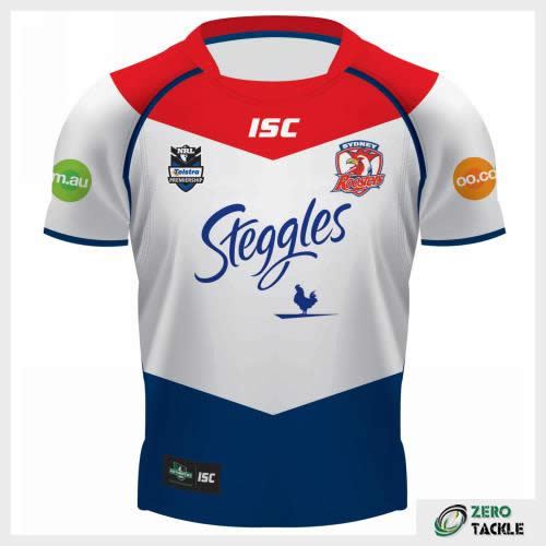
518263-roosters.jpg


White jersey/dark shorts vs dark jersey/white shorts. It just looks messy.


trbojevicj-170723-01.jpg


Matching. Such better contrast

Not in every case

lGRqx_6ssykQBFS9HQtEDq6jdHb7C-0qkoabdvIETN4x9JYSogQkl6uJ_99ZTQQq4HhdkPS-7THsq0JXck3tQ6oGsdev-5CP--b029pFQZcGYEW9pVTf6Qeyv1O8r2mpncDvMyuzpQb-JCMS55njY3s_fqtznQd4TqBUPOr5fuPW3Epv_9zElGrIFanKghge8FuasEfu6niRfrf7ZBc=w326-h451-nc


Too much grey when the shorts match the jersey

B2093A27-77CB-4891-94A5-690B064634A2.png_zpsdifakok1.jpeg


Sooo much better.
 

Timmah

LeagueUnlimited News Editor
Staff member
Messages
100,987
Who remembers the awful harry highpants look the Roosters had with a recent alternate strip?
 

Lambretta

First Grade
Messages
8,689
Who remembers the awful harry highpants look the Roosters had with a recent alternate strip?

Yeah. The three stripe jersey
The bottom stripe of the jersey was blue and the shorts were blue

Looked stupid. Ok shirt. Needed white shorts.
 

Zigwaa

Bench
Messages
2,744
Who remembers the awful harry highpants look the Roosters had with a recent alternate strip?

SYDNEY ROOSTERS
Best: Like the Dragons, the Roosters have stuck to the same design for many years, with only slight variations on a classic layout. The differences between most of their home strips is negligible, but the 2013 edition was close to the best. They tightened up the red and white around the neck enough to make the jersey distinctive, but not enough to look unfamiliar.

Worst: The Roosters away jerseys have either been big hits or awful misses and the worst of the lot was this bludger from 2011. On the surface its all right, albeit a bit forgettable, but some genius decided that the players should wear shorts that were the same shade of dark blue as the bottom section of the jersey. As a result, the players looked as though their shorts were up around their armpits. We’re no fashion experts, but it wasn’t a great look.

9bd8b8914df9e944dc6970ca75d6e49b


roosters12awayfront.jpg
 

Saint Doc

Coach
Messages
11,098
Not in every case

lGRqx_6ssykQBFS9HQtEDq6jdHb7C-0qkoabdvIETN4x9JYSogQkl6uJ_99ZTQQq4HhdkPS-7THsq0JXck3tQ6oGsdev-5CP--b029pFQZcGYEW9pVTf6Qeyv1O8r2mpncDvMyuzpQb-JCMS55njY3s_fqtznQd4TqBUPOr5fuPW3Epv_9zElGrIFanKghge8FuasEfu6niRfrf7ZBc=w326-h451-nc


Too much grey when the shorts match the jersey

B2093A27-77CB-4891-94A5-690B064634A2.png_zpsdifakok1.jpeg


Sooo much better.

Look I appreciate I’m on my own here.

I agree as a stand alone jersey that looks better.

But my point is, when teams with virtually the same colours, like roosters and cowboys play each other, I would prefer one team in an all navy strip, and one team in an all white strip. The individual jerseys might not look as good, but for the clash game, the contrast is so much better

Here is another example of how bad the white/navy vs navy/white look on field
images


I would rather see this in NQLD:

4DC380BE-53E2-49CF-97DF-A102F598D2E5.jpg


And this at Allianz (with proper rooster shorts not training shorts)

255D8861-E798-4F32-A312-8F264E55FB9E.jpg


It makes a mockery of having a clash Jersey if the shorts and socks are opposite and the overall appearance is the same.
 

GAZF

First Grade
Messages
8,754
Look I appreciate I’m on my own here.

I agree as a stand alone jersey that looks better.

But my point is, when teams with virtually the same colours, like roosters and cowboys play each other, I would prefer one team in an all navy strip, and one team in an all white strip. The individual jerseys might not look as good, but for the clash game, the contrast is so much better

Here is another example of how bad the white/navy vs navy/white look on field
images


I would rather see this in NQLD:

4DC380BE-53E2-49CF-97DF-A102F598D2E5.jpg


And this at Allianz (with proper rooster shorts not training shorts)

255D8861-E798-4F32-A312-8F264E55FB9E.jpg


It makes a mockery of having a clash Jersey if the shorts and socks are opposite and the overall appearance is the same.
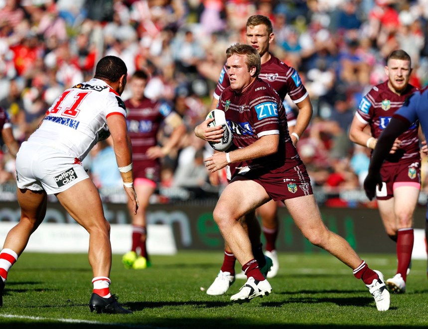
I could get behind that, if clubs did it to avoid clashes rather than for the sake of it. Manly looks a bit off in all maroon but I didn't mind the Cowboys grey/grey/navy look. If anything, it might allow teams to wear their main jerseys more.
 

kdalymc

Bench
Messages
4,349
Look I appreciate I’m on my own here.

I agree as a stand alone jersey that looks better.

But my point is, when teams with virtually the same colours, like roosters and cowboys play each other, I would prefer one team in an all navy strip, and one team in an all white strip. The individual jerseys might not look as good, but for the clash game, the contrast is so much better

Here is another example of how bad the white/navy vs navy/white look on field
images


I would rather see this in NQLD:

4DC380BE-53E2-49CF-97DF-A102F598D2E5.jpg


And this at Allianz (with proper rooster shorts not training shorts)

255D8861-E798-4F32-A312-8F264E55FB9E.jpg


It makes a mockery of having a clash Jersey if the shorts and socks are opposite and the overall appearance is the same.
f**k sake mate, it’s a joke that some people think we need white jerseys let alone whinging about needing white shorts...
 

roofromoz

First Grade
Messages
7,580

Timmah

LeagueUnlimited News Editor
Staff member
Messages
100,987
f**k sake mate, it’s a joke that some people think we need white jerseys let alone whinging about needing white shorts...
Except it's not, because increasingly people are watching sport not on big screen TV's, but on smaller handheld devices. If both team's kits contrast then its far easier to tell them apart.

Way too many occasions in recent seasons where both clubs playing wore kits that didnt provide this and it was difficult to watch - let alone on a big screen.
 

hellteam

First Grade
Messages
6,536
Except it's not, because increasingly people are watching sport not on big screen TV's, but on smaller handheld devices. If both team's kits contrast then its far easier to tell them apart.

Way too many occasions in recent seasons where both clubs playing wore kits that didnt provide this and it was difficult to watch - let alone on a big screen.

The clashes often come because teams insist on wearing away jerseys. Broncos at Bulldogs comes to mind
 

gzerounian

Juniors
Messages
1,094
Here is my perfect world of jerseys. 90% of the time all teams would be able to wear their home jerseys (even at away games...fancy that). Wherever possible colours have just been reversed. Could even have Roosters and Warriors in red for their away. White jerseys would almost be non existent and clubs would have identical design in both their home and away jerseys. Then apply a strict NRL policy that no other on-field jerseys to be produced. All other special event jerseys can still be sold but not worn for matches.

Screen Shot 2018-02-16 at 12.48.11 pm.png
 

Saint Doc

Coach
Messages
11,098
Here is my perfect world of jerseys. 90% of the time all teams would be able to wear their home jerseys (even at away games...fancy that). Wherever possible colours have just been reversed. Could even have Roosters and Warriors in red for their away. White jerseys would almost be non existent and clubs would have identical design in both their home and away jerseys. Then apply a strict NRL policy that no other on-field jerseys to be produced. All other special event jerseys can still be sold but not worn for matches.

View attachment 17592

Dragons, Souths, Broncos, Tigers, Storm = fantastic

Raiders...no. They would rarely if ever wear it under your plan so I would stick with white.
 

Timmah

LeagueUnlimited News Editor
Staff member
Messages
100,987
Here is my perfect world of jerseys. 90% of the time all teams would be able to wear their home jerseys (even at away games...fancy that). Wherever possible colours have just been reversed. Could even have Roosters and Warriors in red for their away. White jerseys would almost be non existent and clubs would have identical design in both their home and away jerseys. Then apply a strict NRL policy that no other on-field jerseys to be produced. All other special event jerseys can still be sold but not worn for matches.

View attachment 17592
Just about spot on for mine, with the exception of Penrith and Canberra. Raiders alternate colour is now the deep grey-blue colour used in their alternate strip so I'd say use that. For Penrith, the main body is too similar. Needs to be white from the neck down as well.
 

Zigwaa

Bench
Messages
2,744
Here is my perfect world of jerseys. 90% of the time all teams would be able to wear their home jerseys (even at away games...fancy that). Wherever possible colours have just been reversed. Could even have Roosters and Warriors in red for their away. White jerseys would almost be non existent and clubs would have identical design in both their home and away jerseys. Then apply a strict NRL policy that no other on-field jerseys to be produced. All other special event jerseys can still be sold but not worn for matches.

View attachment 17592

I'd be happy with that, like how the NFL designs don't change only where the colours are.

Penrith alternate needs to be reverse of the home instead of just white shoulders though, similar to the 90s white alternate.
 

gzerounian

Juniors
Messages
1,094
I'd be happy with that, like how the NFL designs don't change only where the colours are.

Penrith alternate needs to be reverse of the home instead of just white shoulders though, similar to the 90s white alternate.
Yep I was on my phone and couldn't do the Penrith away because it was too hard to edit the white but it needs to be the one they used in 1992. They actually had it as their heritage 2 or 3 years ago but I can't find it anywhere.
penrith-panthers-alternative-away-shirt-1992-s_2917_1.jpg
 

gzerounian

Juniors
Messages
1,094
You know I JUST realised then that the fading stripes are supposed to be claw marks. At least it gives it some context now
 

Knightmare

Coach
Messages
10,716
The Raiders away jersey is crap. It looks more like the official polo shirt than an on-field jersey. It should have the green/ white reversed, as it used to be. And that's before we get onto the fact they've somehow managed to make every single sponsor placement look terrible...
 
Status
Not open for further replies.

Latest posts

Top