Foreign Legion
Coach
- Messages
- 12,064
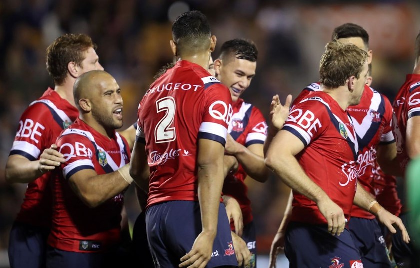
Not a Roosters fan, but really like their jerseys. They aren't the only ones, but they really have built over the years such a recognisable and strong brand, it's hard to think of a time where they released a kit (excluding Nines) which wasn't instantly recognisable as being the 'Roosters' or looked terrible (possibly their 2011 away is the exception).
Interesting but I think you're probably right. I was confused there for a while because I couldn't find it anywhere haha.Looks like they must scan the forums, as it was there yesterday but not today: http://corporate.rabbitohs.com.au/about-rabbitohs/current-sponsors/
Gee, I really hope they are as flexible with their brand as that on our jersey because that will provide some great sponsor integration since it will hopefully fit in similar to how Alcatel is on the away jersey. That's the hope at least.Yep, back of shorts for WSW

Hopefully they are as flexible with their brand on Souths' jersey.
I am a Roosters fan & I agree with you...partly. The tri-colour, in both home & away format, is both an objectively good-looking design & as iconic & timeless as the Rabbitohs’ hoops or the Dragons’ V...& yet, I find myself yearning for something different to own. A fresh design, something entirely more contemporary. An example of what I’m talking about is a jersey the Sea Eagles released a few years ago - it was a maroon kit with a giant Sea Eagle (same model they use on their emblem) emblazoned square on the chest. Looked terrific.
Something completely new & a one-off to own in addition to the beloved classic strip is an idea I’ve long hoped the club would explore, but I won’t hold my breath.
i secretly hope that we can return to the 1995 away jersey for one season.
That's the one. Here's the Roosters' jersey history from reddit:I know this isn’t 1995 from the NSWRL logo, but is that the jersey?

I am a Roosters fan & I agree with you...partly. The tri-colour, in both home & away format, is both an objectively good-looking design & as iconic & timeless as the Rabbitohs’ hoops or the Dragons’ V...& yet, I find myself yearning for something different to own. A fresh design, something entirely more contemporary. An example of what I’m talking about is a jersey the Sea Eagles released a few years ago - it was a maroon kit with a giant Sea Eagle (same model they use on their emblem) emblazoned square on the chest. Looked terrific.
Something completely new & a one-off to own in addition to the beloved classic strip is an idea I’ve long hoped the club would explore, but I won’t hold my breath.
The grass isn’t always greener, be very careful what you wish for...... over sized team logos splashed on the front of jerseys is rubbish 99/100.
I think it depends on the logo/teamThe grass isn’t always greener, be very careful what you wish for...... over sized team logos splashed on the front of jerseys is rubbish 99/100.
i secretly hope that we can return to the 1995 away jersey for one season.
I think it depends on the logo/team
I always wondered why the Roosters haven't tried an alternate red jersey with blue inside the white V (basically switching the red and blue). They've had mostly red striped alternates in the past.. a red jersey with blue and white V would be a change-up.
I’m sure I’ve seen a jersey like that once before at some stage.
Personally, I’m mot a fan of the red as the predominant colour. Blue or white look a lot better IMO.


This is the closest the Roosters have gone to a 'Red' version of the home kit.
The V is more based on the Away V than the home V, still again a very professionally looking kit
