What's new
The Front Row Forums

Register a free account today to become a member of the world's largest Rugby League discussion forum! Once signed in, you'll be able to participate on this site by adding your own topics and posts, as well as connect with other members through your own private inbox!

2019 Jerseys/Logos/Sponsorships

kdalymc

Bench
Messages
4,351
there is no 3 year rule ffs.

ALSO check the Warriors CCC template- the vee going up the shoulders, this could be f**kING GREAT for the Kangaroos!!!!
oh and them grubs from south of the border
 

unforgiven

Bench
Messages
3,138
Confirmed!

A8B79E72-34C5-400C-8E6A-A121160DB367.jpg
Wow, That is so bad!
 

GAZF

First Grade
Messages
8,756
The Warriors jersey is ok but the V feels very vertical, probably to fit the sternum sponsor in.

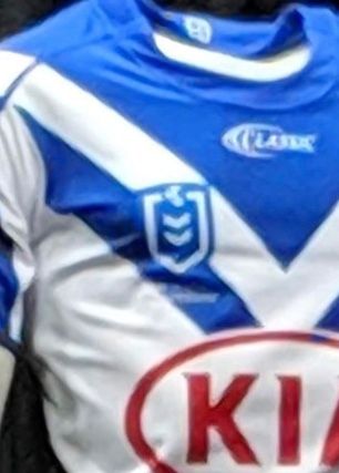
I'm sure the Dogs jersey will look better on a player but it does look a bit "cheap" on the mannequin, the collar in particular. I'm a bit disappointed that they didn't go with the jersey cut that the Titans had this year.
 

gzerounian

Juniors
Messages
1,094
The new nrl badge on the bulldogs jersey makes it look like a NSW cup jersey.

Competition logos look nicer when they stand out (contrast)....BUT not this much...

Screen Shot 2018-10-31 at 9.12.34 am.png

...now that's a big mf Grand final badge! There are probably people on a Soccer forums saying
"why cant we be more like the NRL and have normal badges for Grand Finals"
 

wazdog

Juniors
Messages
377
In NRL Daily Top 5 email yesterday, they managed to use two different versions of the corporate logo at the top and bottom of the email (on the same black background). They seem confused on which one to use.
 

Timmah

LeagueUnlimited News Editor
Staff member
Messages
100,992
In NRL Daily Top 5 email yesterday, they managed to use two different versions of the corporate logo at the top and bottom of the email (on the same black background). They seem confused on which one to use.
I'm gonna suggest that once they get down beyond a certain resolution they do away with the border to avoid over-complicating the logo.
 

GAZF

First Grade
Messages
8,756

The Marshall

Juniors
Messages
630
Looks better when worn but I wish they went with all blue sleeves.

Just noticed that the Telstra Premiership logo has a keyline which is rounded at the top like the NRL logo. Weird choice since they deliberately went an angular top on the shield icon. Might be to better accommodate the Telstra logo.
It also looks like its a different shade of blue.
 

greenBV4

Bench
Messages
2,510
I actually dont mind the new logo, only thing that needs to go is the text, it "off-centres" the logos and it can't even be read in most images anyway, definitely wont be able to read it on tv or at the field so whats the point of it?
 

Timmah

LeagueUnlimited News Editor
Staff member
Messages
100,992

Cowboys have upgraded a sponsor to the sleeve. Looks like they're sticking with the home design - interestingly this photo doesn't even have the NRL logo visible.
 

Lucev23

Juniors
Messages
44
Wow. That white text on white jersey is ridiculous
The NRL gave strict guidelines stating the text colour could be white or (for those familiar with pantone colours) Cool Grey 1c.

Also, the list of usable logo colours were standardised so that clubs couldn't simply use the bulldogs blue, it had to be the pantone blue that the NRL stated.
 

Dawesy76

Juniors
Messages
278
Who cares about the writing on the new logo. Personally as long as the badge looks good then who cares. I love that the bulldogs have used a slighting different contrast of blue to avoid a clash.
 

Latest posts

Top