That Storm jersey was hideous in it's original version.
This heritage jersey has managed to make it worse. Why wouldn't they replication the blue on the sleeves to continue on top of the shoulder?!
Guessing it's an issue with the lines at the top of the right sleeve on the Dynasty template.Why not do the single sleeve tho
Why not do the single sleeve tho
Guessing it's an issue with the lines at the top of the right sleeve on the Dynasty template.
Looks good overall though, modern take on a classic jersey.
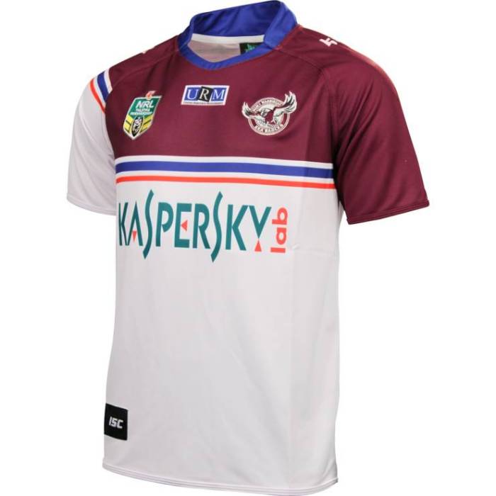

Manly bringing back the Pepsi Jersey. To be worn against the Dragons in Round 19
https://www.seaeagles.com.au/news/2022/07/07/sea-eagles-release-special-90s-retro-pepsi-max-jersey/
unless im drunk, that template is simply a middle section with 2 sleeves. get a white sleeve.Guessing it's an issue with the lines at the top of the right sleeve on the Dynasty template.
I'd prefer they call it the 1997 heritage jerseyManly bringing back the Pepsi Jersey. To be worn against the Dragons in Round 19
https://www.seaeagles.com.au/news/2022/07/07/sea-eagles-release-special-90s-retro-pepsi-max-jersey/
Dynasty did get the blue and red around the right way though.They did the same with their 2020-21 alternate which was also based on the Pepsi jersey
ISC didn't have that issue with the white sleeve though in 2014
The issue is more the cut and shape of the jerseys these days. The sleeves and body of the jersey are more curved now. Used to be more rectangular. Makes it tricky recreating an old design.unless im drunk, that template is simply a middle section with 2 sleeves. get a white sleeve.
PS that Storm jersey is f**ken terrible hahaha
its a white sleeve with 2 lines on it. literally the same shape/template of the jersey they had in the 90sThe issue is more the cut and shape of the jerseys these days. The sleeves and body of the jersey are more curved now. Used to be more rectangular. Makes it tricky recreating an old design.
Sleeves are smaller and sponsors are bigger. Something has to give (hint: its not usually sponsors).its a white sleeve with 2 lines on it. literally the same shape/template of the jersey they had in the 90s