yakstorm
First Grade
- Messages
- 6,585
I meant the Raiders home only being a minimal change.Raider away isn't minimal, it's gone blue from total white
I meant the Raiders home only being a minimal change.Raider away isn't minimal, it's gone blue from total white
Look much betterNRLW version of the new Titans home kit. IMO the difference chest & sternum sponsors, significantly improve the jersey.
View attachment 96487
Hopefully these jerseys don't cause cancer like James Hardie did back in the 80s.


Top left; is that Darius Boyd?NRLW version of the new Titans home kit. IMO the difference chest & sternum sponsors, significantly improve the jersey.
View attachment 96487
I see shit like this and get so jealous on how much better other clubs can integrate sponsorship into their jerseys compared to the Titans…..
I see shit like this and get so jealous on how much better other clubs can integrate sponsorship into their jerseys compared to the Titans…..

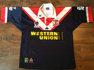
I'd suggest the logo itself isn't small. The lettering is thin, sure, which means less space being taken up, but I think the main thing for it is that a) the colour integrates with the jersey colours, and b) it sits rather low down on the jersey by 2020s NRL jersey standards. It sits below the chevrons, not through the middle.Newscorpse reporting the roosters BYD deal as 2 million a year for 5 years which is the biggest sponsorship I know of. Obviously not all figures are known for each club.
And once again the integration on the jersey is perfect and the actual logo you would say is quite small.
‘City Index’ sponsor is missing on the men’s in the central V area where the girls have Unibet. Strange they don’t have all sponsors on a kit launch unless it will remain clean which is something I’d prefer tbhClearer pic on Roosters insta:
