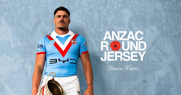
Princess Guffo got a tit enhancementSt George ANZAC jersey
That “V” is horrendous. Why is it so flat?C
Cracker jersey
Knights should wear a cinnamon and green away/alternate full time. Our away jerseys always suck.
I know it's not League, but nib have shown with the Auckland Blues they are open to existing without the green button for an entire season. I'm not sure why the Knights add it... the green button isn't even in their nib brand guidelines (https://www.nibtravelinsurance.com....ebrand2022/nib-core-partners-guidelines-1.pdf)Oh look, NIB can allow good sponsors integration, why so many years of shitty green blob


Other then the Tooheys sponsor the rest look crap.... especially the "Star" and why do we need a beer and whisky sponsor?
Haha! Beer, whiskey, AND a casino. Way to promote healthy habits to the kids..!Other then the Tooheys sponsor the rest look crap.... especially the "Star" and why do we need a beer and whisky sponsor?
Probably not an issue as game starts so late on 9 that kids are asleep (as are some adults) by the time the team takes the field so they don't see the jerseyHaha! Beer, whiskey, AND a casino. Way to promote healthy habits to the kids..!


 raidersshop.com.au
Haha! Beer, whiskey, AND a casino. Way to promote healthy habits to the kids..!

 www.roosters.com.au

SO much nicer. How good does that clean jersey look?! Still a shame about the big red W, but a damn-sight better than the adults one.


