Foreign Legion
Coach
- Messages
- 13,027
OMG that looks mega sh...t.Dogs Away is an inverse of the home design. View attachment 107503
It looks like a Best and Less NRL Kids tee shirt
OMG that looks mega sh...t.Dogs Away is an inverse of the home design. View attachment 107503
They used that design from 2019-2021 but I don’t think they executed it very well. On field it didn’t seem to have enough red. In my opinion they should commit to the stripes. It has a great ratio of blue to red and no other team use the design, it’s completely unique in the compPersonally, I'd love a fulltime return to the 1995-era style of the original jersey design. And by fulltime, I mean permanent. Keep it forever, deviating only for alternate / away kits, special jerseys, ect.
To me, it's just the best looking jersey in the history of jerseys.
They did. It was only on the front of the jersey, though. The pattern didn't continue onto the back.They used that design from 2019-2021 but I don’t think they executed it very well. On field it didn’t seem to have enough red. In my opinion they should commit to the stripes. It has a great ratio of blue to red and no other team use the design, it’s completely unique in the comp
 www.newcastleknights.com.au
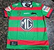
Budget Direct are really doubling down on their investment in the NRL. That's four clubs now that they've paid to become sleeve sponsors of (Phins, Bears, Storm, Rabbitohs)Souths home. Not a fan of the Roman numerals or the new sleeve sponsor.
Is Budget Direct going to sponsor the whole competition?Souths away
That logo isn’t getting any better.Dogs Away is an inverse of the home design. View attachment 107503
Is Budget Direct going to sponsor the whole competition?
People, yellow, and bright red together on a jersey is rough on the eyes.View attachment 107516
Not terrible but definitely a downgrade. Would have liked the navy on the shoulders and sleeves as well (like an inverse of the 2024/25 jersey).
Don’t like the lightning bolts on the sleeves.
Meh.View attachment 107516
Not terrible but definitely a downgrade. Would have liked the navy on the shoulders and sleeves as well (like an inverse of the 2024/25 jersey).
Don’t like the lightning bolts on the sleeves.
Looks like the members vote on the away jersey went the way many expected.Souths away